Rafa Ministro

Oca Tupi

BRAZIL | Brand creation, social media, packaging and website

01 · The idea

A healthy-food brand from Brazil

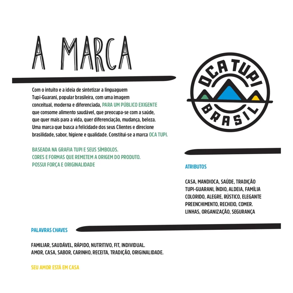
Oca Tupi joins the Tupi-Guarani language with a modern and distinctive visual identity. It speaks to a discerning audience that values healthy food, cares about well-being and always looks for more from life. This audience wants difference, change, beauty and unique experiences.

The brand was designed to show happiness, and to highlight Brazilian identity, flavour, hygiene and quality. This is the base of the whole Oca Tupi visual world.

4Disciplines
30Visuals
6Flavours
4Brand colours
3Typefaces
02 · The system

One symbol. Three colours.

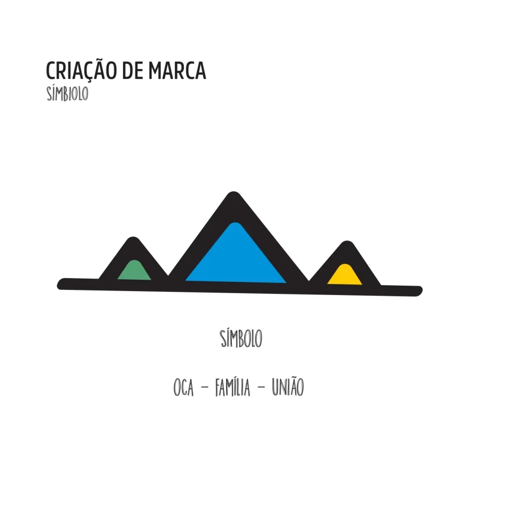
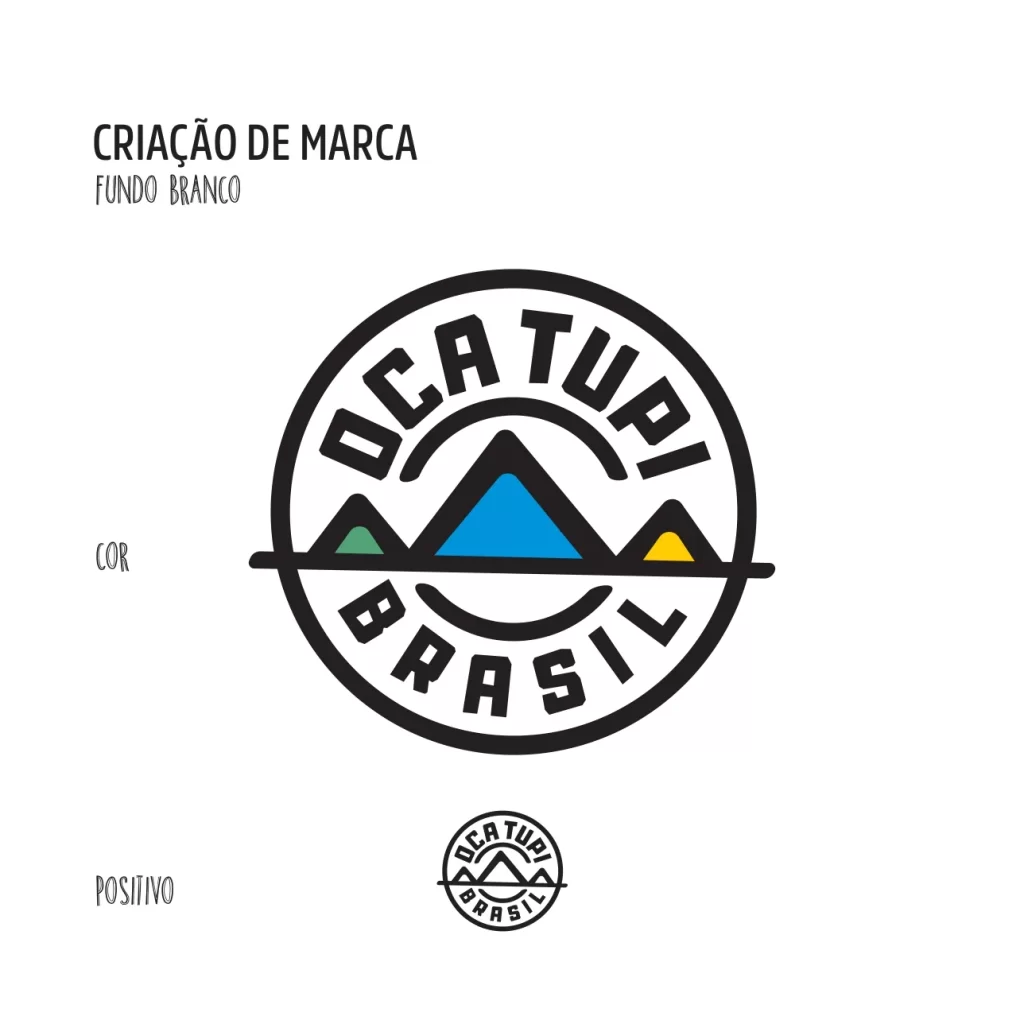
The symbol is three triangles on a line, filled with green, blue and yellow. The manual sums it up in three words: oca, family, union. The colour sheet adds black, and the type sheet shows three typefaces.

Colour
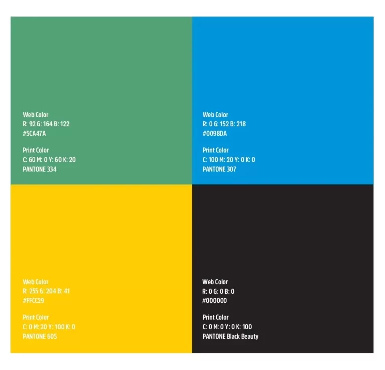
Green #5CA47APantone 334
Blue #0194DBPantone 307
Yellow #FFCC29Pantone 605
Black #000000Pantone Black Beauty
Typefaces
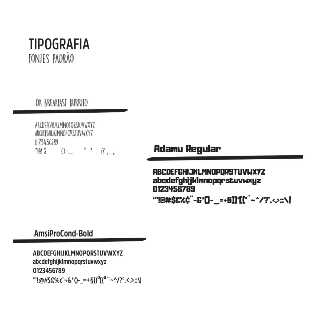
AaDK Breakfast Burrito · Adamu Regular · AmsiProCond-Bold
Slogan
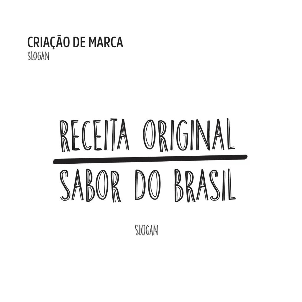
Original recipe, taste of Brazil
Symbol
Oca+Family+Union
Oca Tupi
03Brand creation
03 · Brand creation

The brand manual

The manual sets the rules of the brand: the logo, the brand story, the symbol, the slogan, the support elements, the colours and the typefaces.
LogoSymbolSloganColourTypography
Oca Tupi Brasil logo with the mountain symbol, on the brand manual
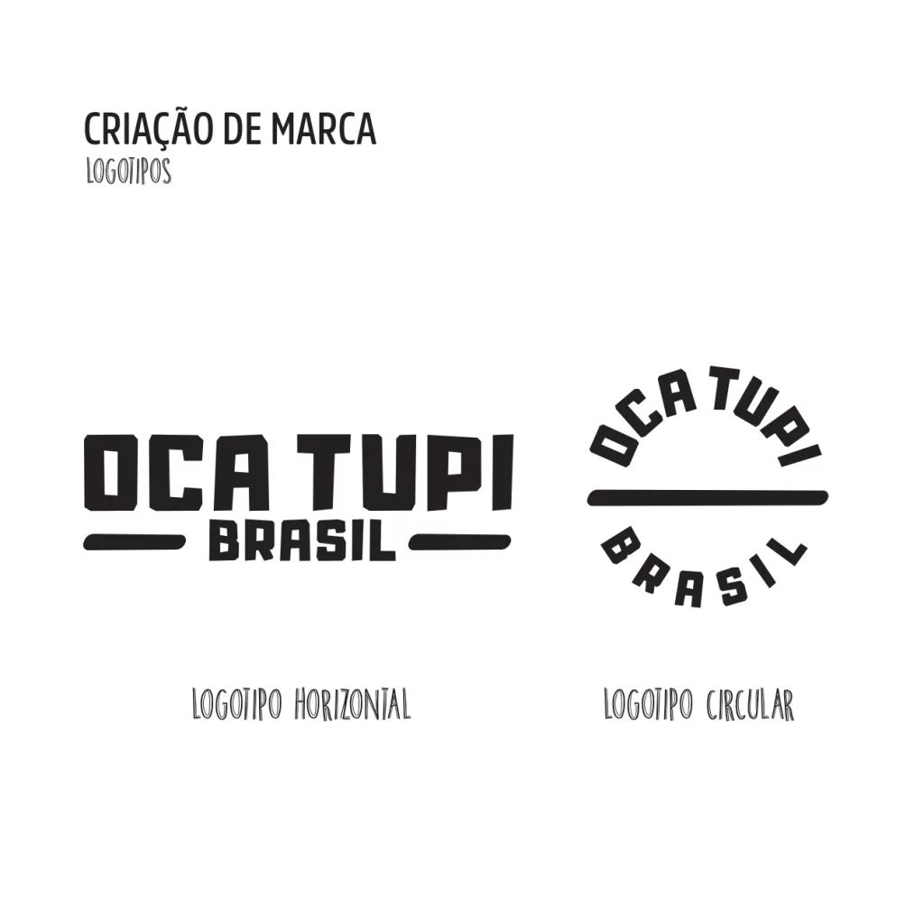
Oca Tupi Brasil logo lockups on the brand manual
Oca Tupi symbol in green, blue and yellow: oca, family, union
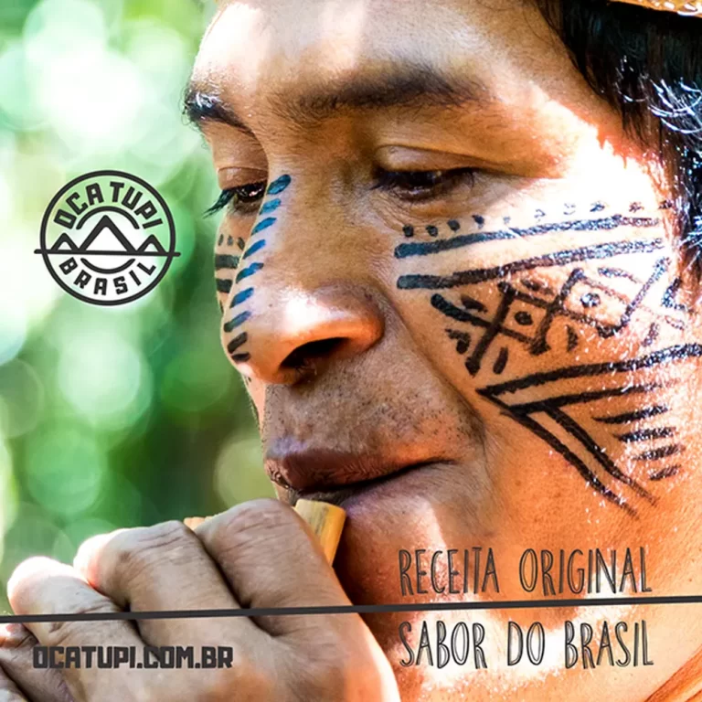
Slogan on the brand manual: Receita original, sabor do Brasil
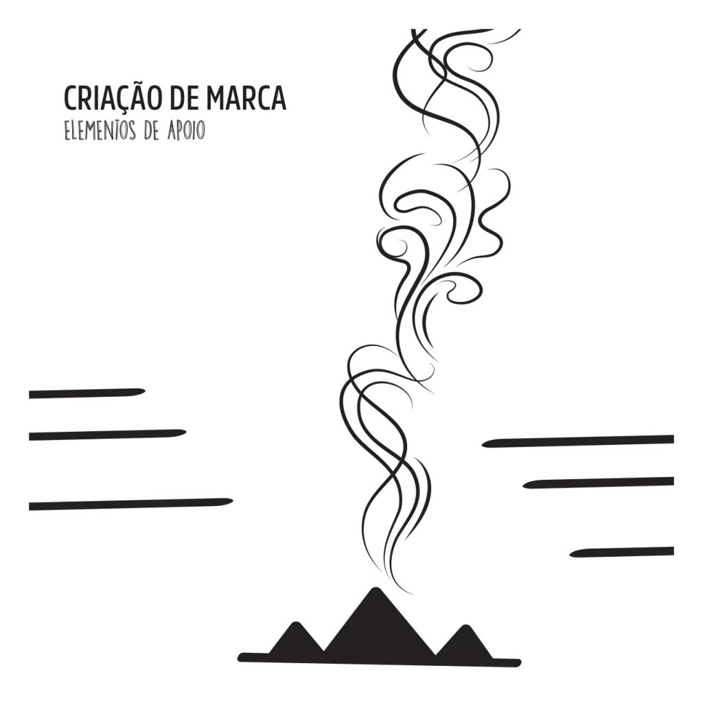
Supporting elements: smoke lines, strokes and the symbol
Brand manual page about the brand, with the brand story
Typography sheet with DK Breakfast Burrito, Adamu and AmsiPro Cond
SymbolOca · Family · Union
Oca Tupi colour sheet: green, blue, yellow and black
Oca Tupi
04Catalogue & social media
04 · Catalogue & social media

Catalogue and social media

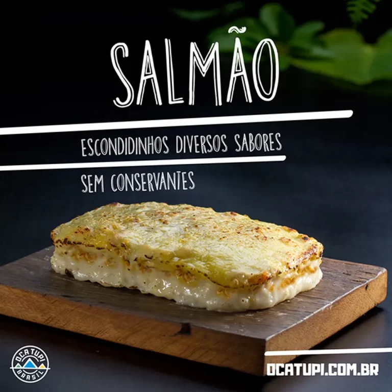
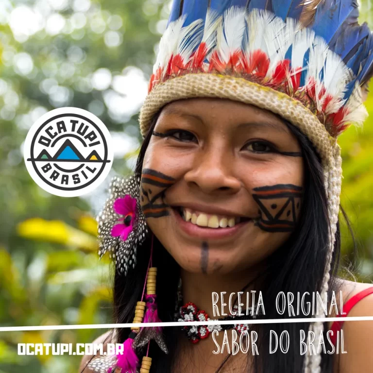
On social media, Oca Tupi grew its reach and engagement. Bright visuals and content that speaks straight to its audience gave the brand more visibility and more interaction online.

This online presence supports the brand promise of transparency, innovation and quality.
CatalogueSocial mediaAdvertising
Social media post: woman with a feather headdress and the Oca Tupi logo
Social media post: close portrait with traditional face paint
Social media post: man with a blue feather headdress and the Oca Tupi logo
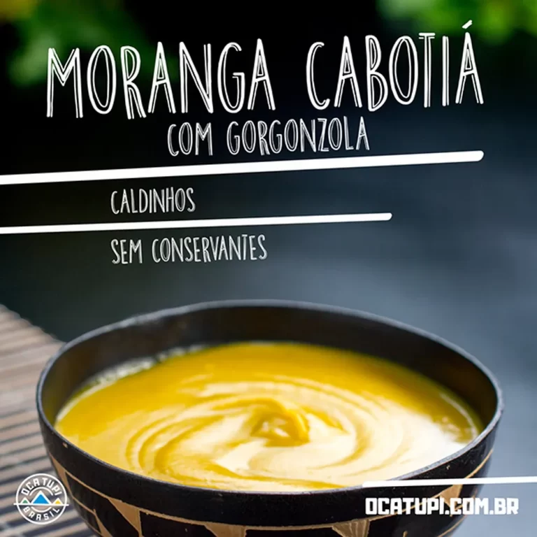
Social media post: pumpkin cream escondidinho
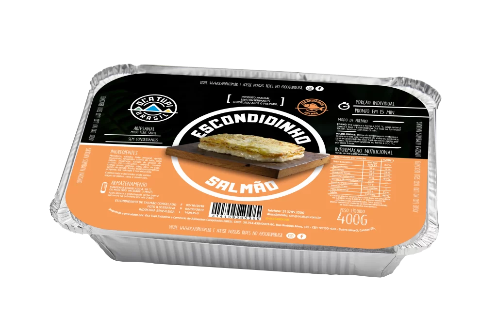
Social media post: salmon escondidinho
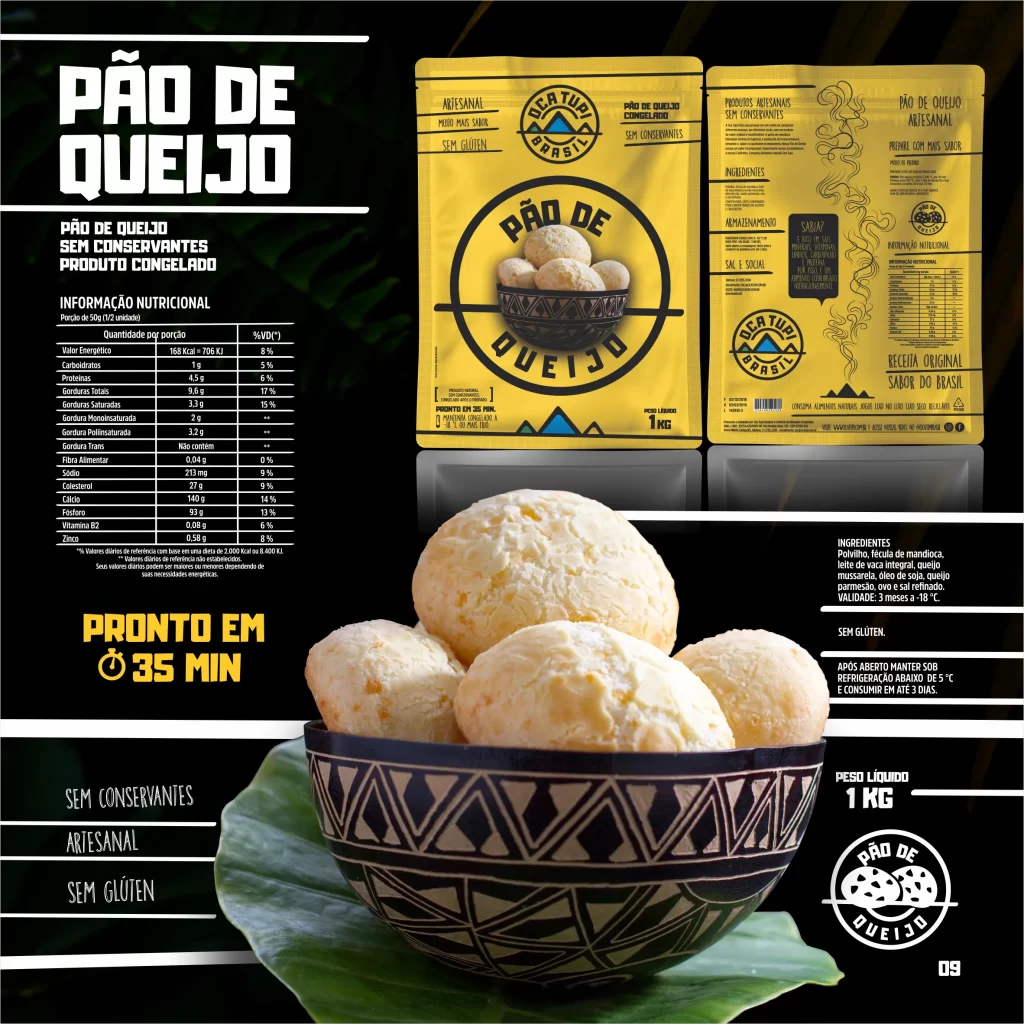
Cheese bread catalogue page
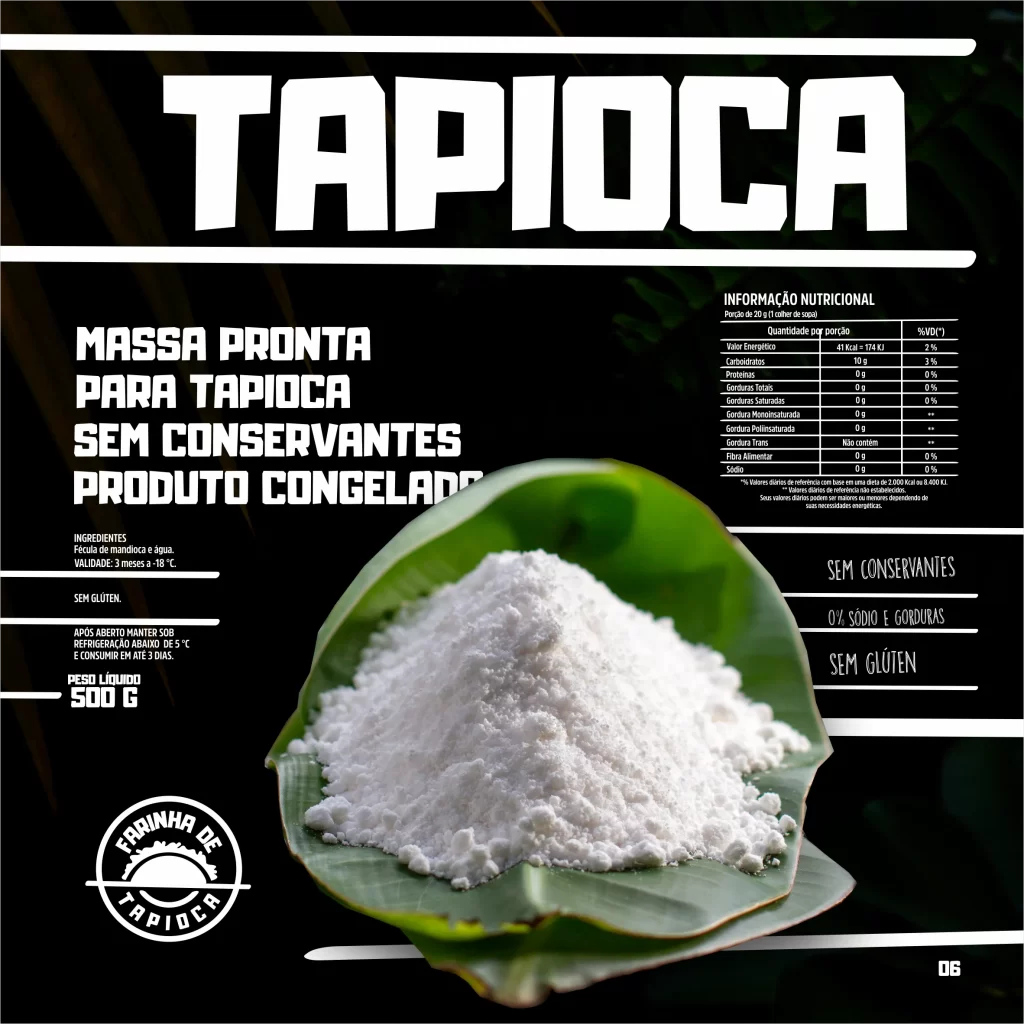
Tapioca catalogue page
Tapioca catalogue sheet with the Oca Tupi logo and a package
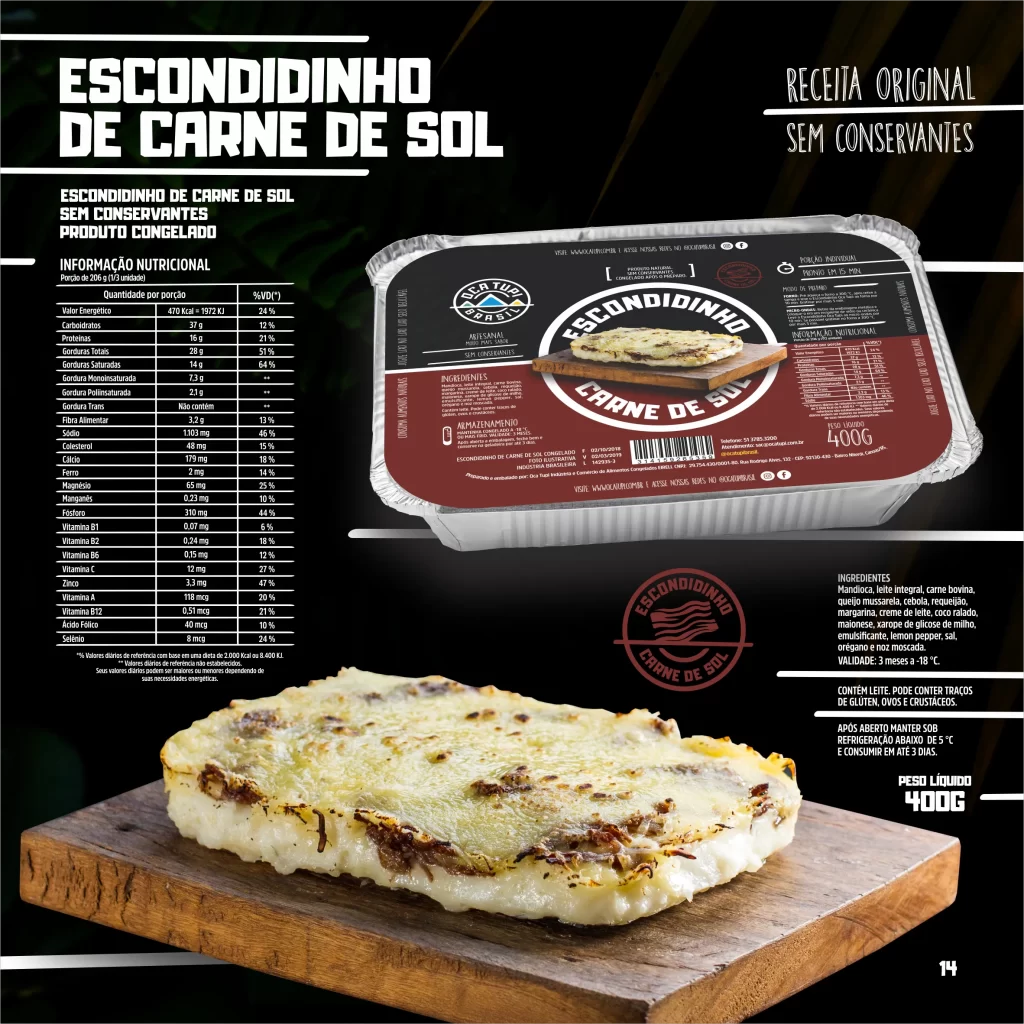
Beef escondidinho catalogue page
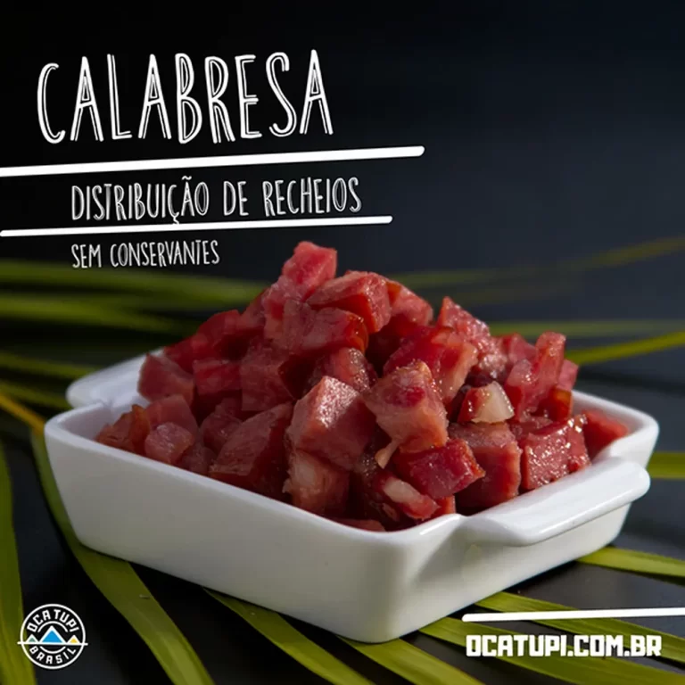
Social media post: calabresa sausage escondidinho
Oca Tupi
05Packaging
05 · Packaging

Packaging

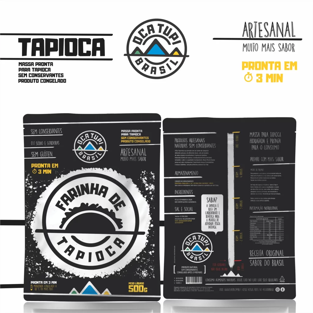
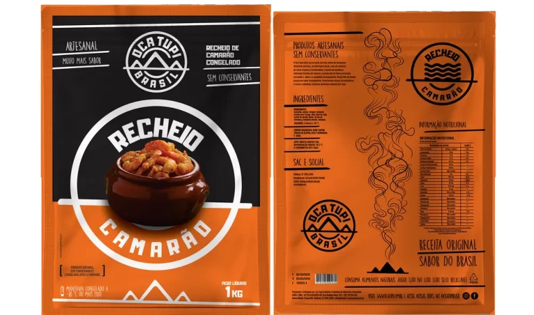
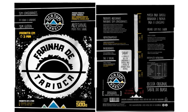
The packaging line uses a zip-lock system with clear windows. On the front, buyers can see the product. On the back, they can check how much is left.

This sets Oca Tupi apart from competing brands and supports its promise of quality and transparency. The pack is practical and builds trust. It shows the care Oca Tupi puts into its products and its customers, and it is a reference for innovative, consumer-focused design.
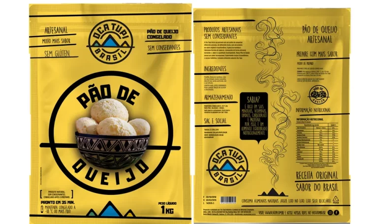
Zip-lock systemClear windowsTrust
Tapioca flour pack, front and back
Tapioca flour
Cheese bread pack, front and back
Cheese bread
Pack for various fillings, front and back
Various fillings
Oca Tupi
06Escondidinhos
06 · Packaging

Escondidinhos

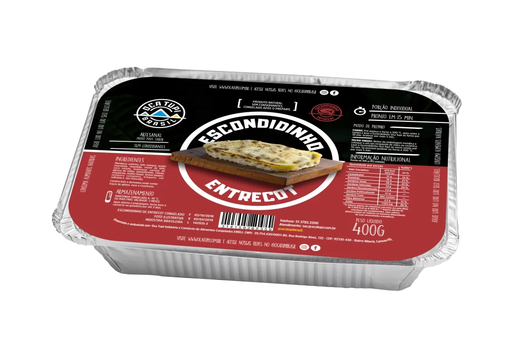
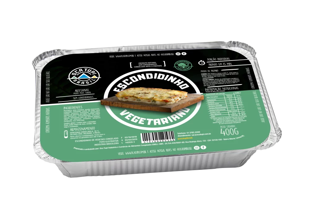
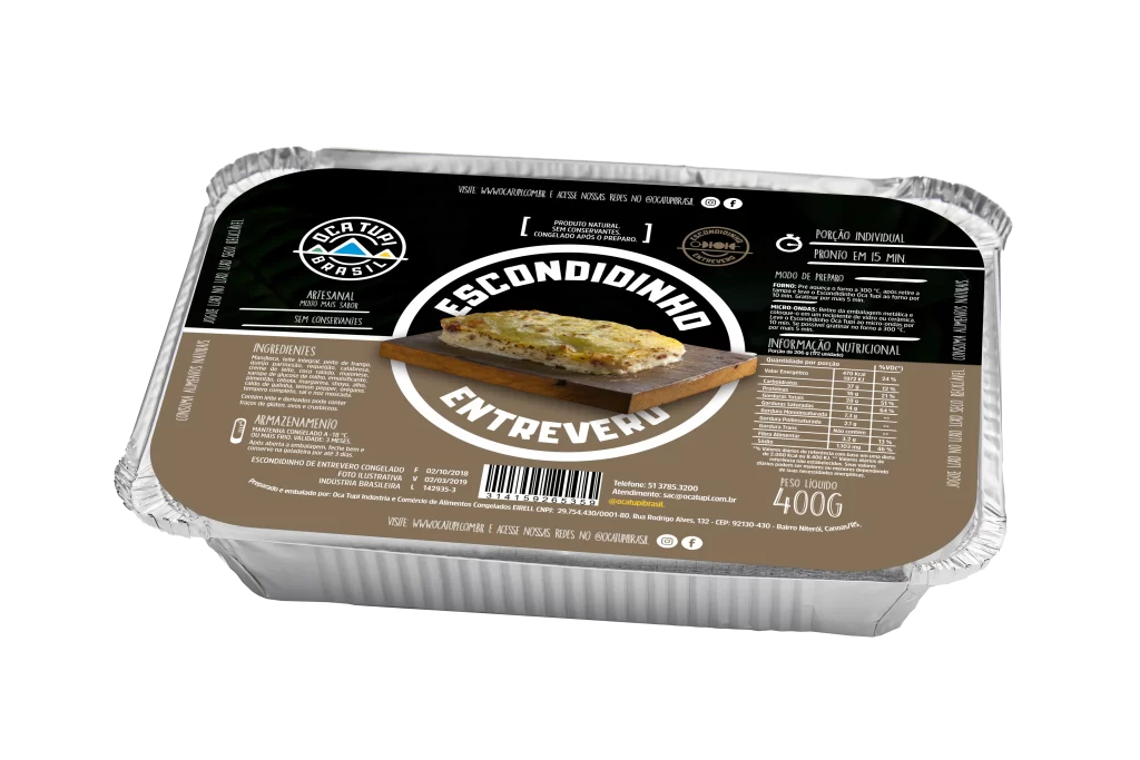
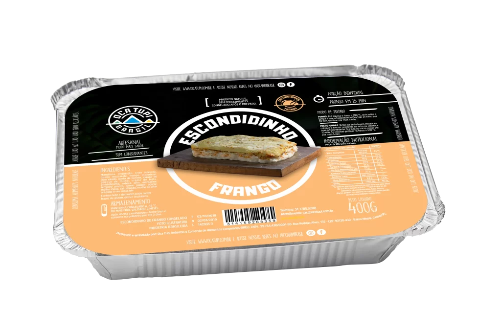
For the escondidinhos, we made a practical, low-cost pack that goes straight into the oven. Each flavour has its own colour, and all the colours stay in harmony with the bright brand identity.

The pack adds convenience and value, and it makes the product more attractive and more useful. With it, Oca Tupi keeps its promise of quality, innovation and convenience, and gives people a unique and practical experience.
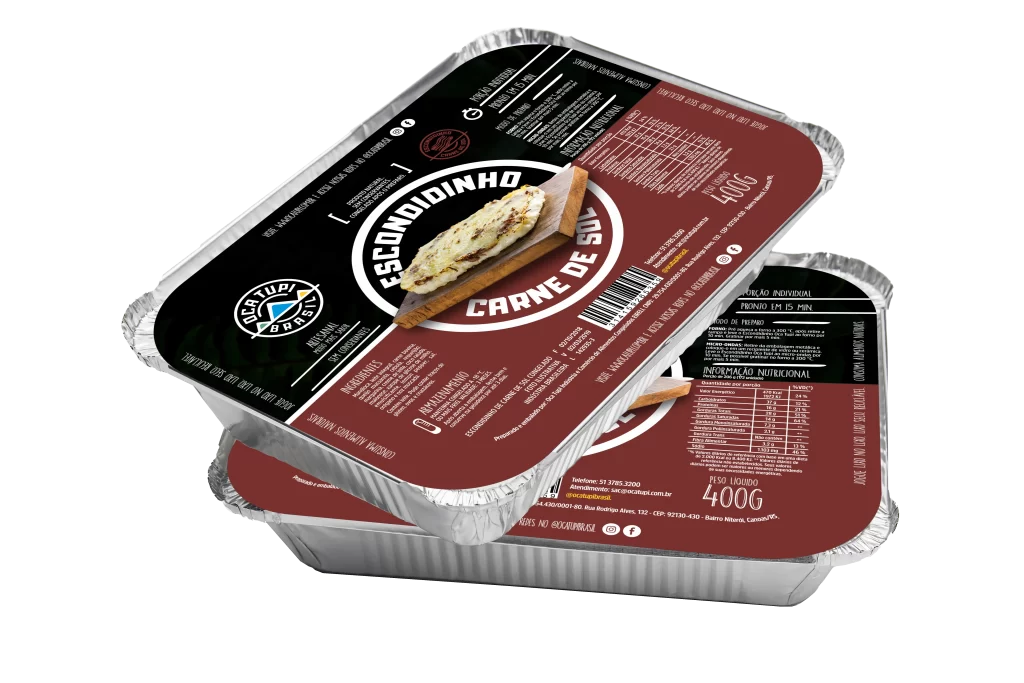
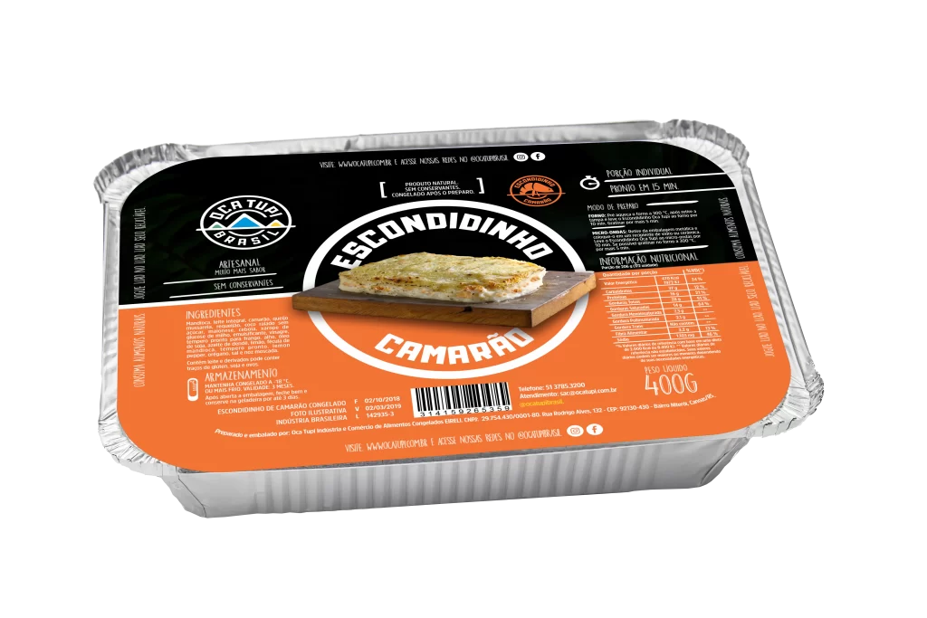
Oven-readyOne colour per flavourPractical
Two escondidinho trays
Escondidinho pack in orange
Escondidinho pack in light orange
Escondidinho pack in red
Escondidinho pack in green
Escondidinho pack in brown
Escondidinho pack in peach
FlavoursSix flavours. Six colours.
Oca Tupi
07Website
07 · Webdesign

Website

The Oca Tupi website shows the renewed identity. It has a clean design, easy navigation and content that matches the brand values.

Visitors get a smooth experience, both to learn about the brand and to shop. The site makes Oca Tupi a reference in healthy, high-quality food.
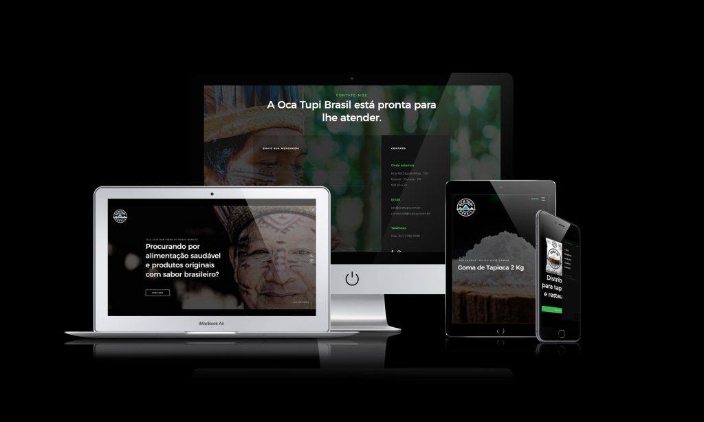
Clean designEasy navigationShopping
Oca Tupi website shown on a laptop, a tablet and a phone
Oca Tupi
08Result
08 · Result

A stronger brand in the market

The Oca Tupi brand work covered social media strategy, advertising, concept, packaging and website. Together they made a strong and consistent identity that shows the values of the brand: quality, authenticity and care for customers.

Social media raised engagement and visibility. Ad campaigns with modern ideas and clear messages made the brand stronger in the healthy-food market.

New packaging ideas, like the zip-lock system and clear windows, made life easier for buyers and gave them more confidence. The website gave a smooth experience that fits the purpose of the brand, and it made Oca Tupi a reference in flavour, quality and convenience.

The result was a stronger place in the market, with more recognition, more satisfaction and more loyal customers.

BrandSocial mediaPackagingWebsite
My role

Brand creation, social media, packaging and website.

I created the brand identity of Oca Tupi and worked on its social media, packaging and website.

Let’s talk.
Open to remote Creative Art Director roles.
Based in
Lisbon · Portugal