
Where complexity meets clarity.
Imperium Lawyers Portugal was born with a clear purpose: to make the complex simple and turn the law into a tool for progress, stability and protection, never an obstacle. The brand had to feel classic but modern, authoritative without arrogance, and close without losing professionalism.




Two columns. One decision.
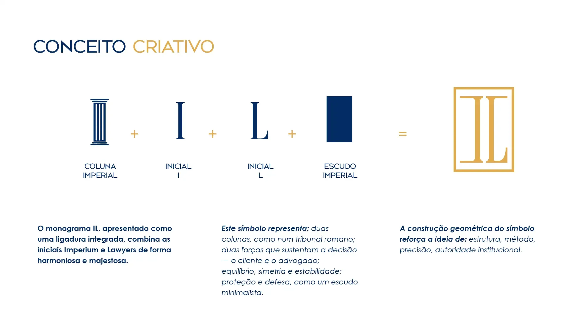
The IL monogram is a single ligature that joins the initials of Imperium and Lawyers, harmonious and majestic.
- Two columns, like a Roman court.
- Two forces that hold up the decision: the client and the lawyer.
- Balance, symmetry and stability, protection and defence, like a minimalist shield.
- Geometric construction that reinforces structure, method, precision and institutional authority.
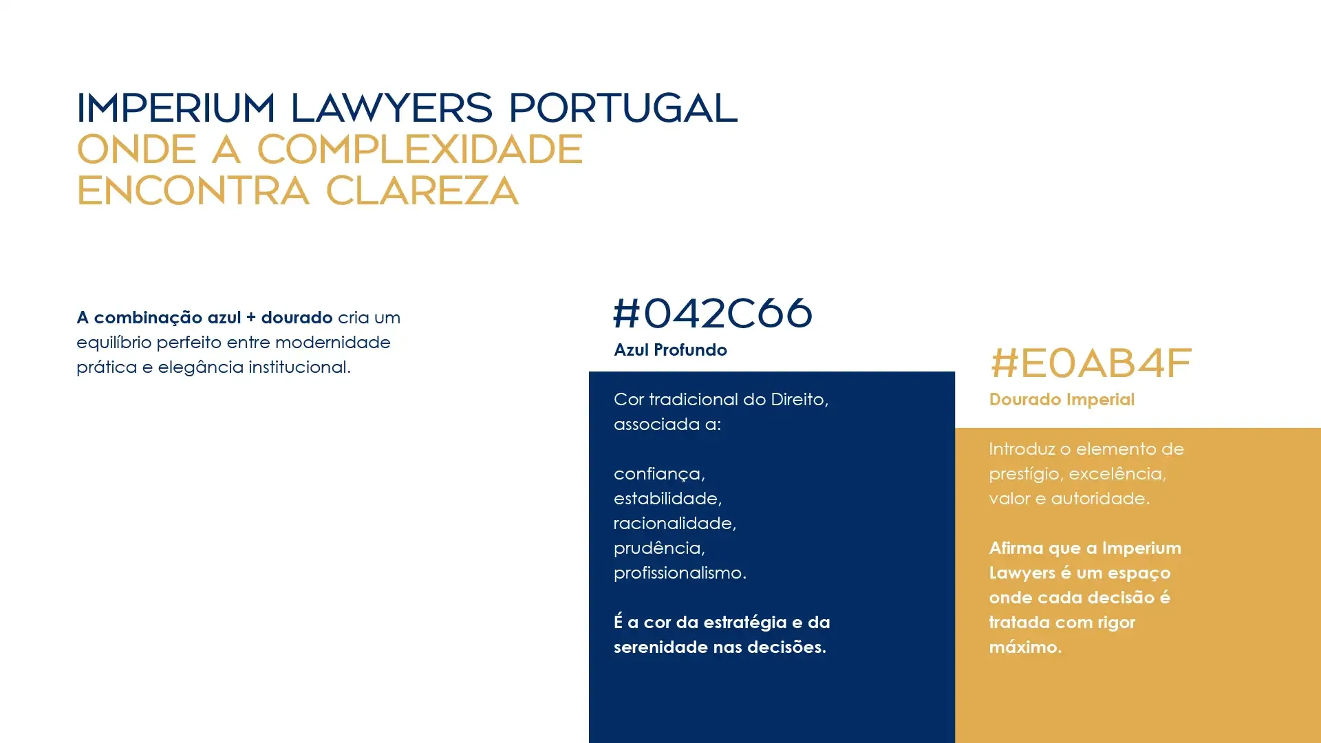
Blue for trust. Gold for authority.
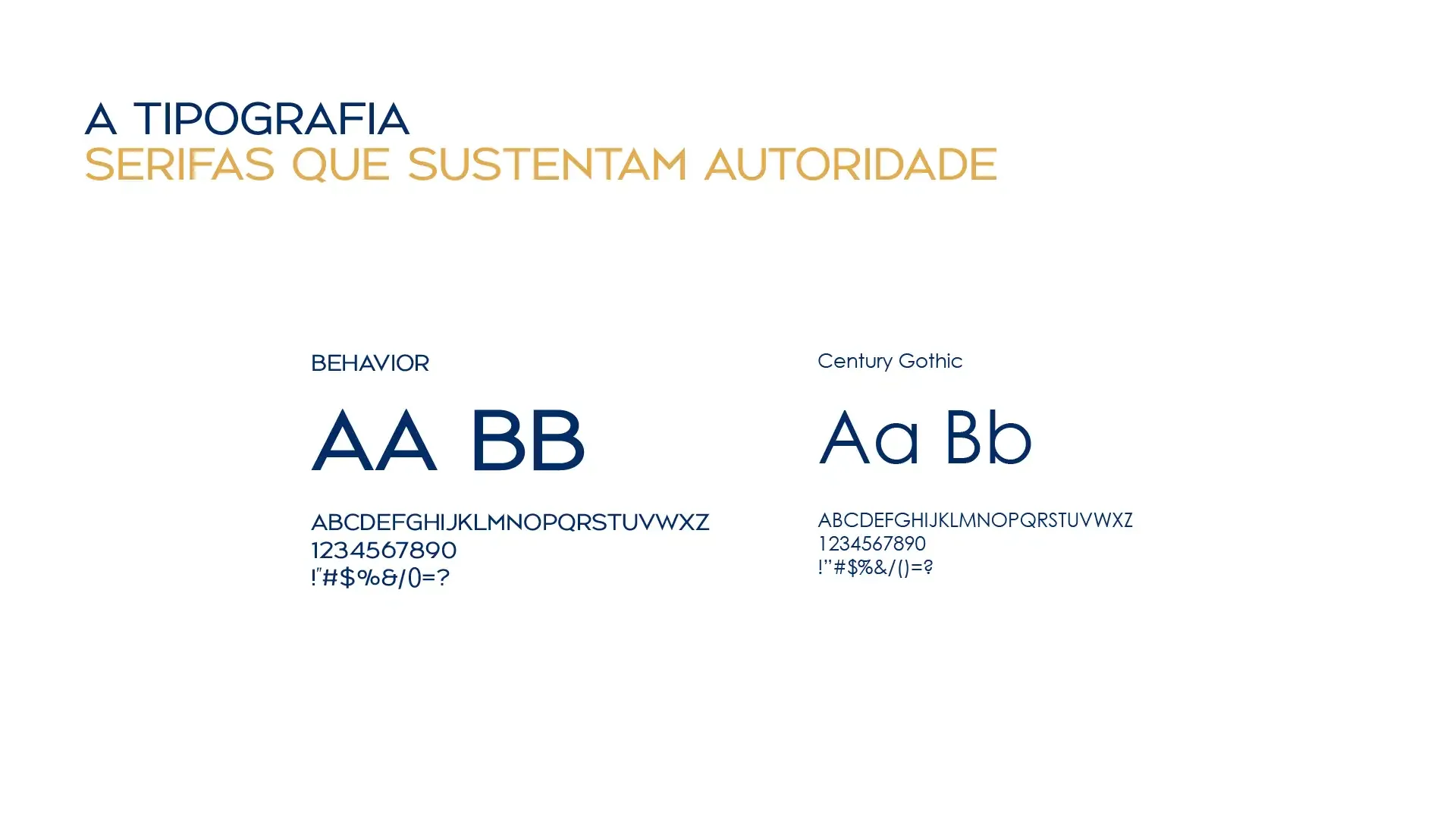
Deep Blue is the traditional colour of the law: confidence, stability, rationality, prudence and professionalism. Imperial Gold adds prestige, excellence and value. Together they balance practical modernity with institutional elegance. Type pairs Behavior for display with Century Gothic for text.
Six values. Six seals.
A seal system built on the imperial crest idea. Each value has its own engraved emblem and a Latin name, in a positive and a negative version, so the firm can speak through symbols as well as words.












Ideas, engraved.
A conceptual illustration language inspired by banknote engraving: eagle and columns, scales and open book, torch, shield and helmet, lyre and laurel. Every value gets its own scene, in blue ink on warm paper.






Faces for the values.
Each value is carried by a person from the firm and an object that stands for it: columns, torch, scales, armour, sun and star. The result is communication that feels human, close and professional.






The law is complex. The communication shouldn't be.
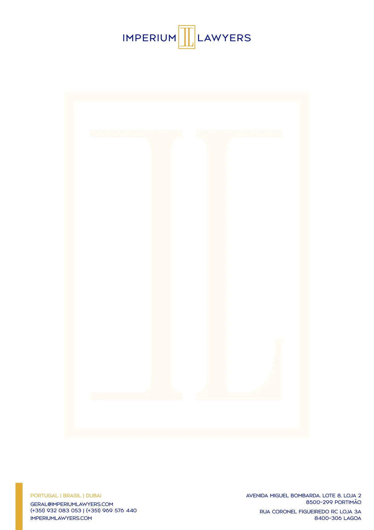
The letterhead carries the monogram as a quiet watermark and a gold band at the foot. The tone of voice follows the same idea: every word reflects focus, method and objectivity.
- Classic, but modernSpeaks with authority without being arrogant.
- Clear and directThe law is already complex. The communication should not be.
- Strategic and safeClose, human and transparent, with proximity that never loses professionalism.
- Results-orientedEach word reflects focus, method and objectivity.