One hub. Many modules.
BIGhub is a group of brands that work as one system for online sales. My job was to give every module its own identity inside a single, recognisable family, and to lead the team that produces it all, from brand and social to motion and web.

 Marketplace sales
 Finance
 Reconciliation
 Logistics
 Cash
CashA family of logos
One master mark, a colour logic of white, black and red, and a distinct wordmark for each module. Every module signs off with "by BIGhub", so the family is always visible and the system scales as new modules join.
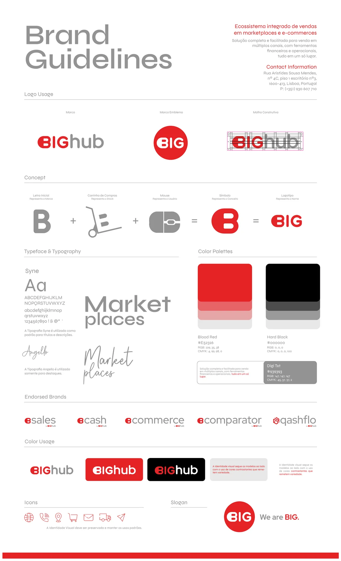 Brand Guidelines
The brand wall
Nine marks, one symbol size, on black, white and red.
Characters that sell
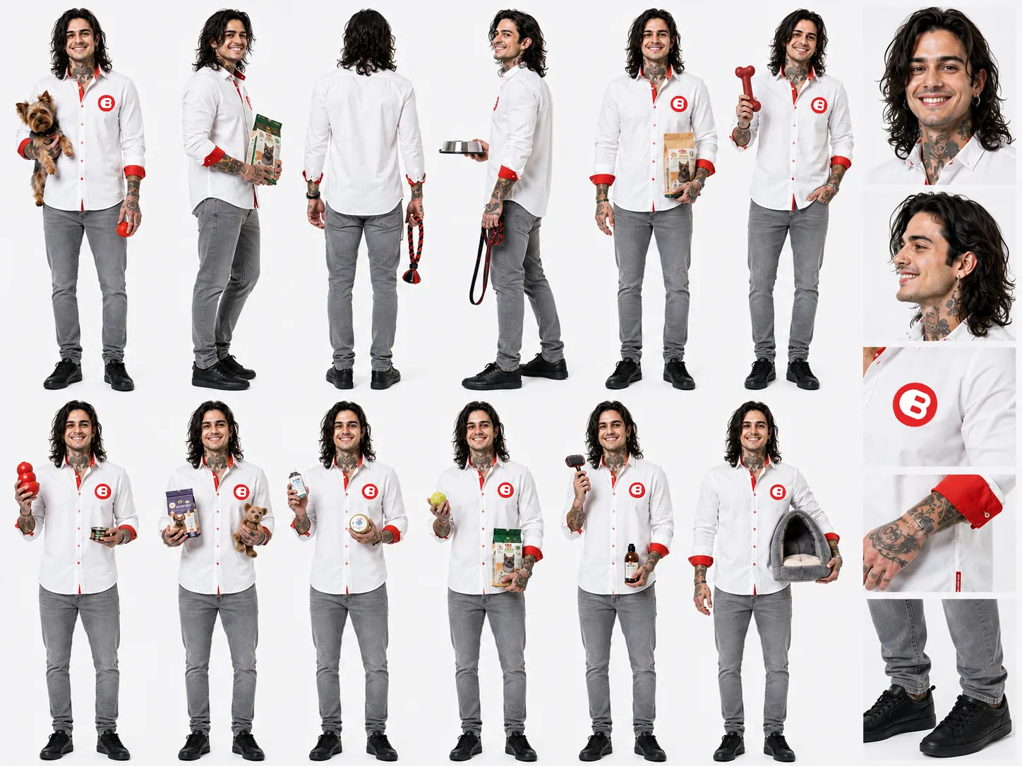
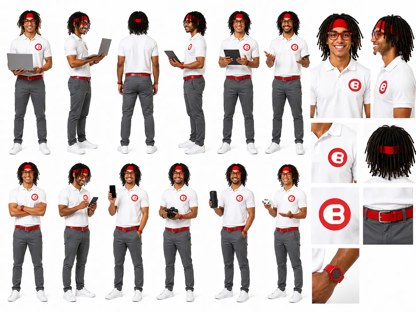
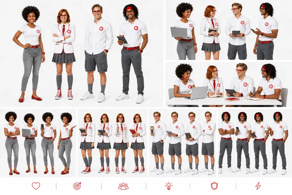
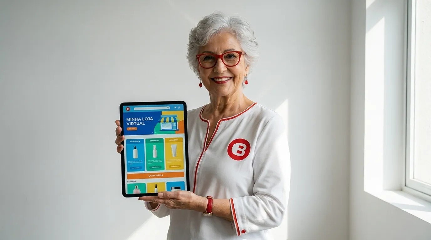
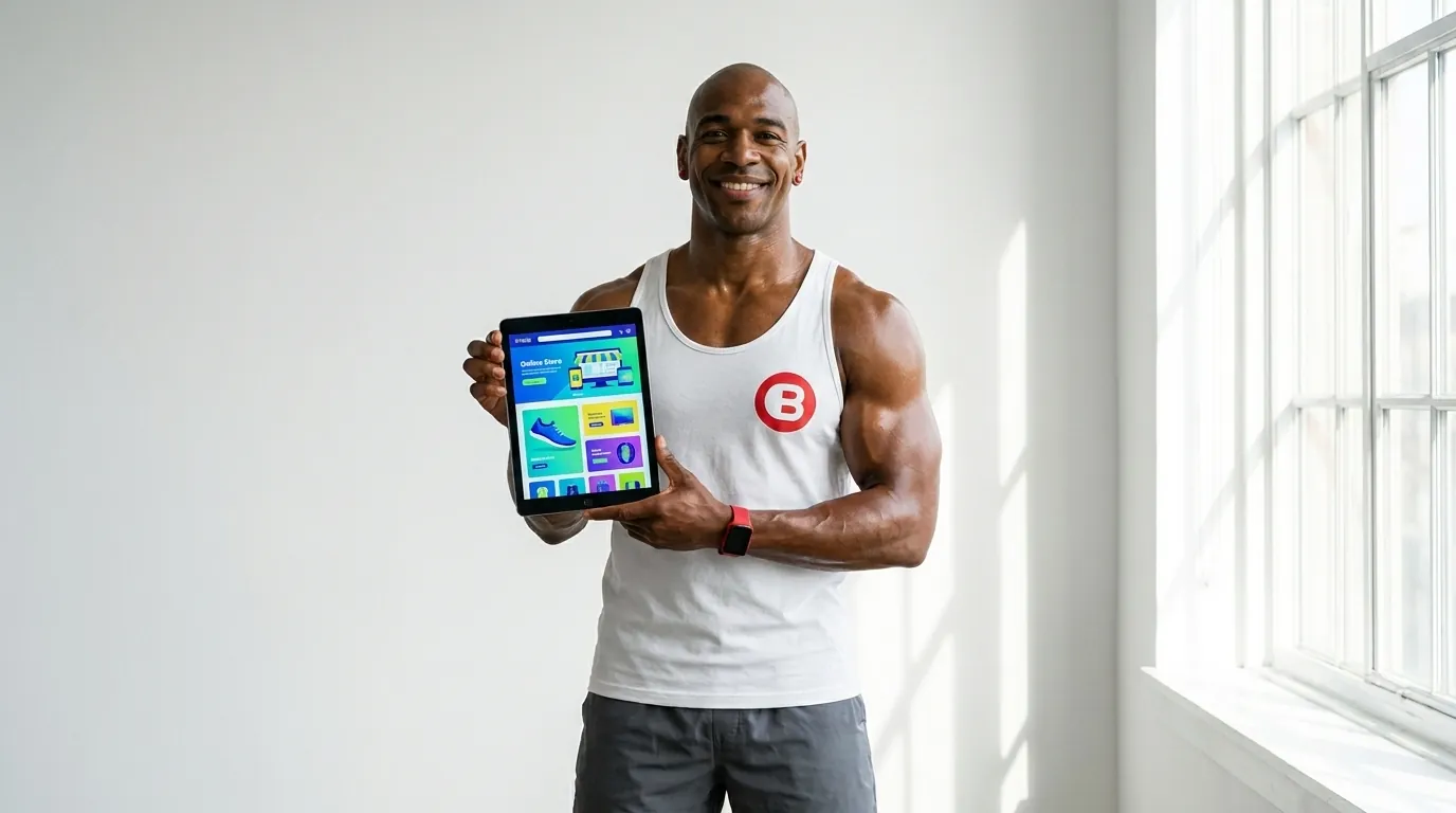
BIGsales is the marketplace sales engine. Its brand is built around a cast of characters, with model sheets, narrative scenes and a Sales Drop line for dropshipping, so the product feels human on every screen.
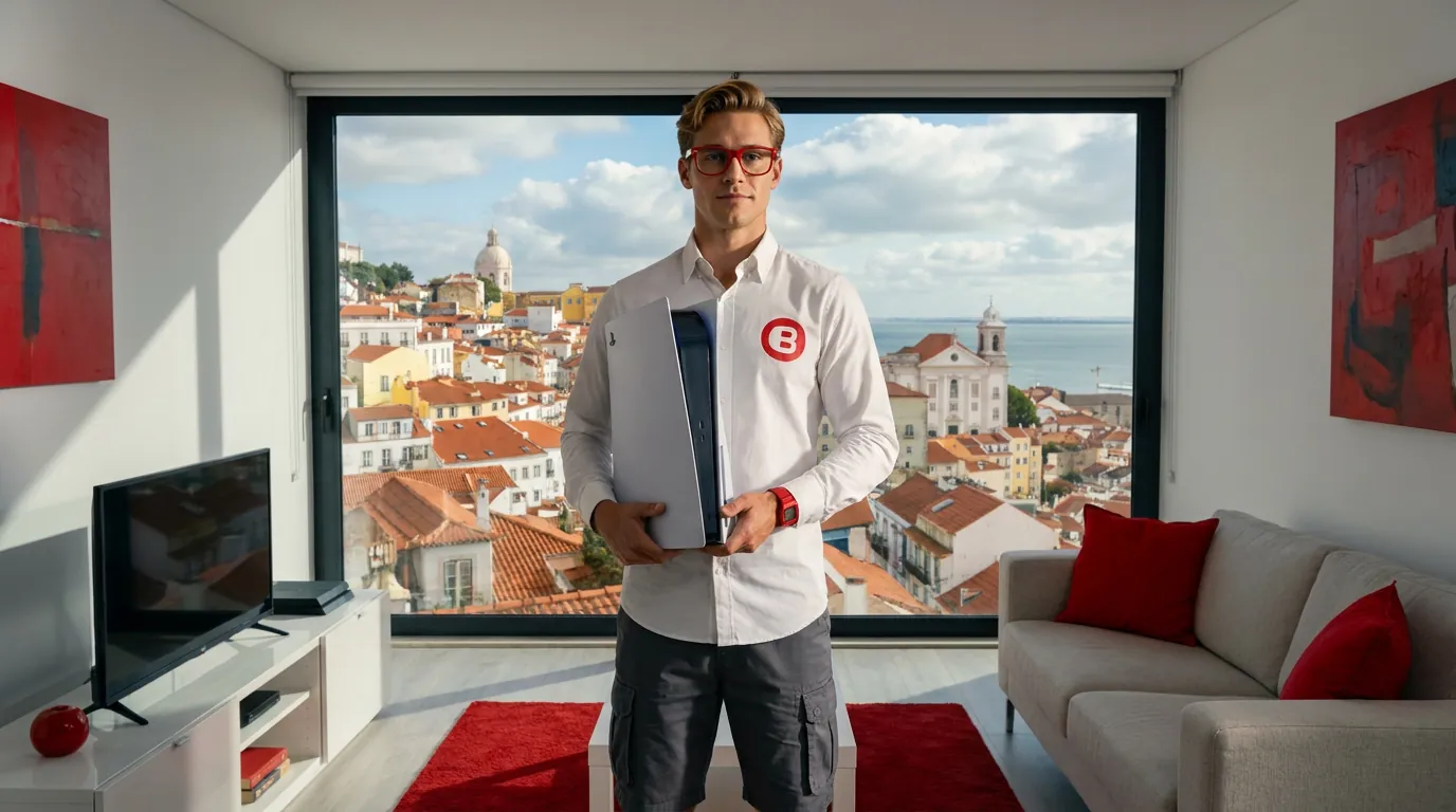
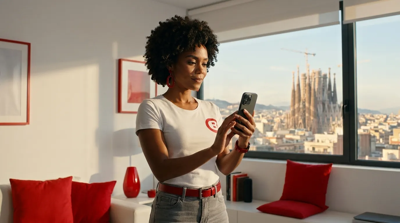
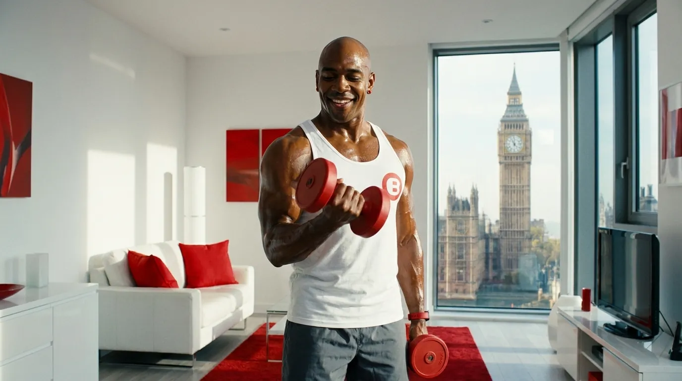
One cast, every angle
Each character is documented as a model sheet, so any designer or animator on the team can reproduce poses, outfits and expressions consistently.
Dropshipping, in the same universe
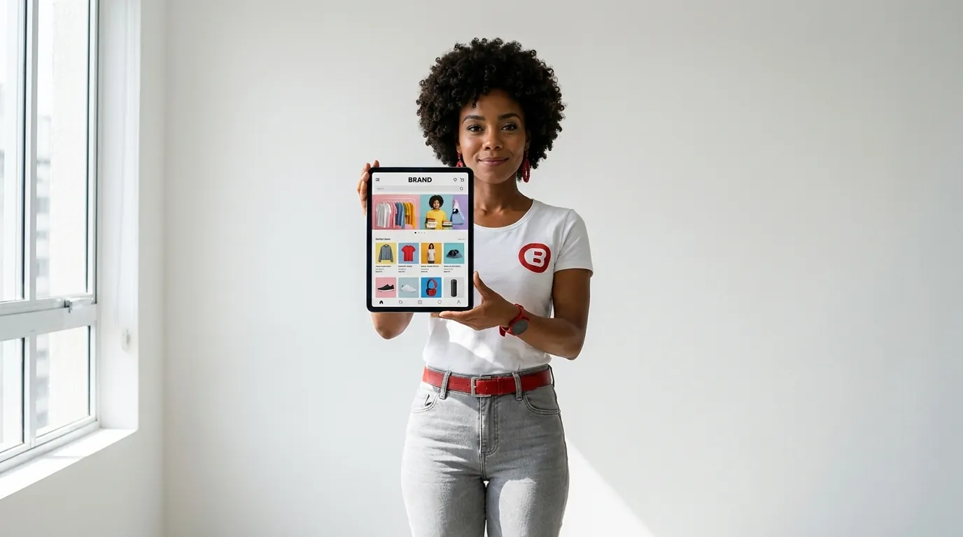
Sales Drop extends the BIGsales world to dropshipping: same characters, same palette, with scenes built around devices and the buying journey.


BIGsales in motion
From the BIGgroupTV channel.


Finance with a city on its side
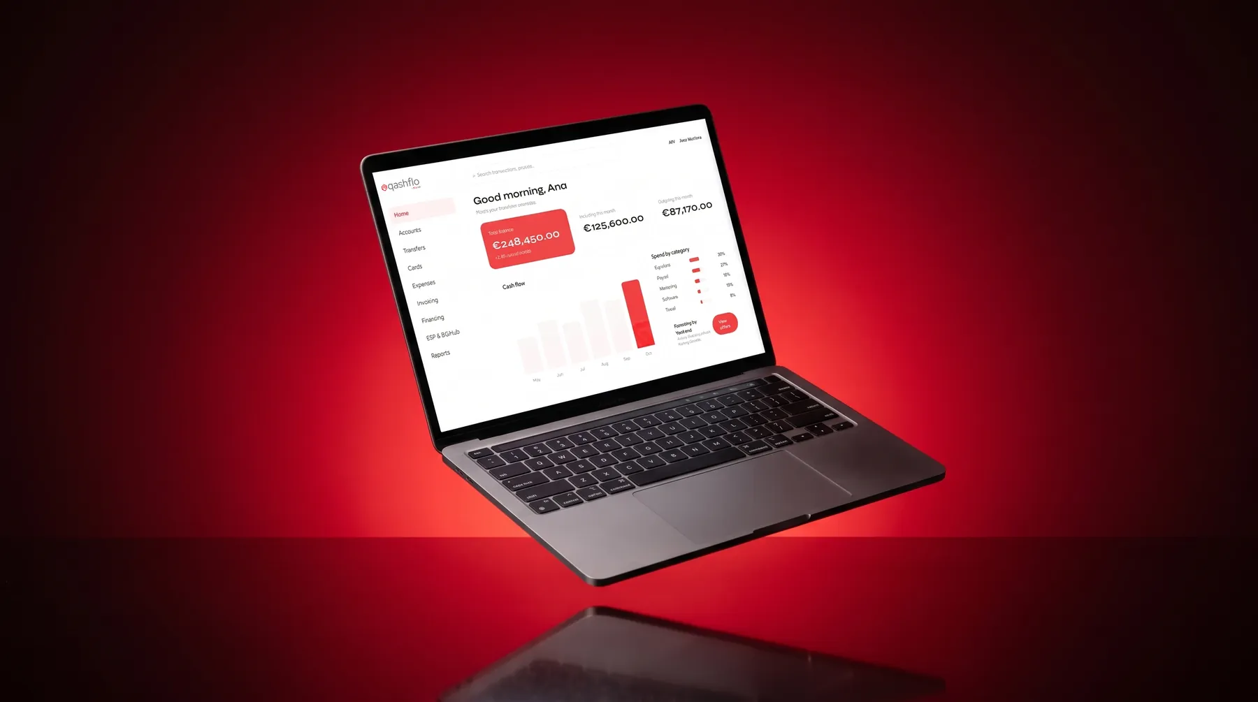
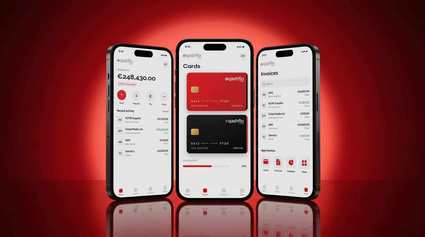
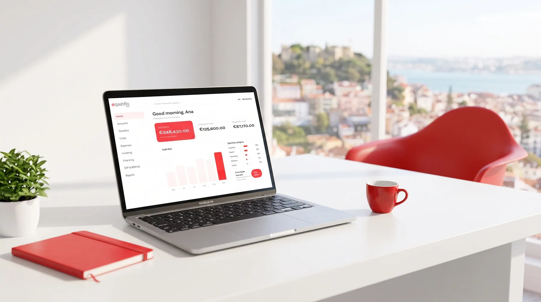
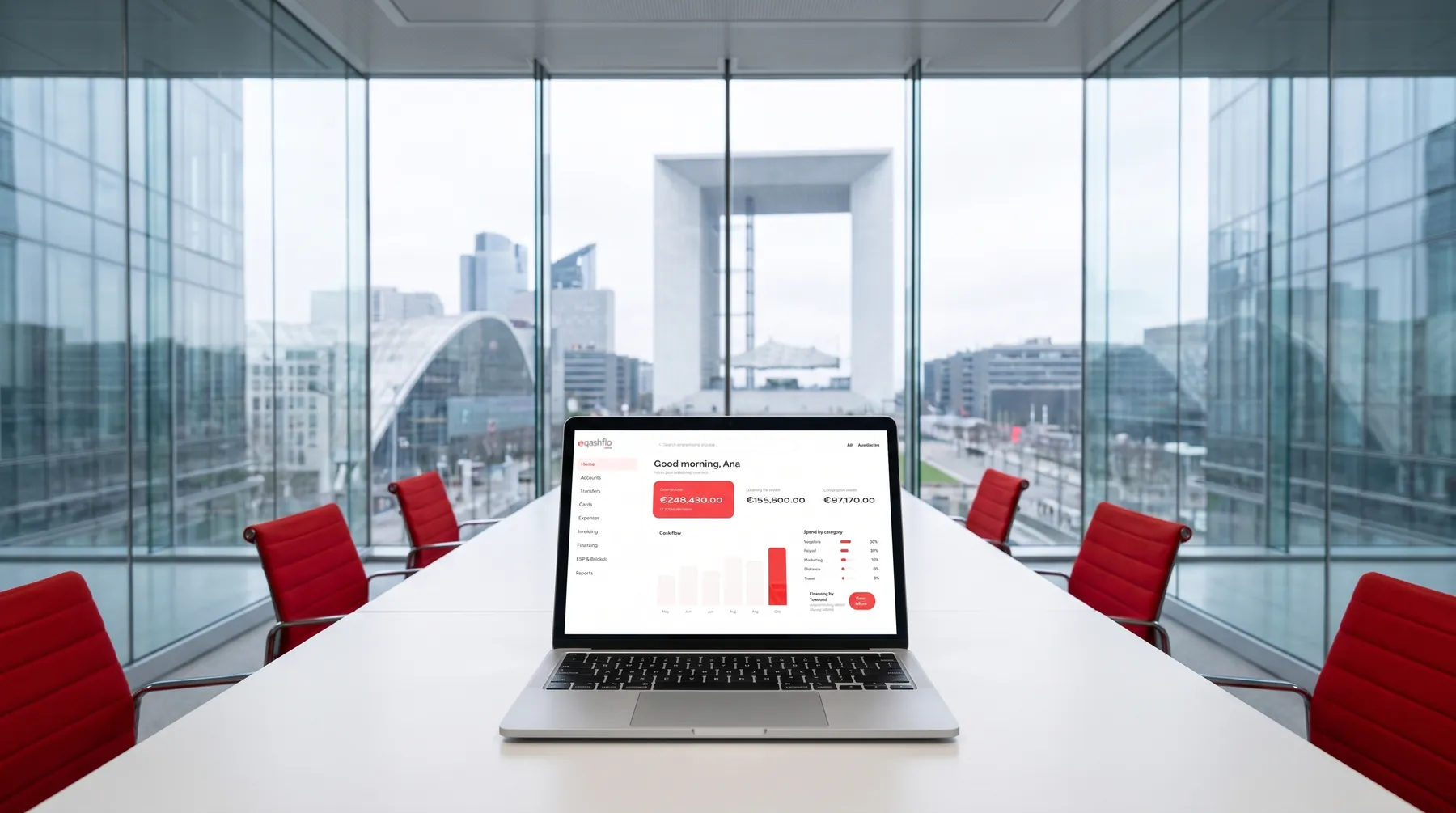
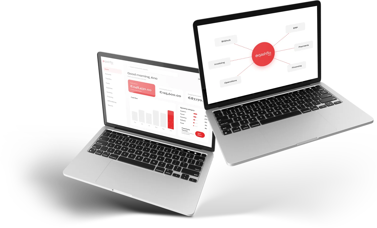
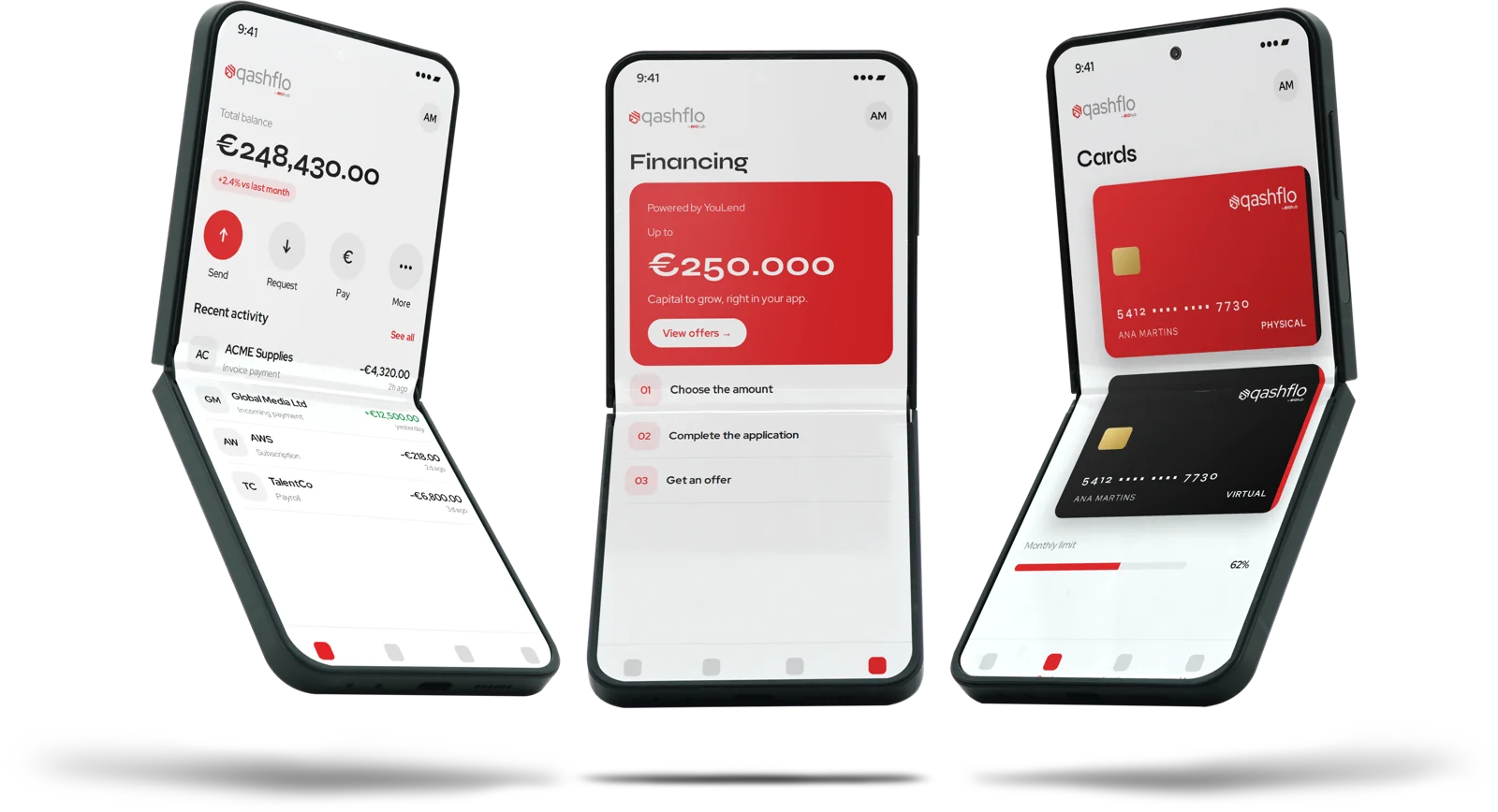
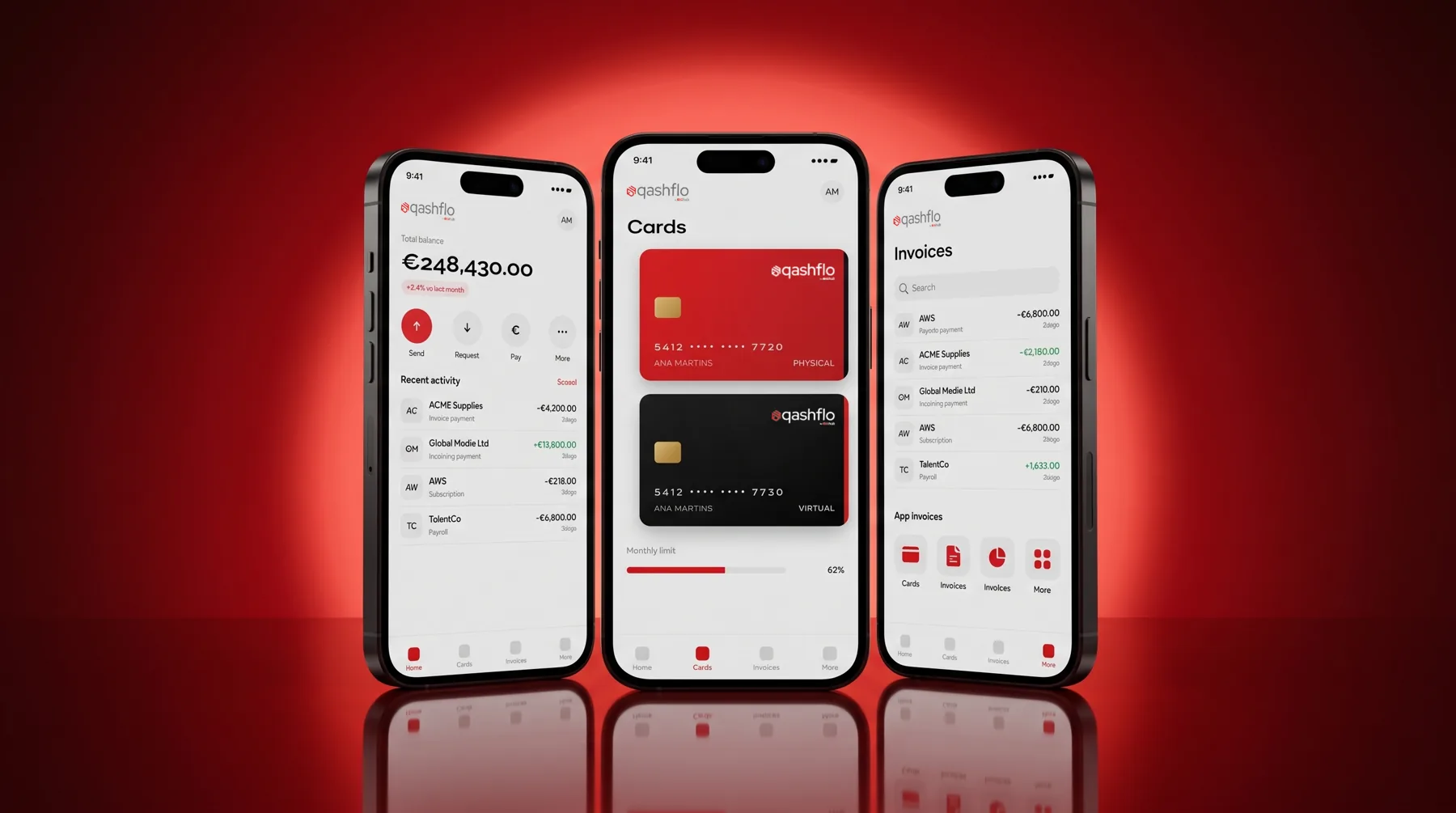
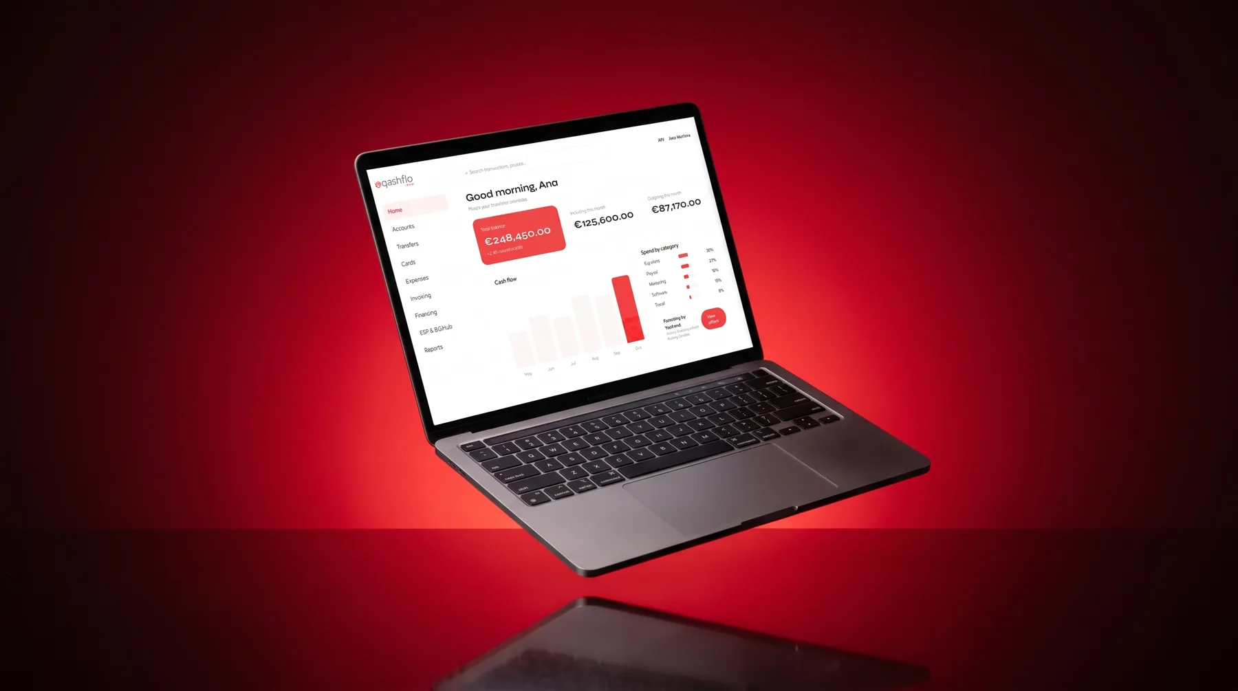
Qashflo is the financial product of the hub. The identity runs from cards and app interface to characters, devices and mockups set in European cities, so a payments brand feels local and premium.
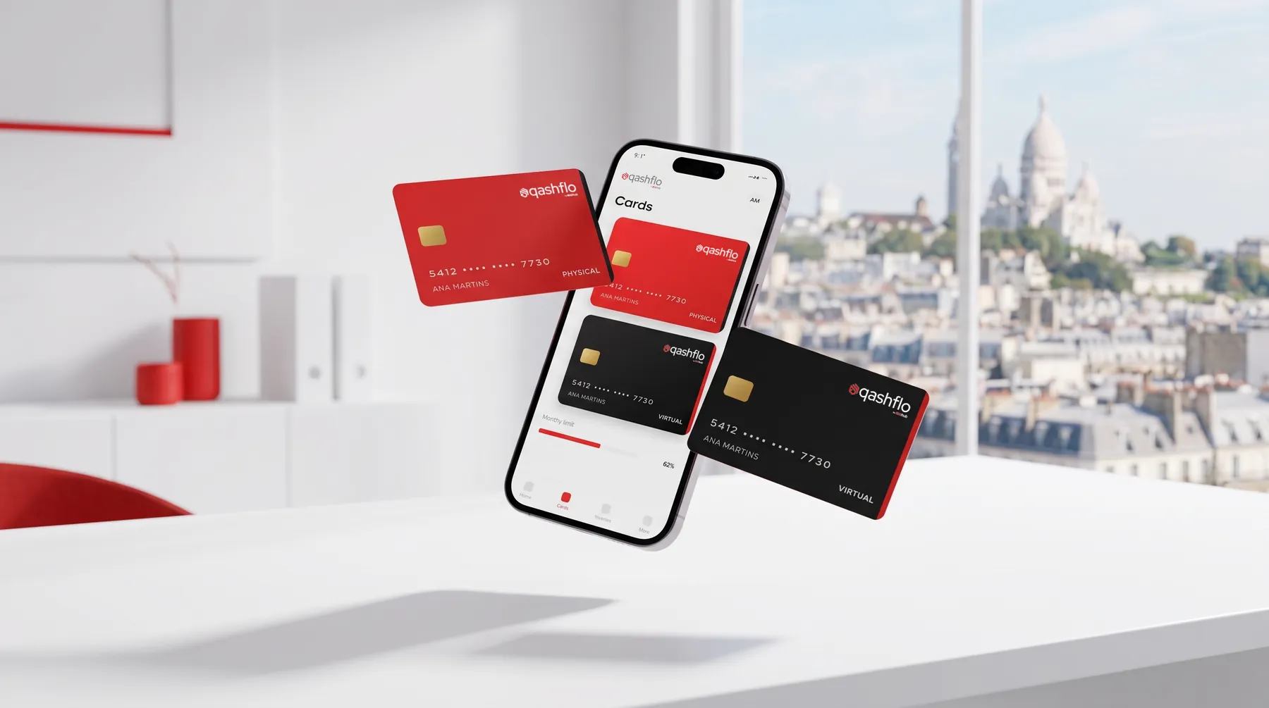
One product, many cities
Each character works in a different city, with the product always on the desk. It gives the financial brand a human face and a sense of place.
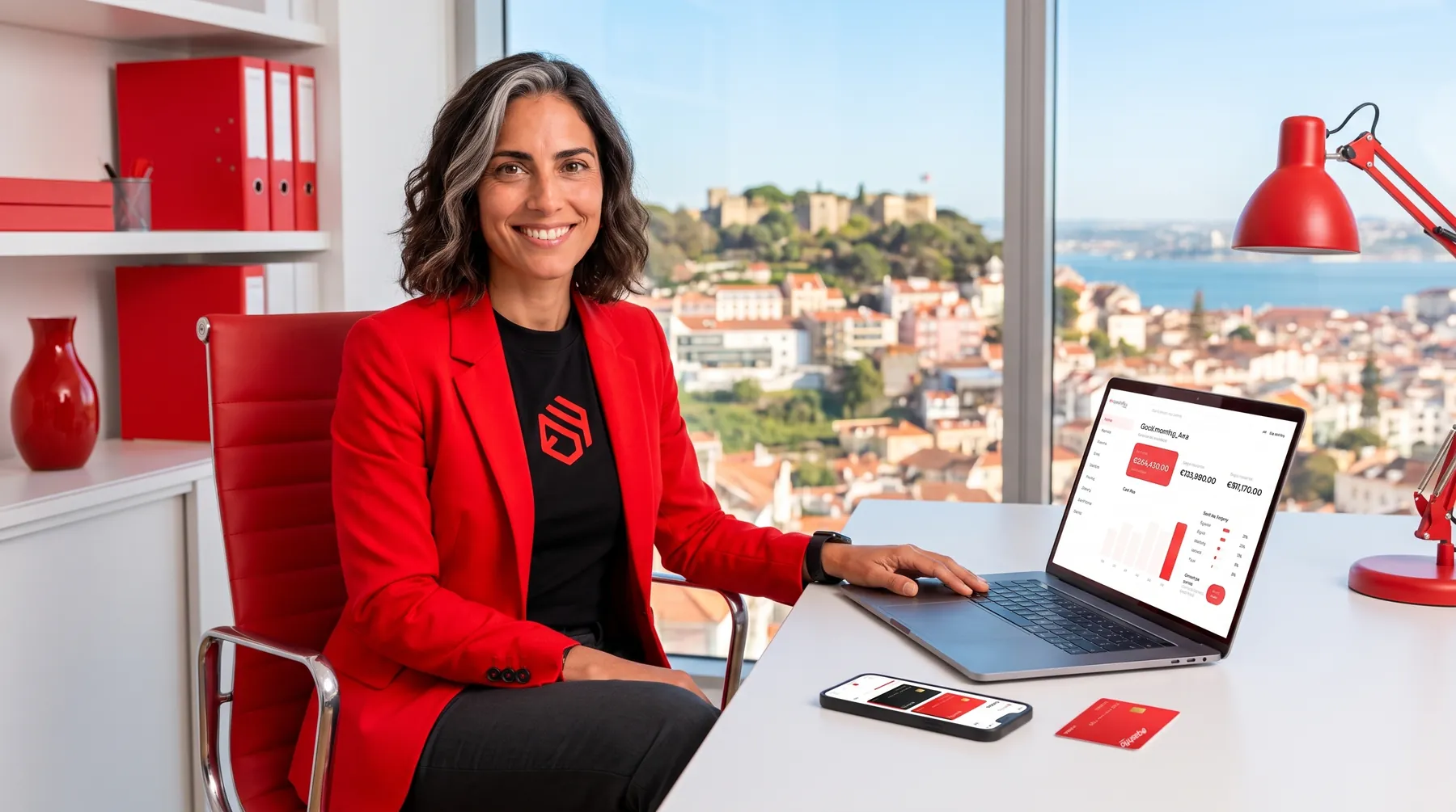

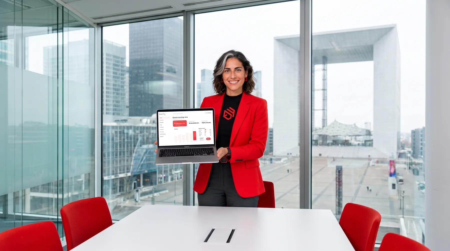
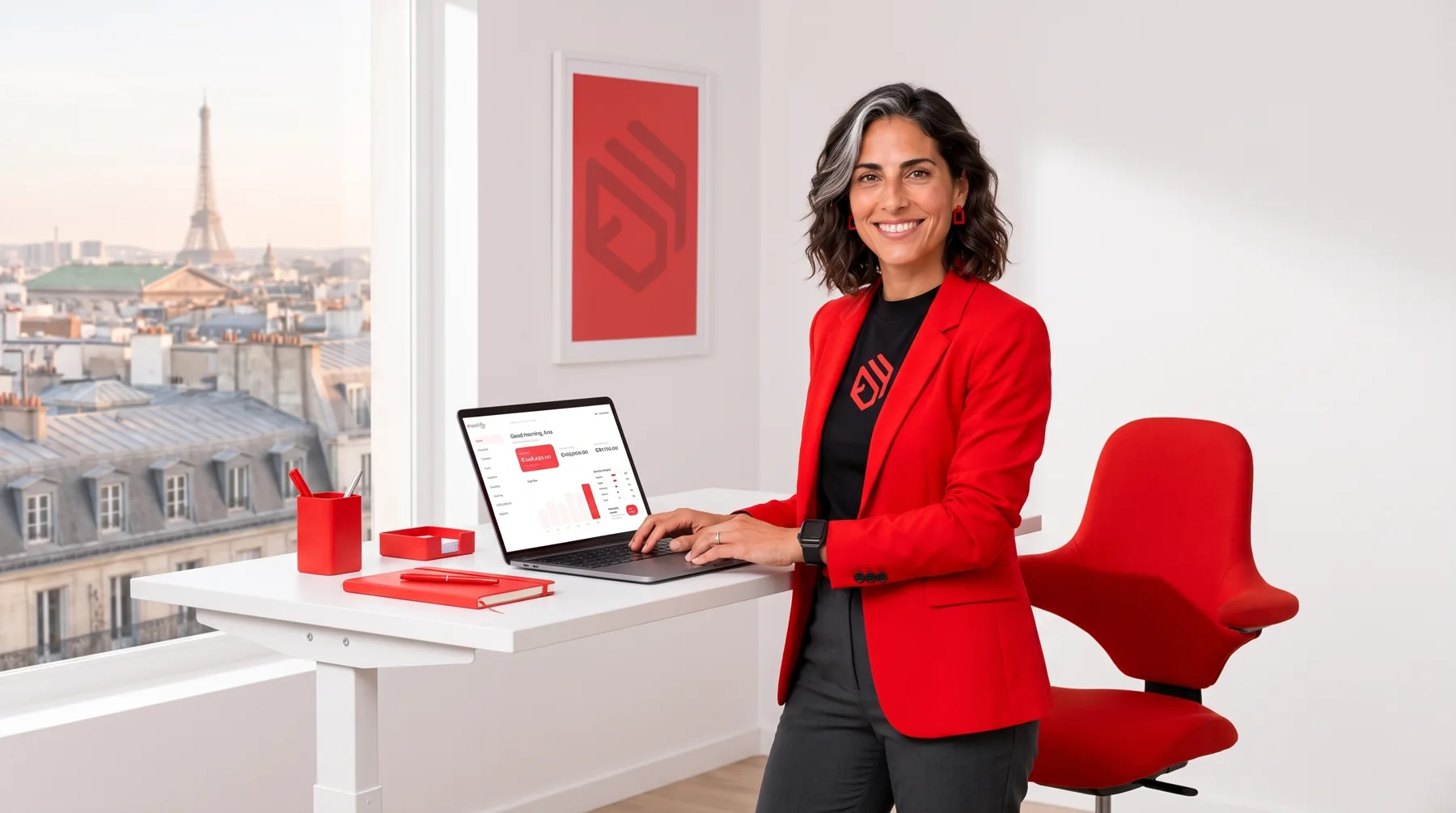

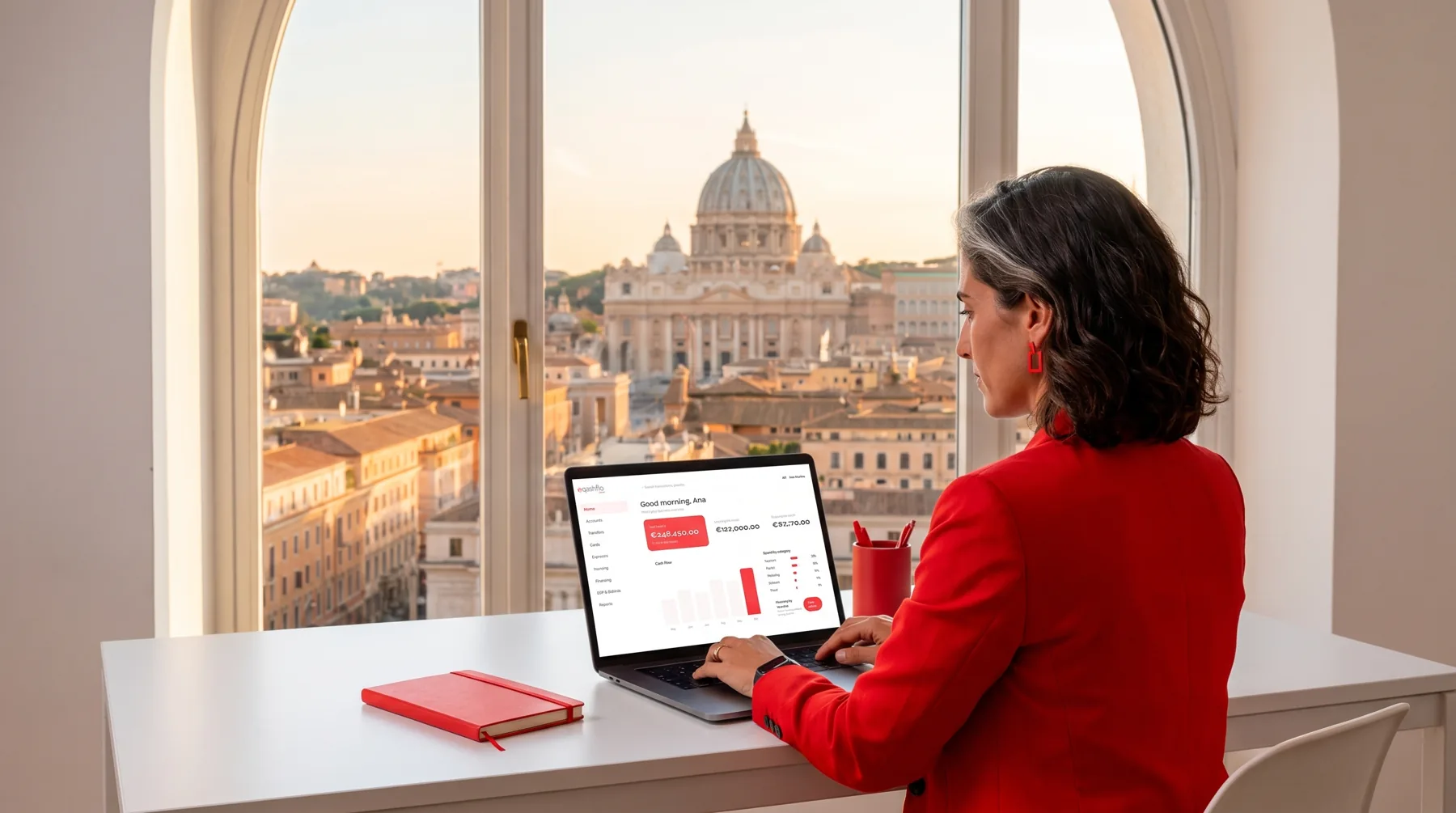
Product on the desk
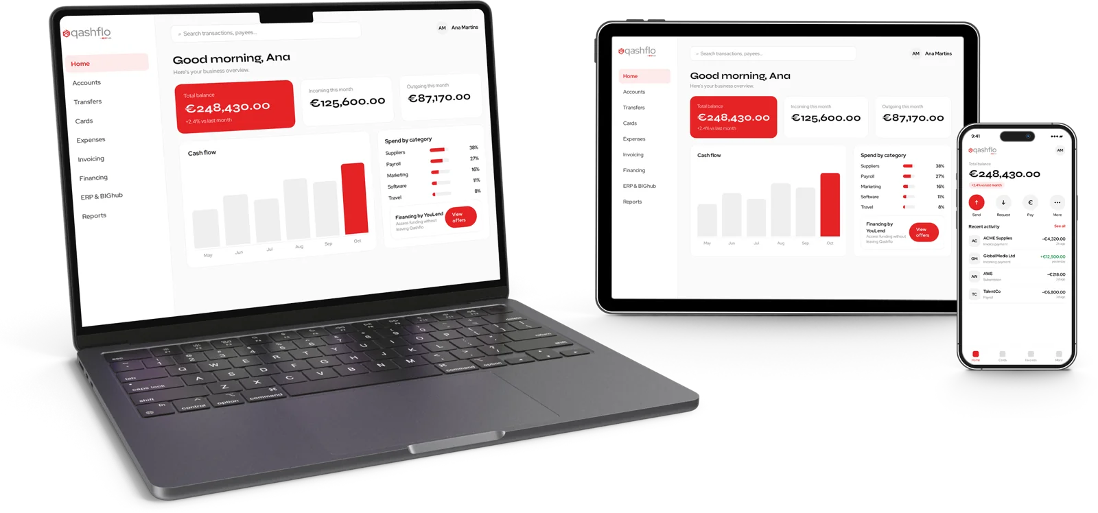
The same interface shown on phone, tablet and laptop, each one placed in a different skyline.
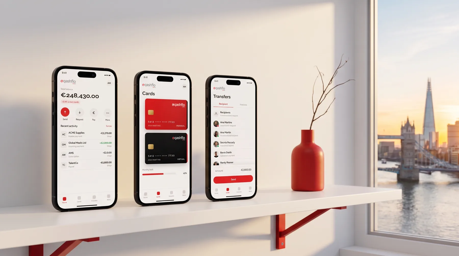
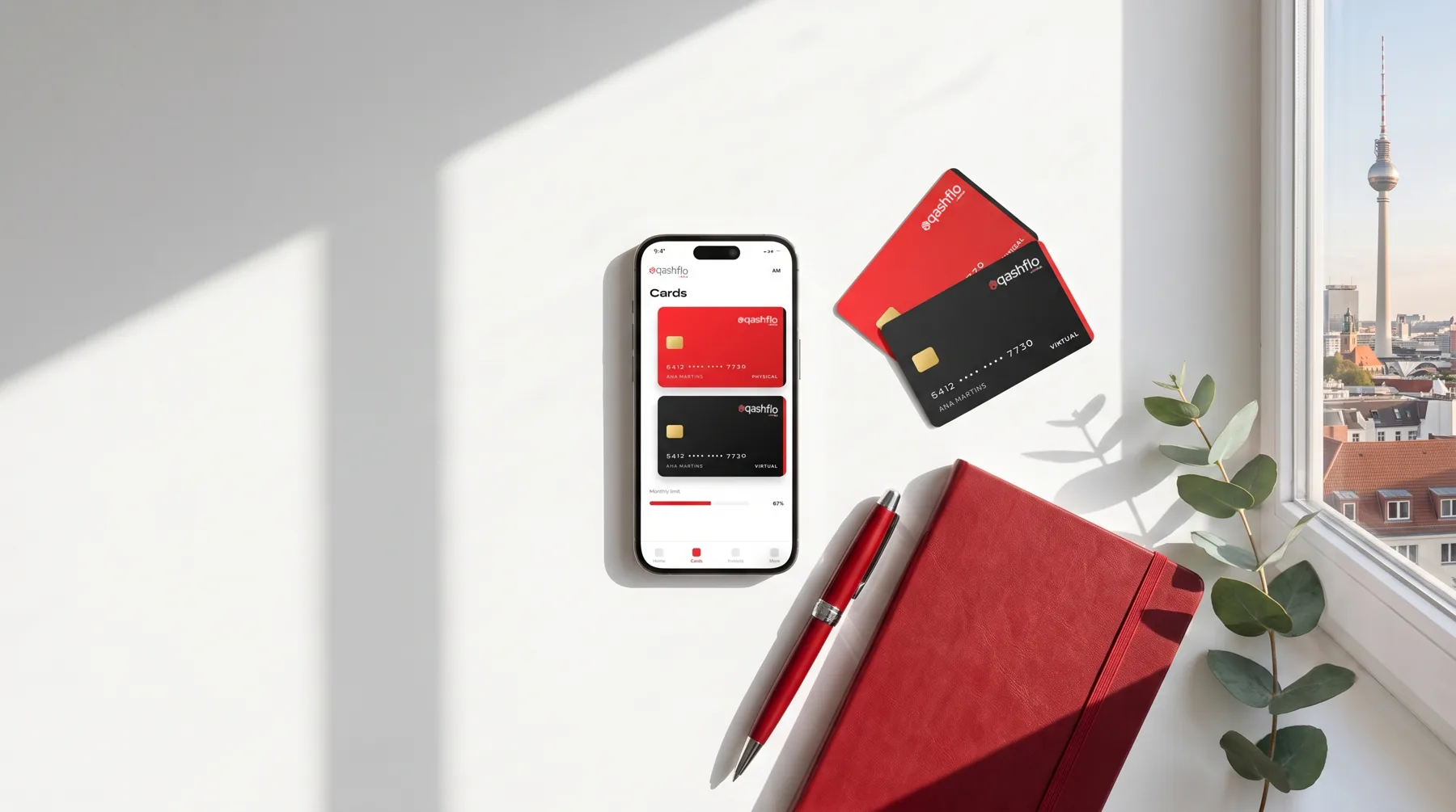
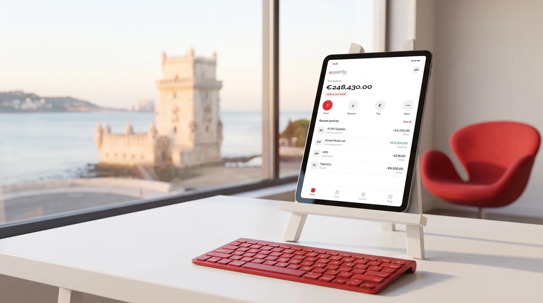
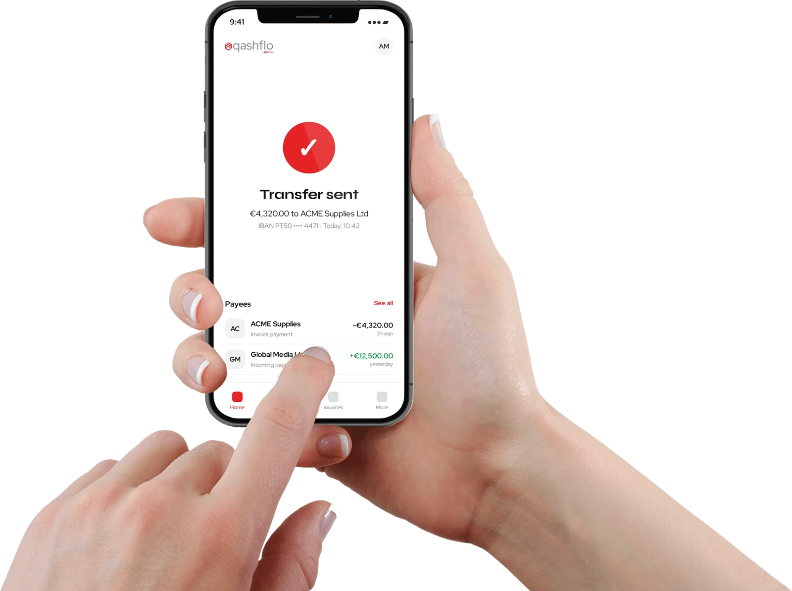
Interface, in context
Clean cut-out mockups for decks, sales material and the website, plus red studio renders for campaigns.
Reconciliation, told as a story
Koncili turns financial reconciliation into a narrative: a magnifying glass, an accountant and the numbers that finally match. A technical product with a clear, friendly face.
Five frames, one idea
The story is built as a sequence, so the product can be explained in a campaign, a deck or a social carousel without extra words.
 01
01 02
02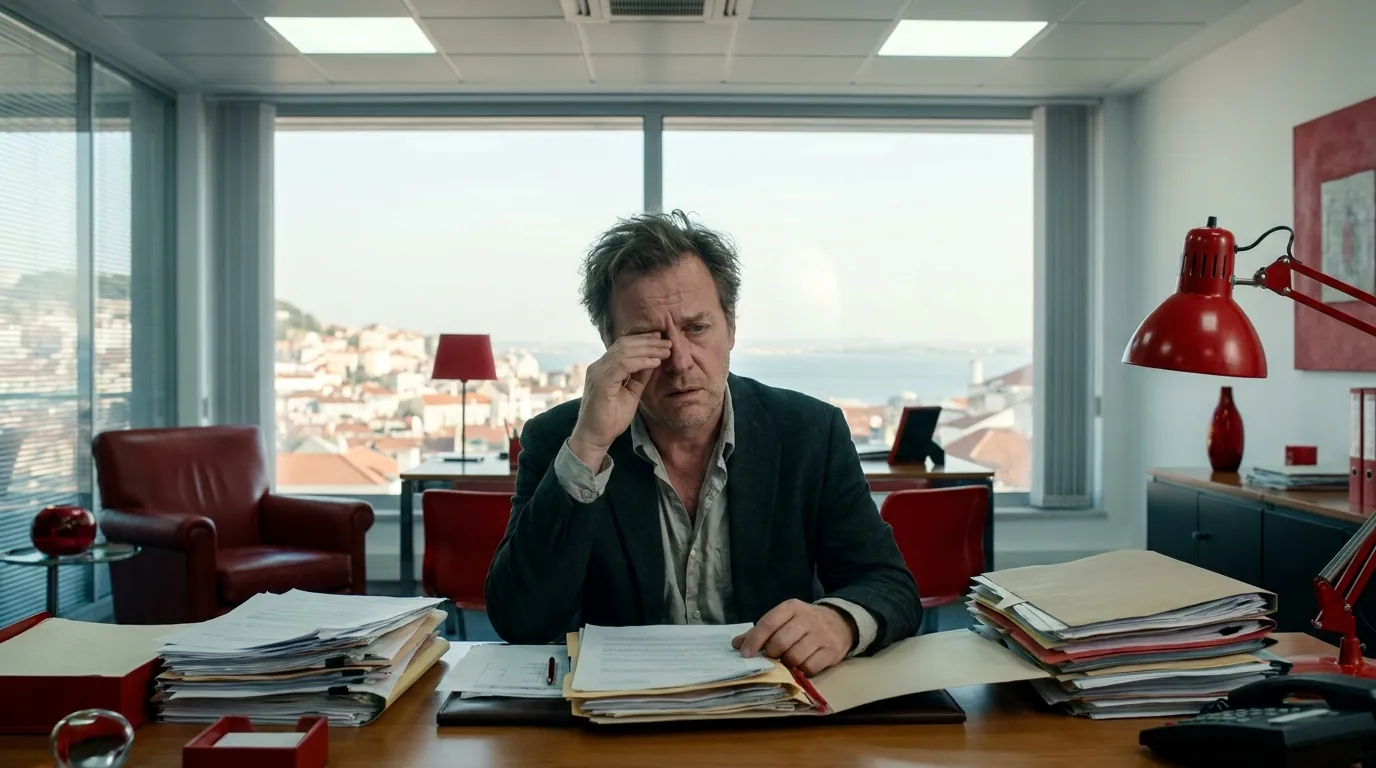 03
03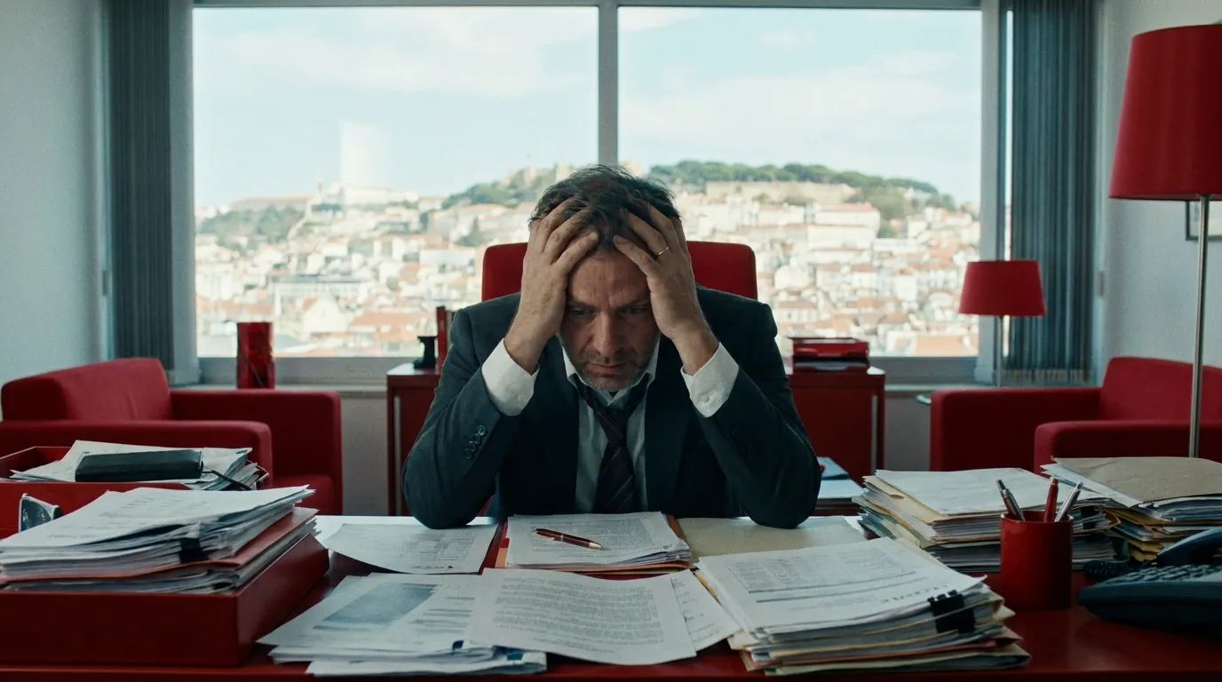 04
04 05
05BIGkoncili
From the BIGgroupTV channel.

A courier with personality
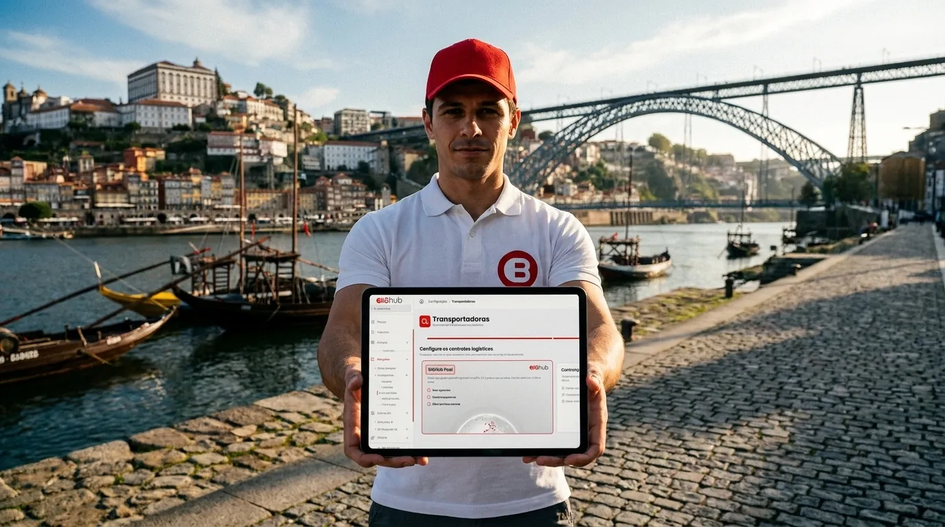
BIGlogistics brings the physical side of the hub to life through a delivery character travelling between Lisbon, Porto and Rome.
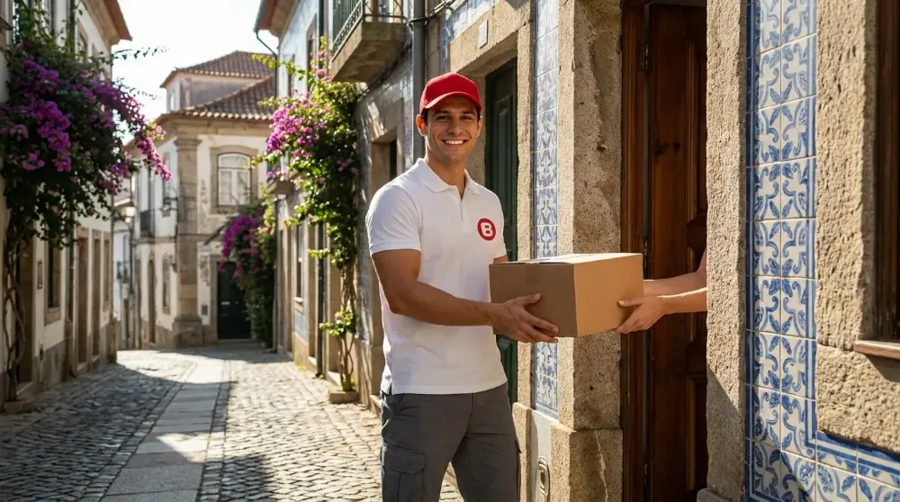
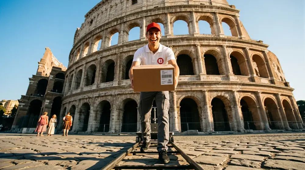
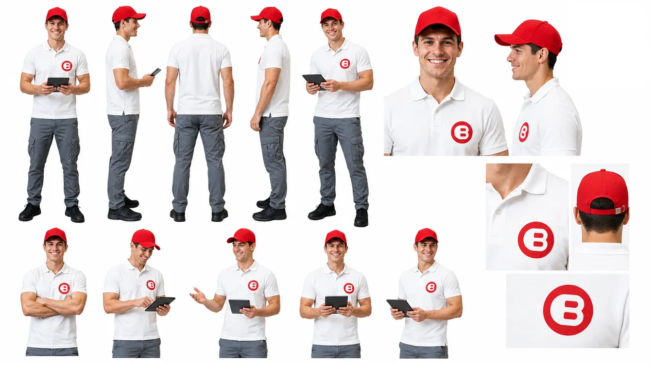
A model sheet keeps the courier consistent across scenes, formats and teams.
BIGlogistics presentation
From the BIGgroupTV channel.

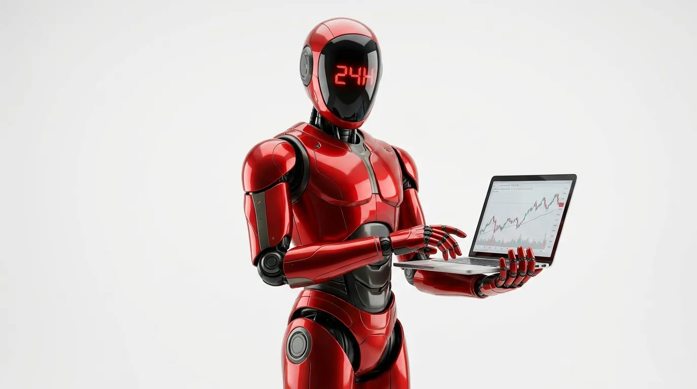
Cash, 24 hours a day
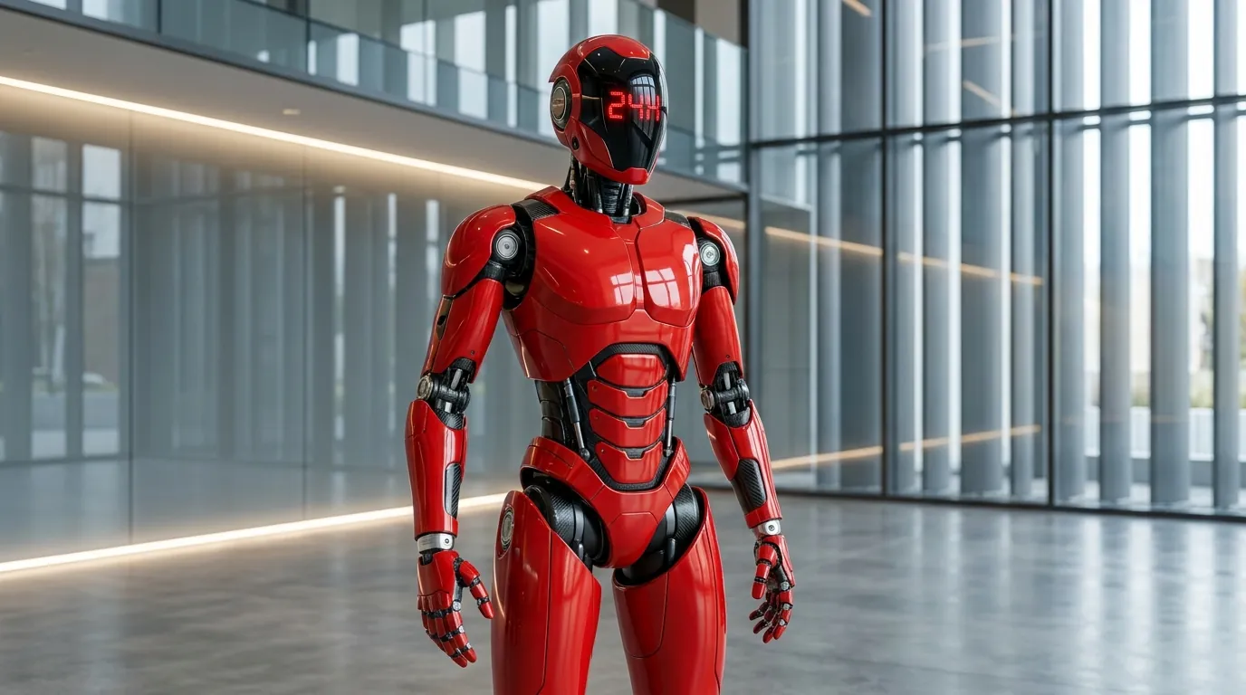
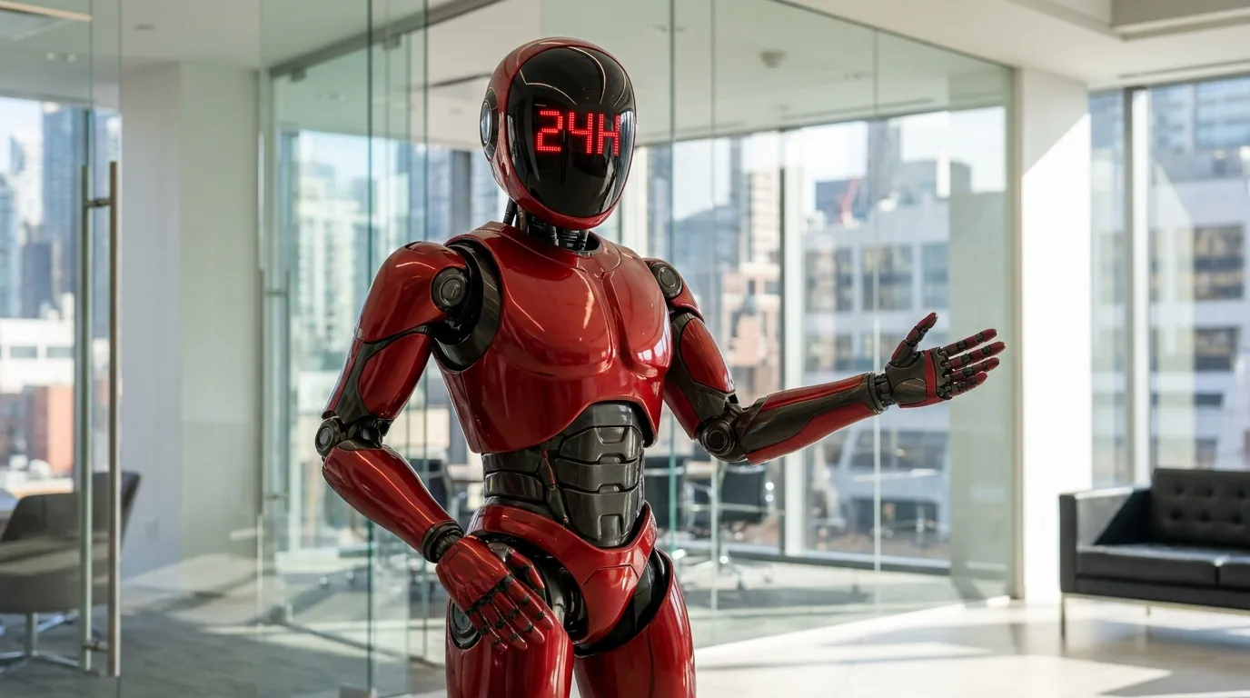
BIGcash is the cash-flow module, represented by a red robot and the 24H promise. Bold colour, simple shapes and a character that works as an icon.
Always on
A single colour and a friendly machine: the module reads in one second, at any size.

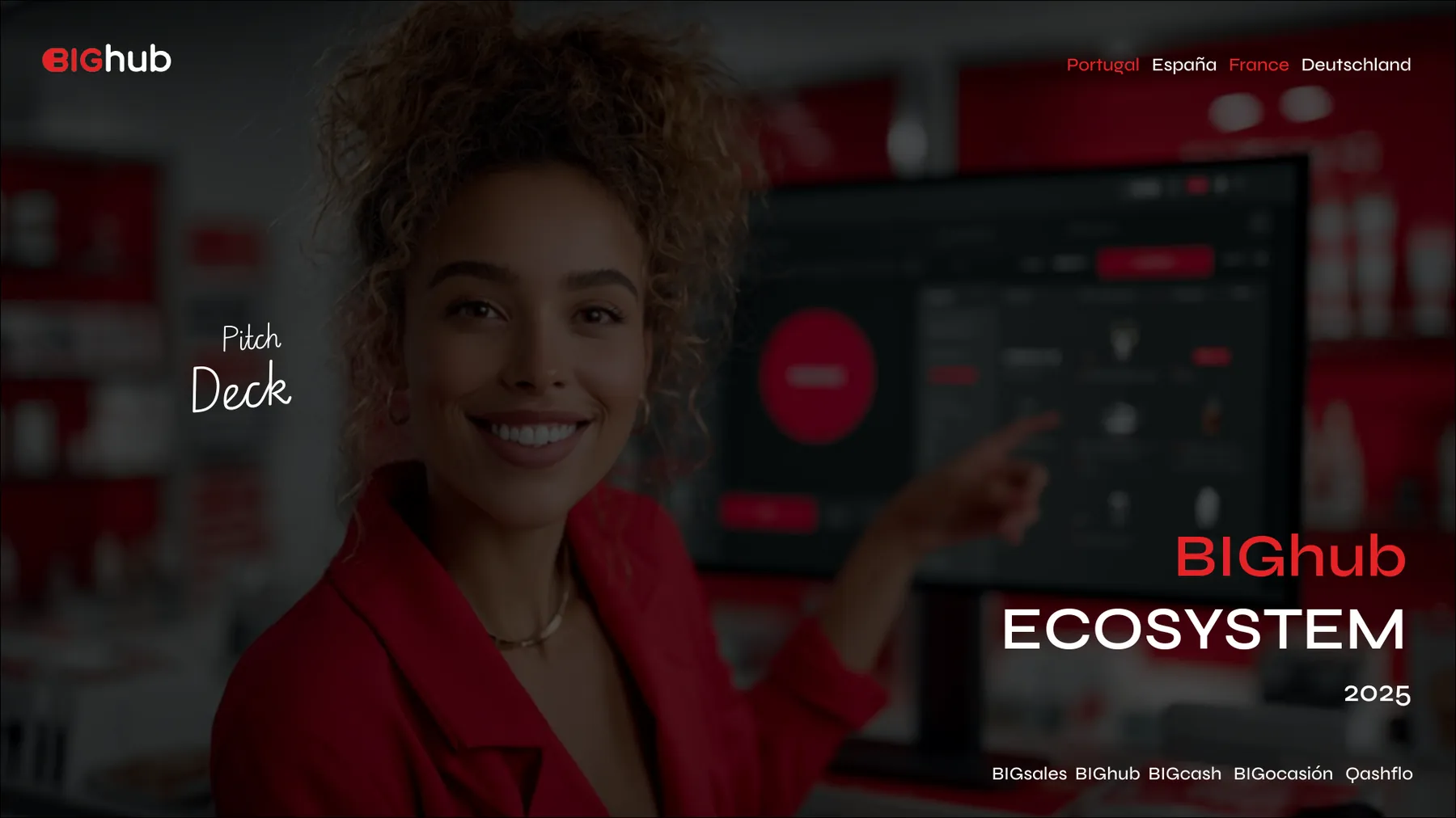
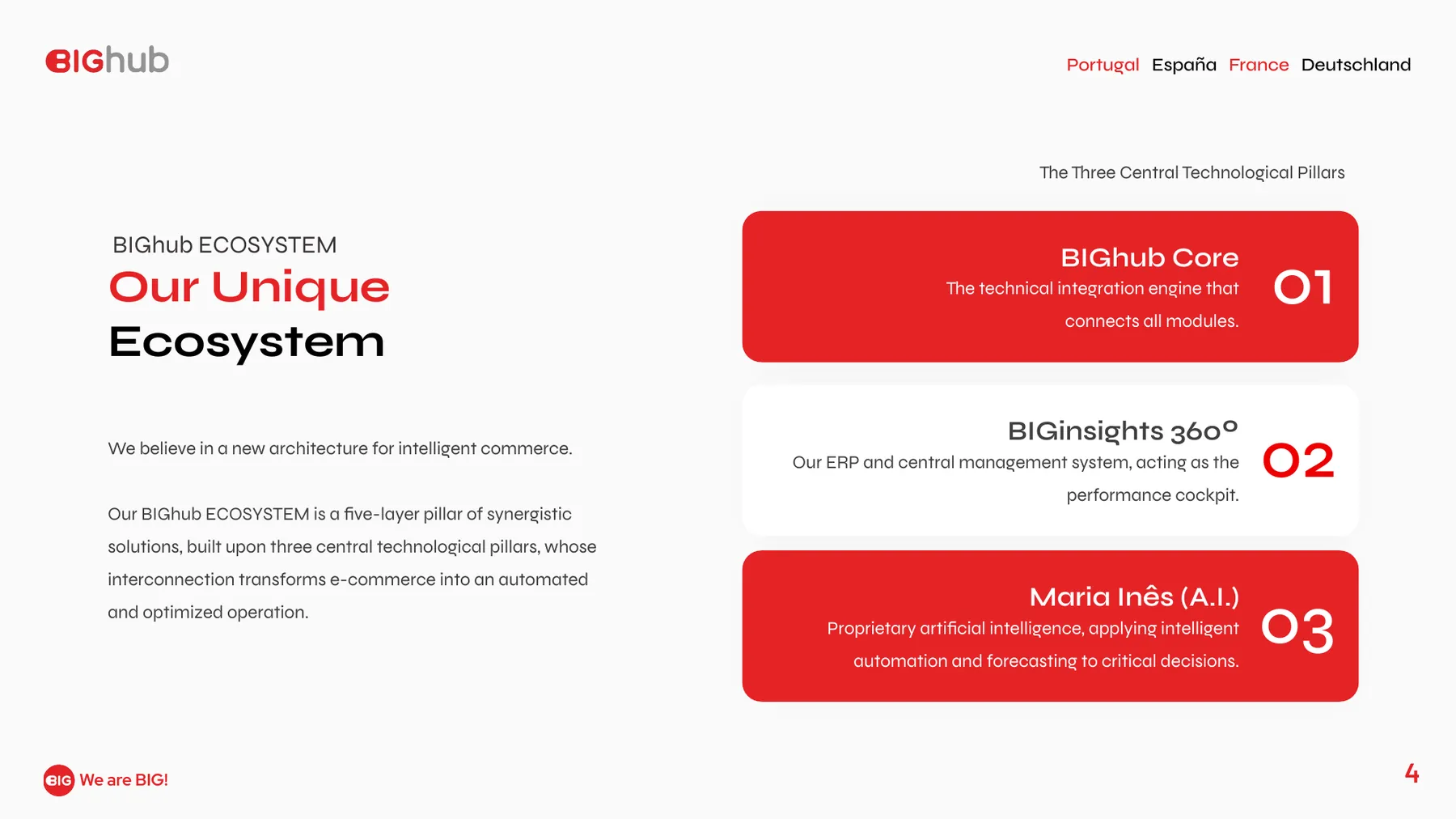
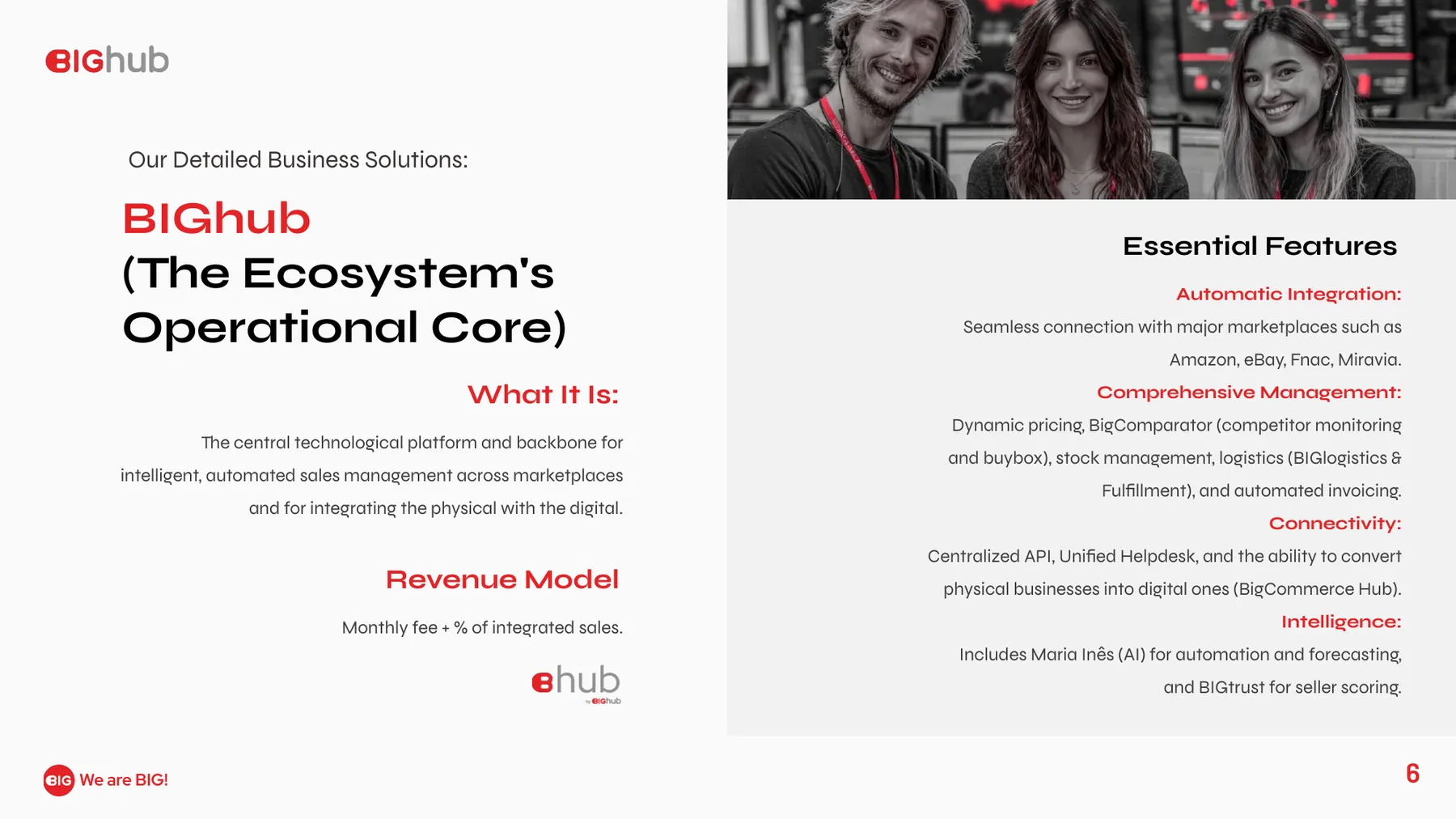
Pitch deck system
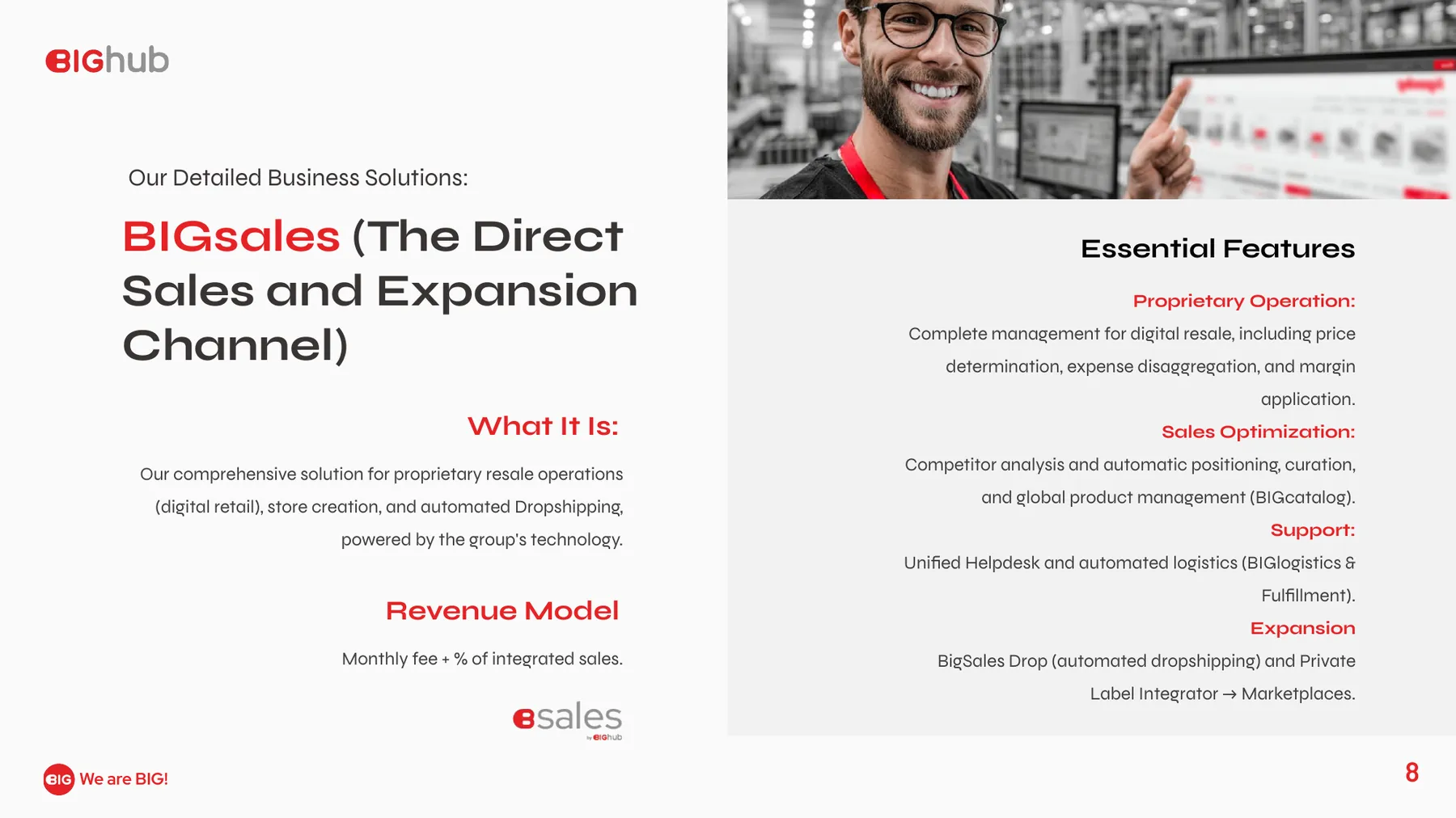
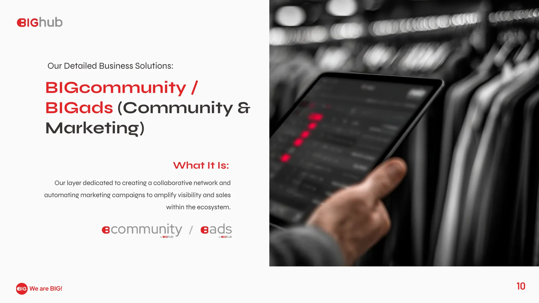
The decks that explain the hub to partners and investors: cover, ecosystem, core business, sales and community, designed as one narrative with the same grid and type as the brand.
From screen to wall
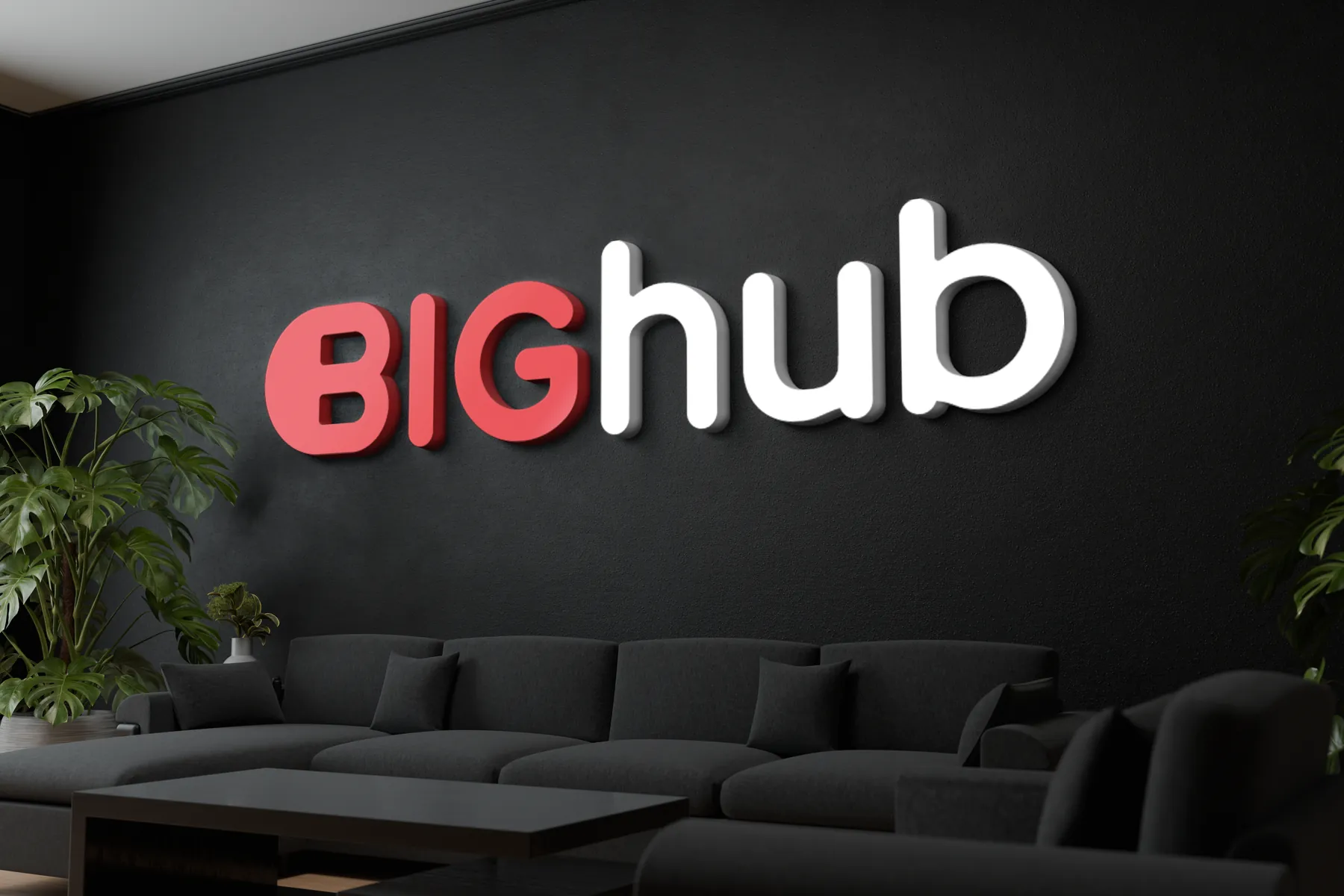
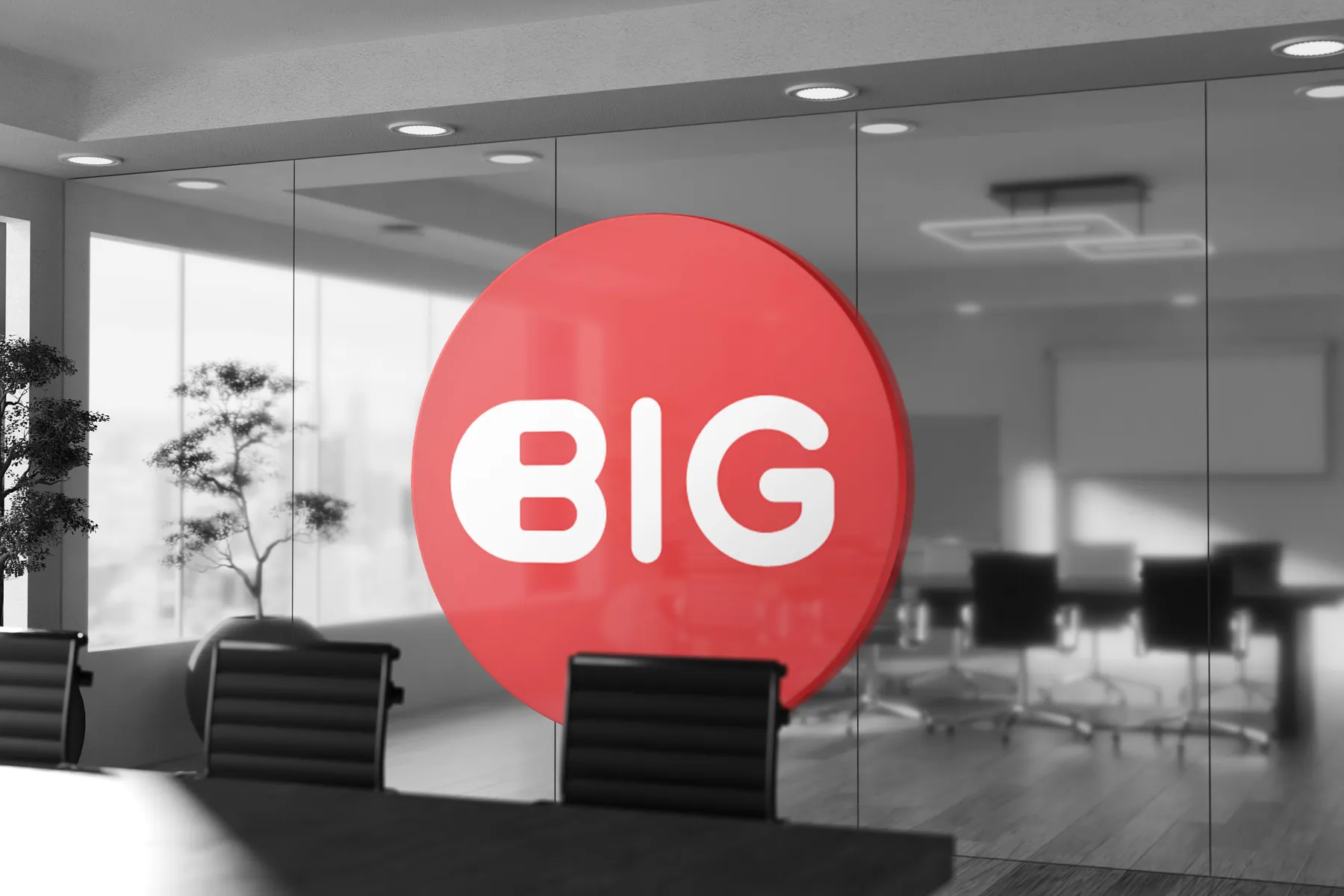
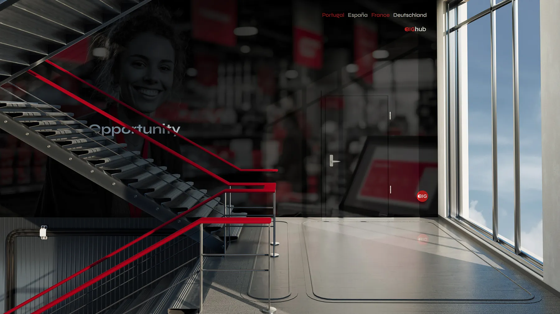
The brand also lives offline: roll-ups, flyers and office walls, from the 3D BIGhub wall logo to the glass circle in the meeting rooms.
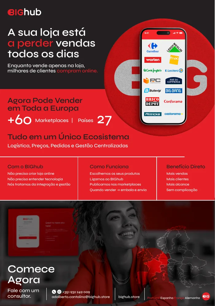
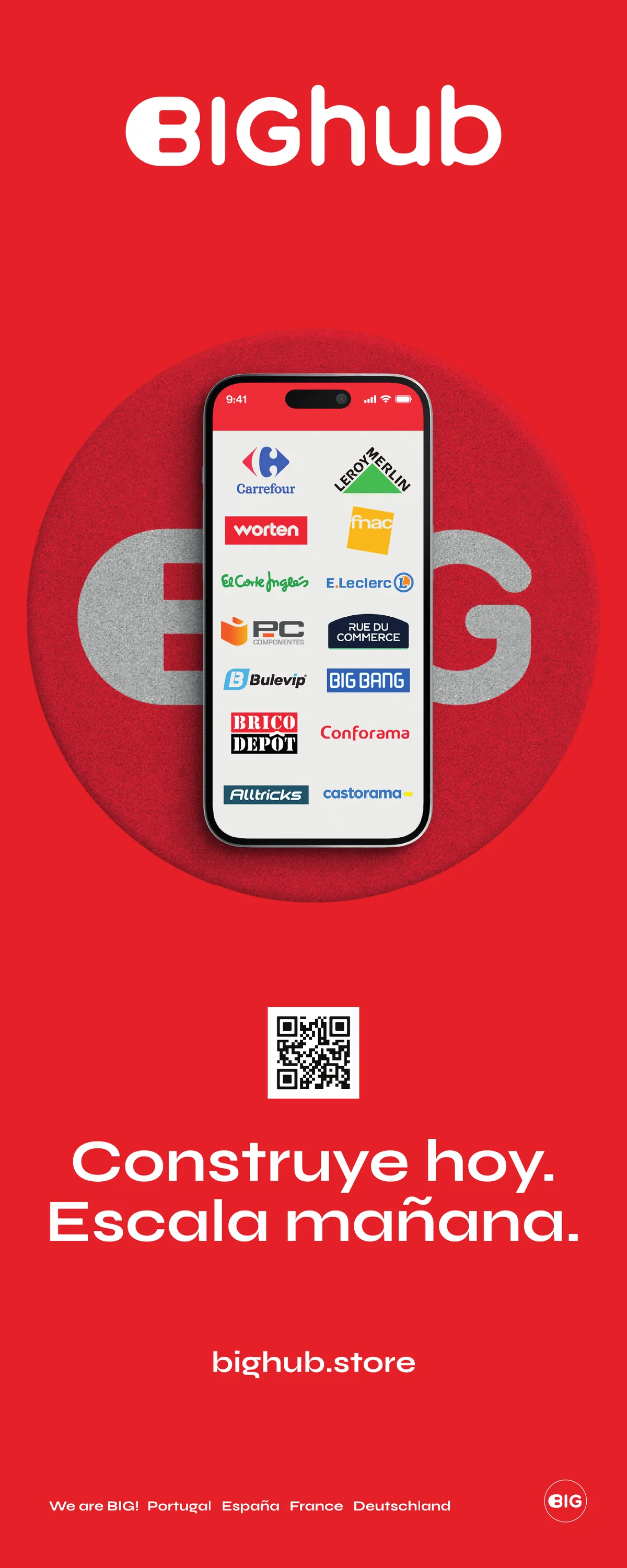
Flyer and roll-up
Printed pieces carry the same red, the same grid and the same tone as the digital ones.
The daily layer
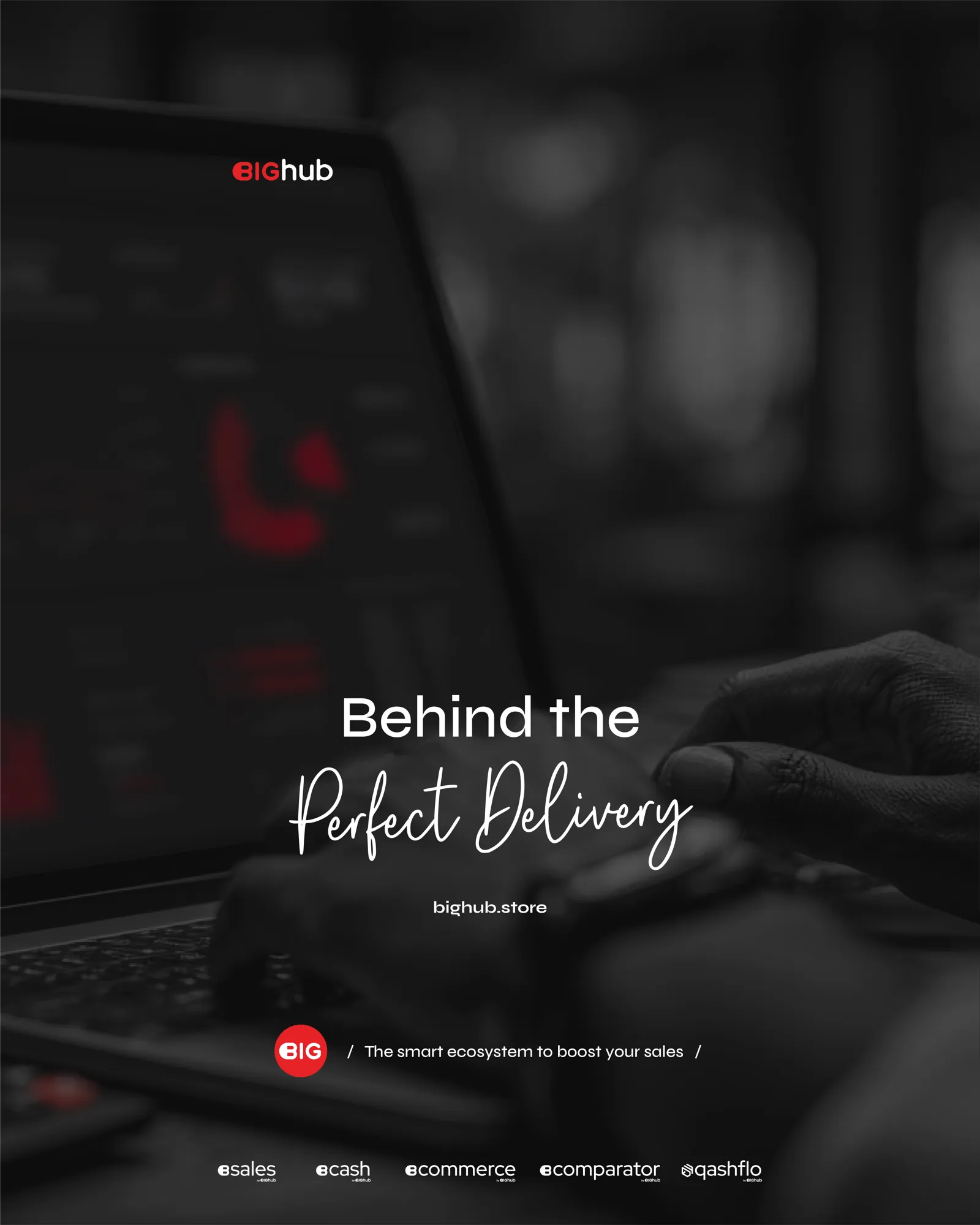
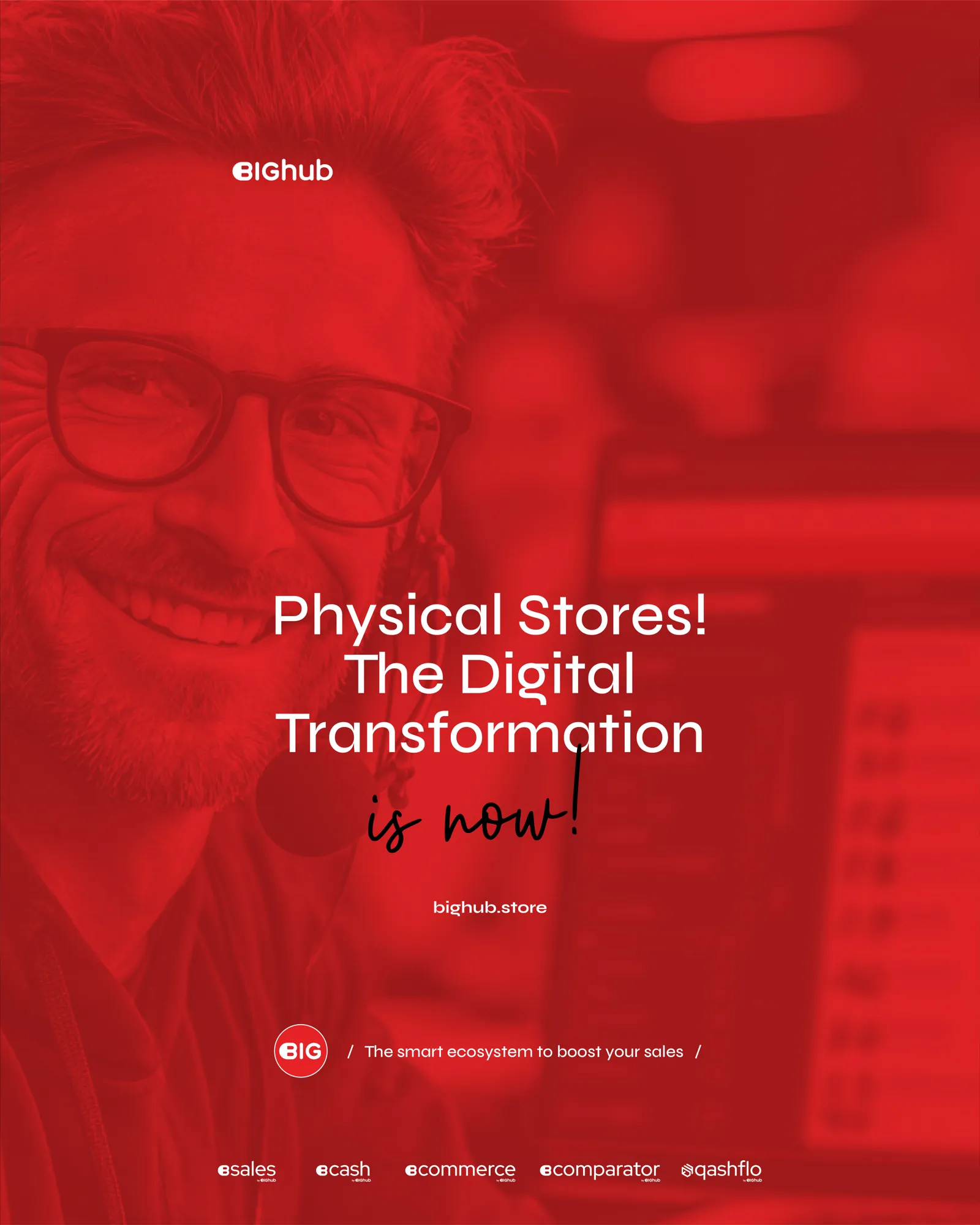
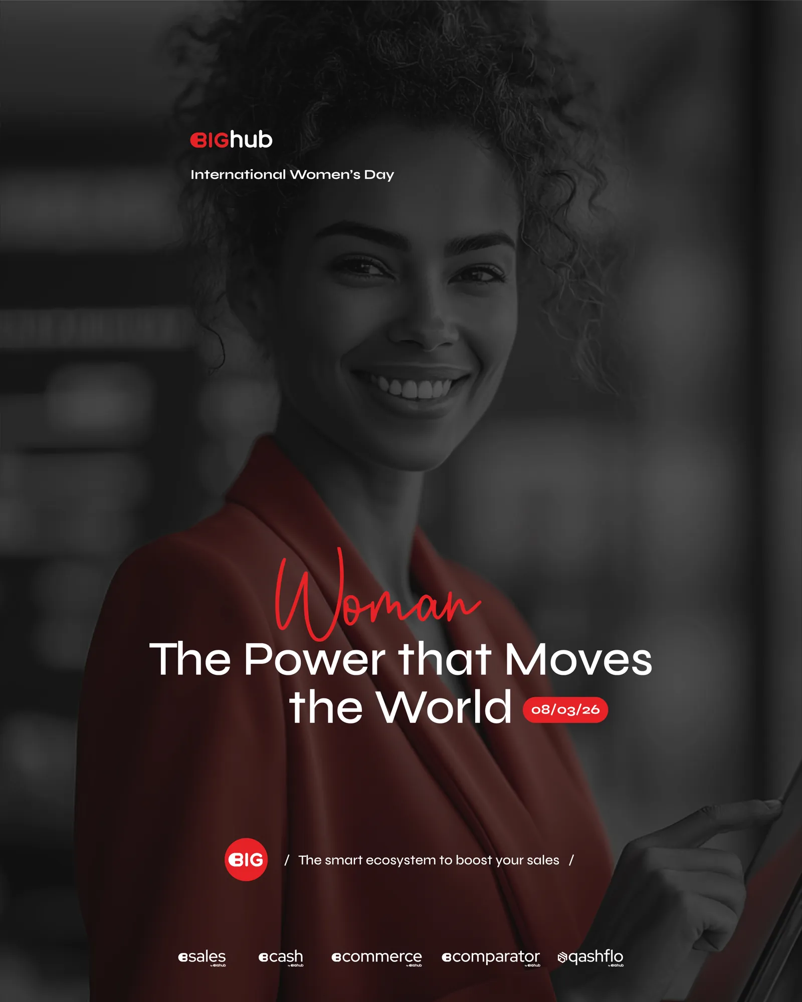
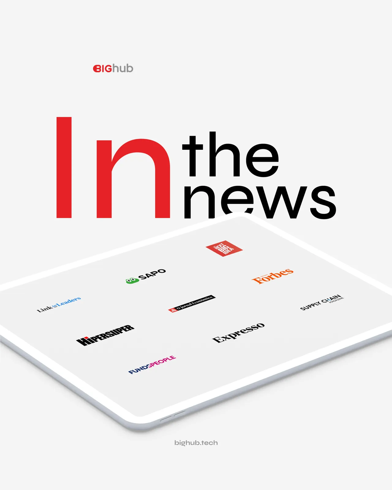
Under the big pieces sits a constant stream of social posts, announcements and press visuals, all kept inside the same system.