Where the project starts
The Aurelia rebranding had one aim: to modernise the brand and give it a stronger place in the financial market, without losing its essence and its history. The new identity feels more sophisticated and solid. It shows that the company offers financial solutions with confidence and excellence.
The redesigned symbol joins elegant lines with the initial “A”, inside shapes that suggest protection and growth. The golden colour palette stands for value, prestige and stability. The result balances today’s look with tradition.
From one letter to one symbol
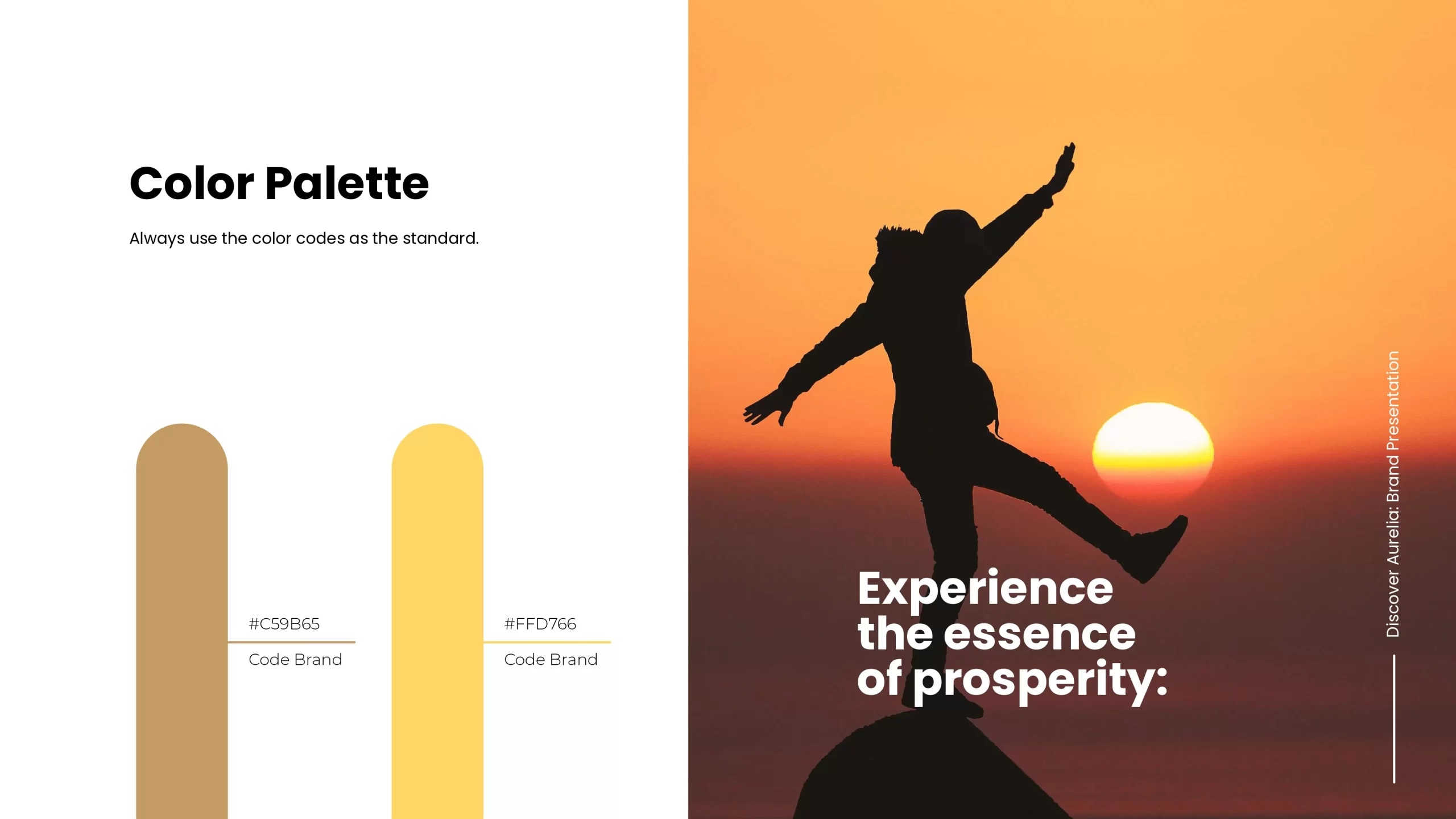
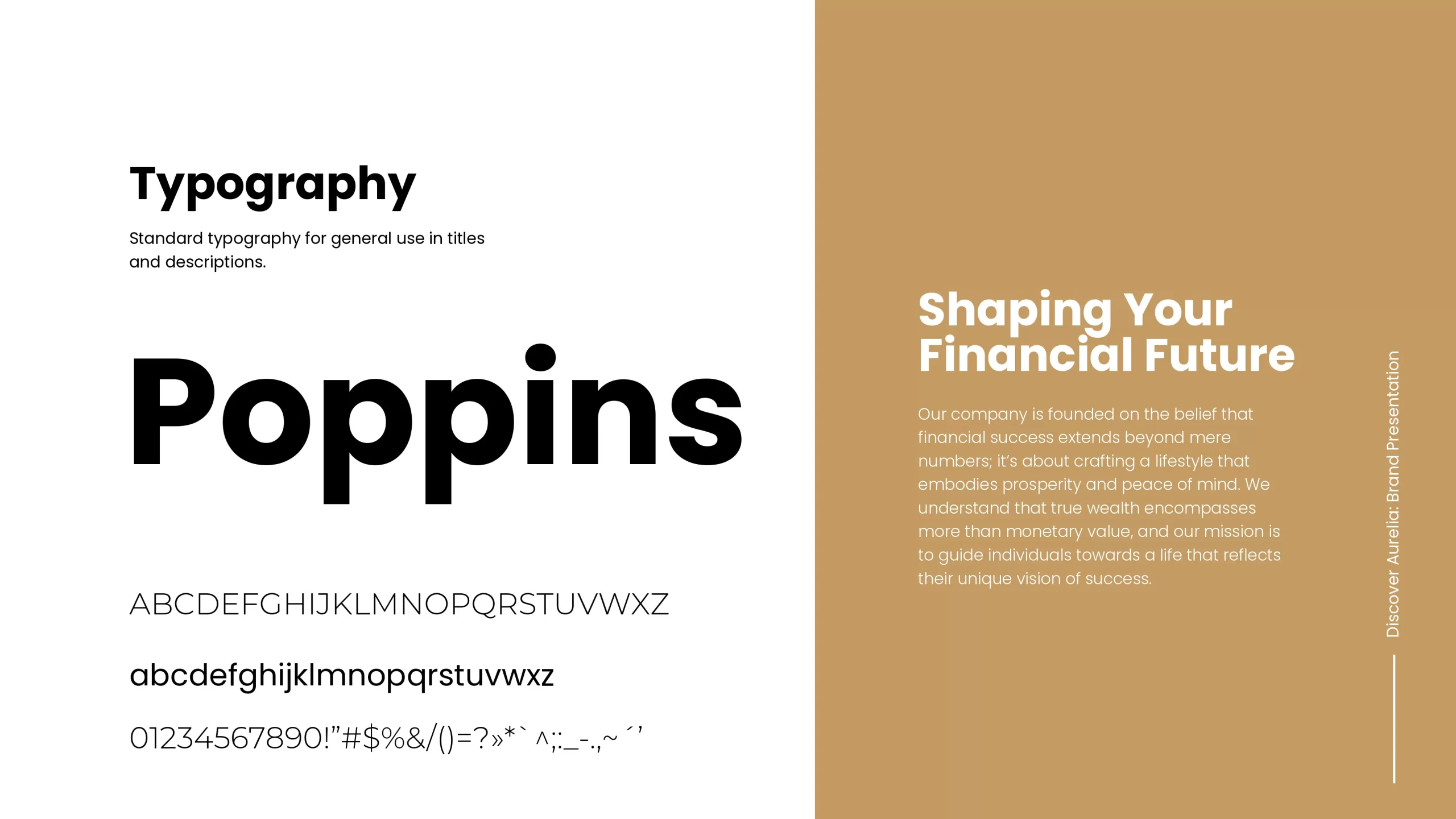
The symbol starts with the letter “A”. Elegant lines wrap around it and suggest protection and growth. Gold and Yellow set the colour, and Poppins sets the voice. The colour codes on the brand sheet are always the standard.
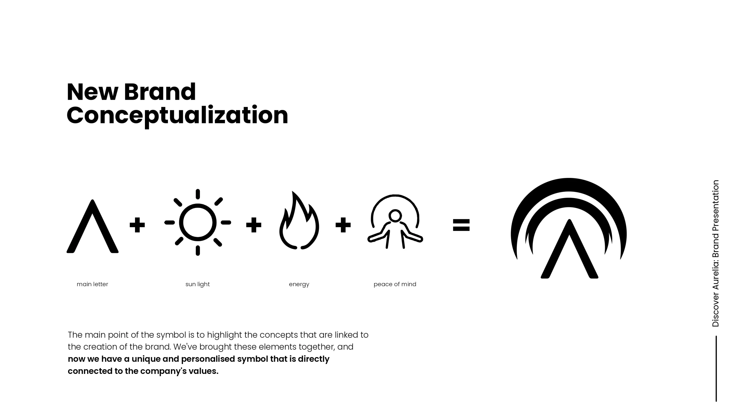
Light, energy and peace of mind
One main letter, three ideas and a single mark. The final symbol keeps the “A” and adds the arches of protection and growth.
A new look for a modern brand
Aurelia’s new visual identity was built for consistency and strong recognition. Modern typography, soft geometric shapes and the golden colour work together. They speak of credibility, professionalism and a friendly, open approach.
Every element supports the brand both online and in print. Together they make one clear visual world that stands out in the financial sector.

One brand, many places
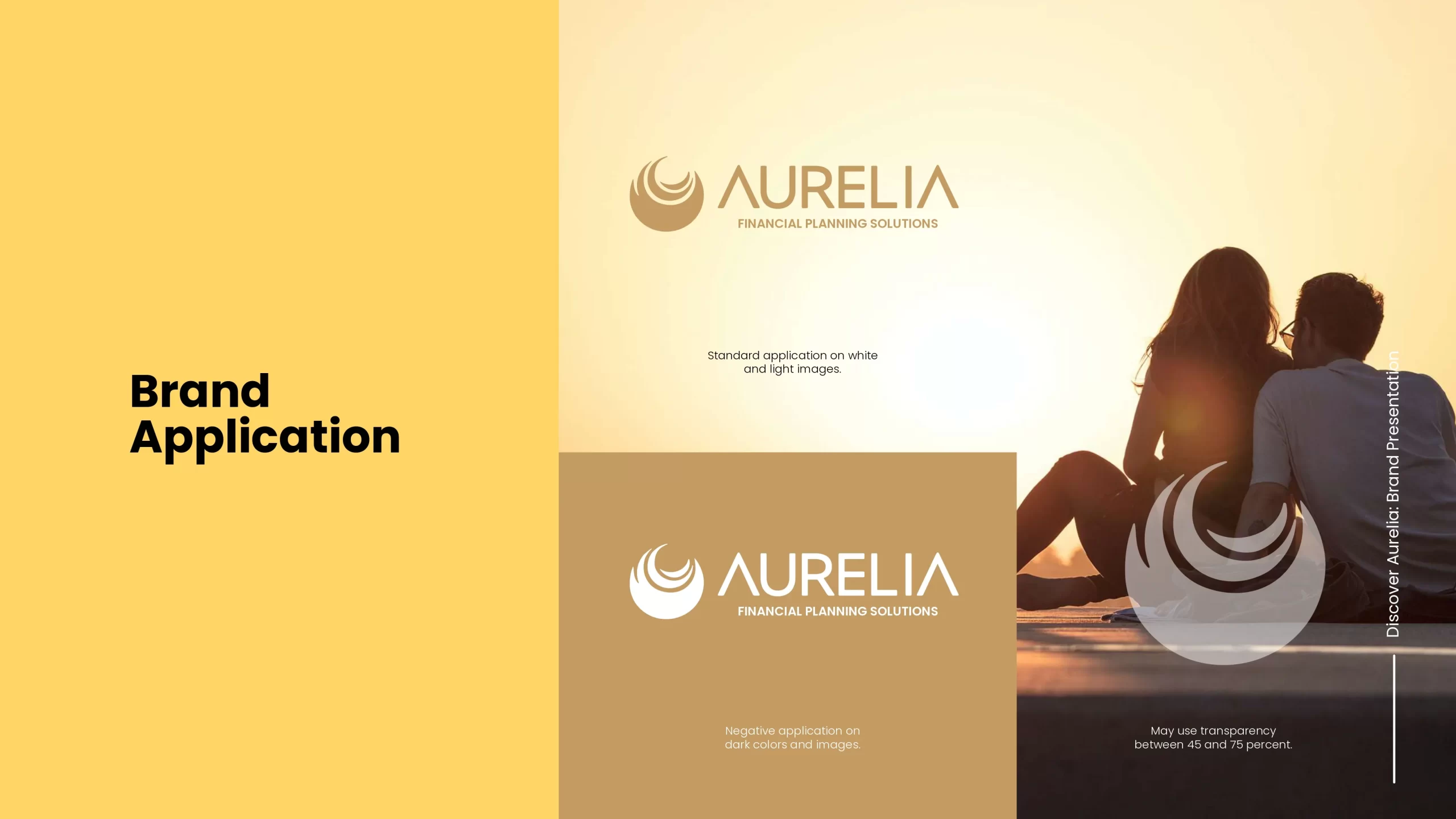
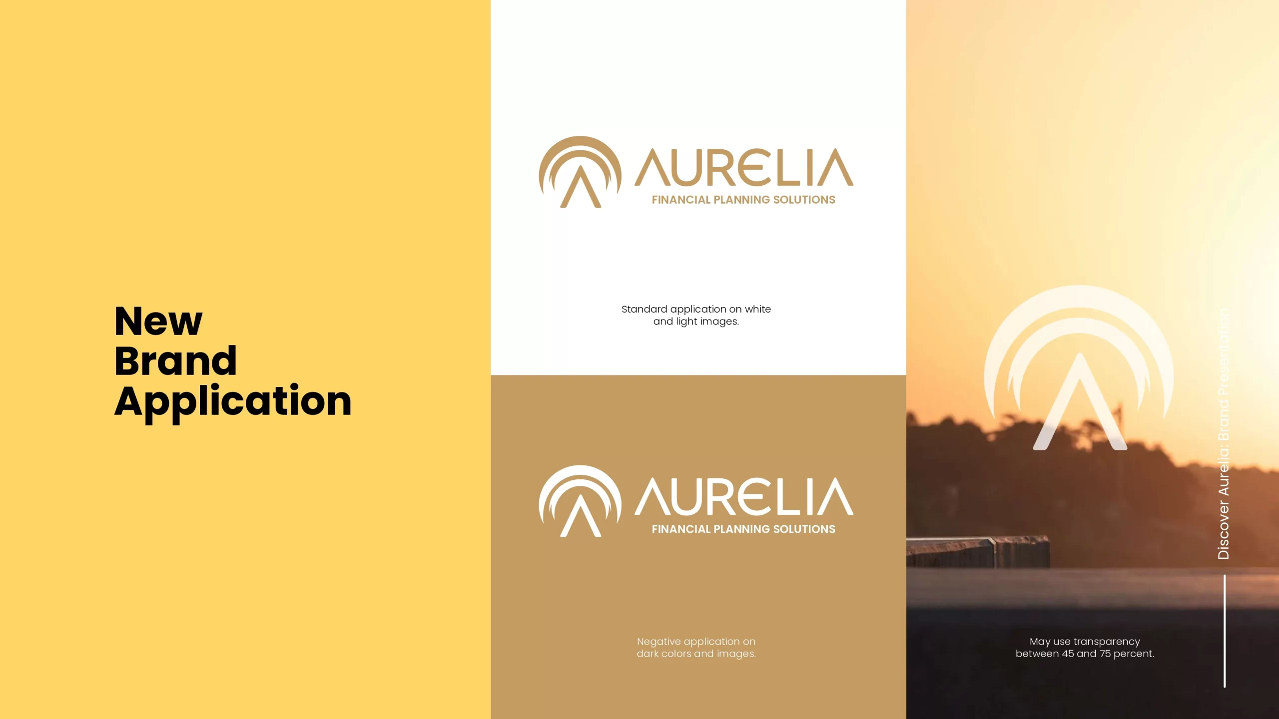
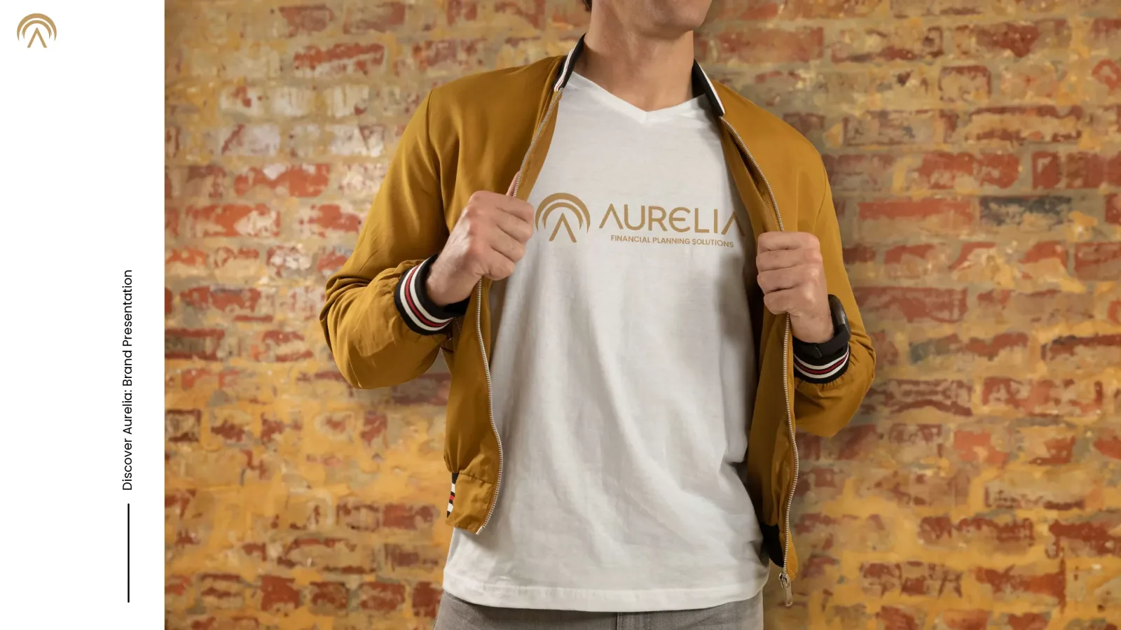
The identity was designed for screens and for real objects. The same symbol, colour and type appear on a brand page, on a T-shirt and on a dark surface.

One golden symbol
It works on light and dark backgrounds, on photos and on clothing, and it keeps the same calm, solid feeling.
A clear website for a premium brand
Aurelia’s new website gives visitors a simple and efficient experience. It follows the rebranding and the premium position of the brand. The design is clean and the navigation is clear, so the financial consulting services are easy to find and understand.
Graphic elements and the new colour palette bring sophistication and accessibility. Together they present Aurelia’s value in an elegant and impactful way.