
ATÉ
03Concept
03 · Concept
Brand and message aligned in the same direction
The visual development began with the promise “We take it to…”. It defined the symbol, the typography and the colour choices. Together they reflect dynamism, confidence and simplicity.
SymbolTypographyColour
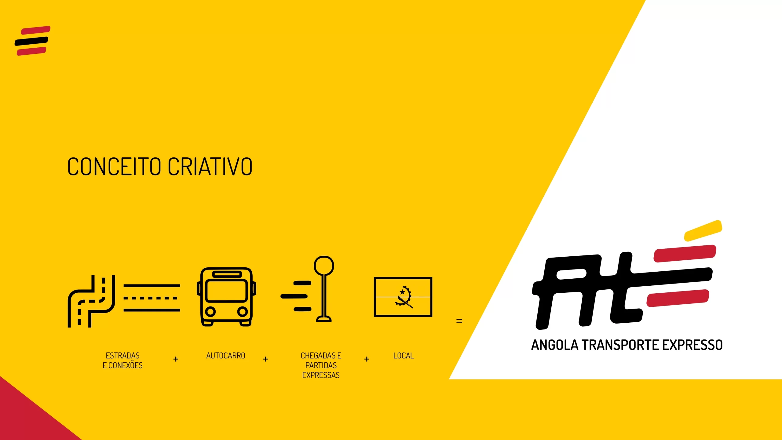
SymbolSpeed lines in yellow, red and black. They also work alone, as the icon.
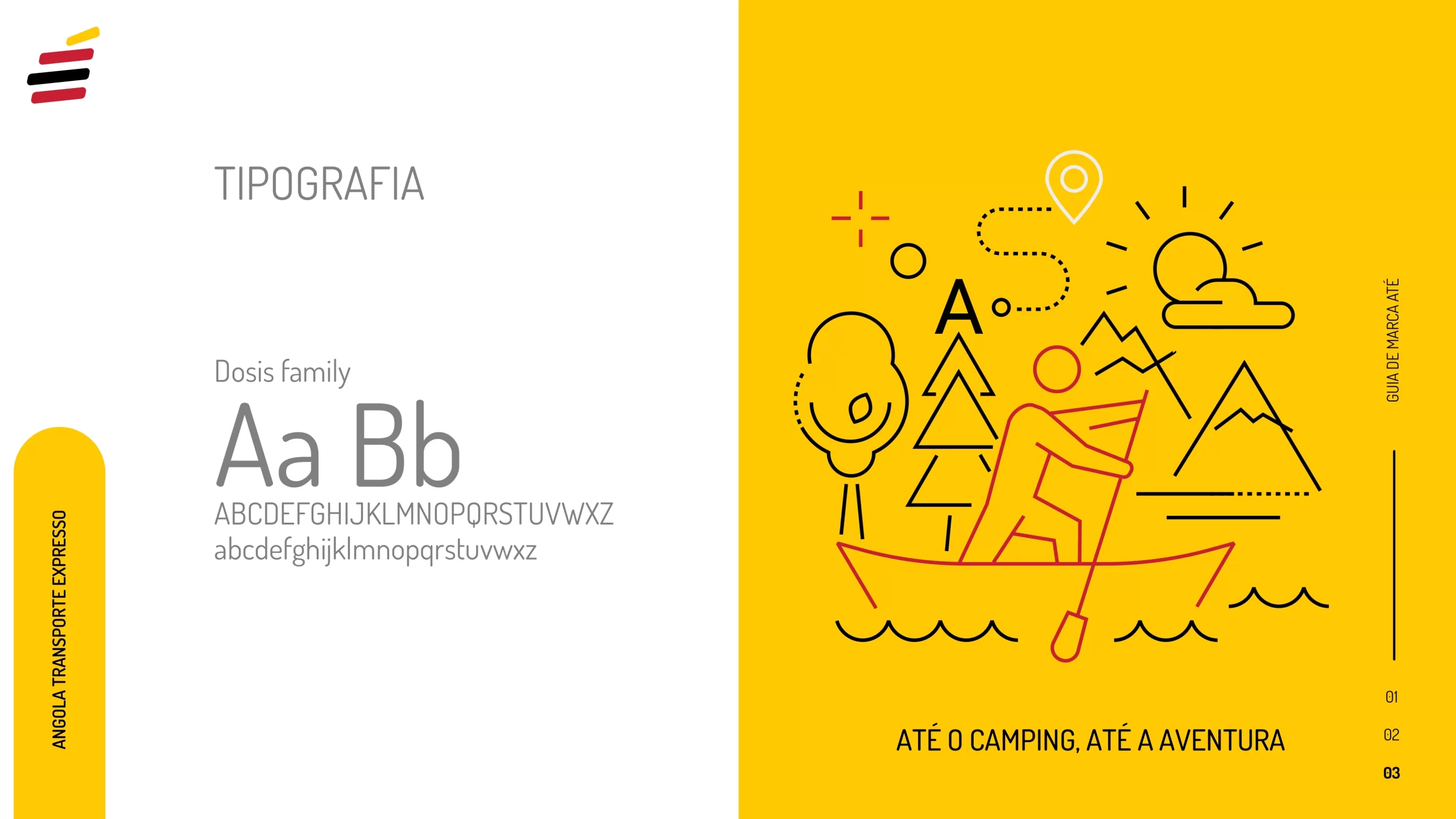
TypographyThe Dosis family, clean and easy to read.
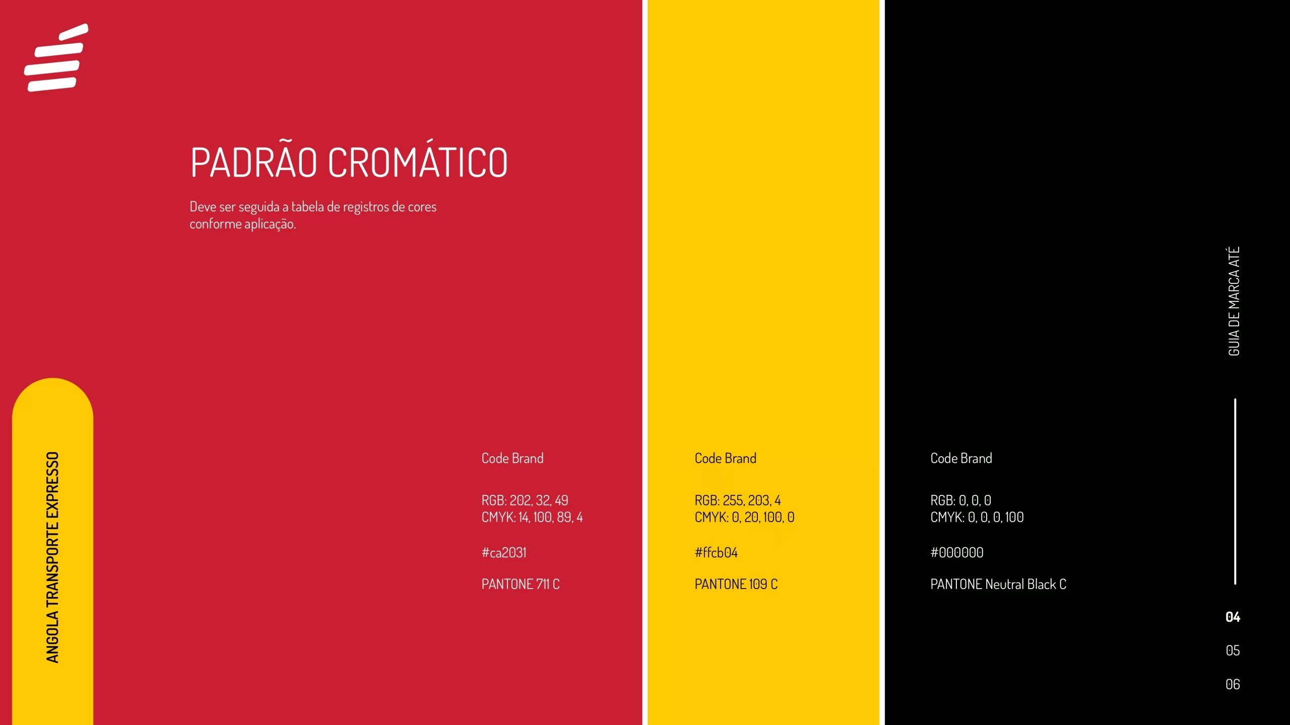
ColourRed, yellow and black, used on white, black and red backgrounds.
ATÉ
04Identity system
04 · Identity system
Logo, typeface and colour
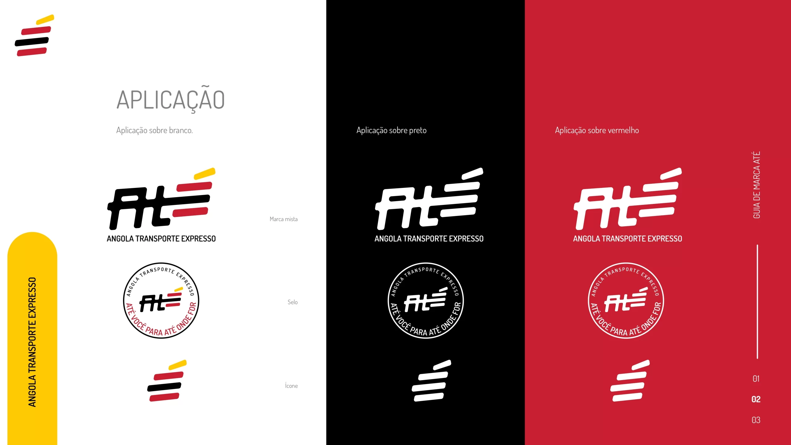
The guide sets the rules of the brand. The logo comes as a mixed mark, a seal and an icon, and it works on white, black and red. The typeface is the Dosis family. The colours follow a fixed table: red, yellow and black.
Logo versionsTypographyColour table
ATÉ
05Campaign
05 · Campaign
From brand to advertisement: coherence in every detail
The advertising campaign reinforces this idea through pieces that express movement, delivery and arrival. The brand is always visible. The language is always authentic, never generic.
BusesBus stopOutdoor
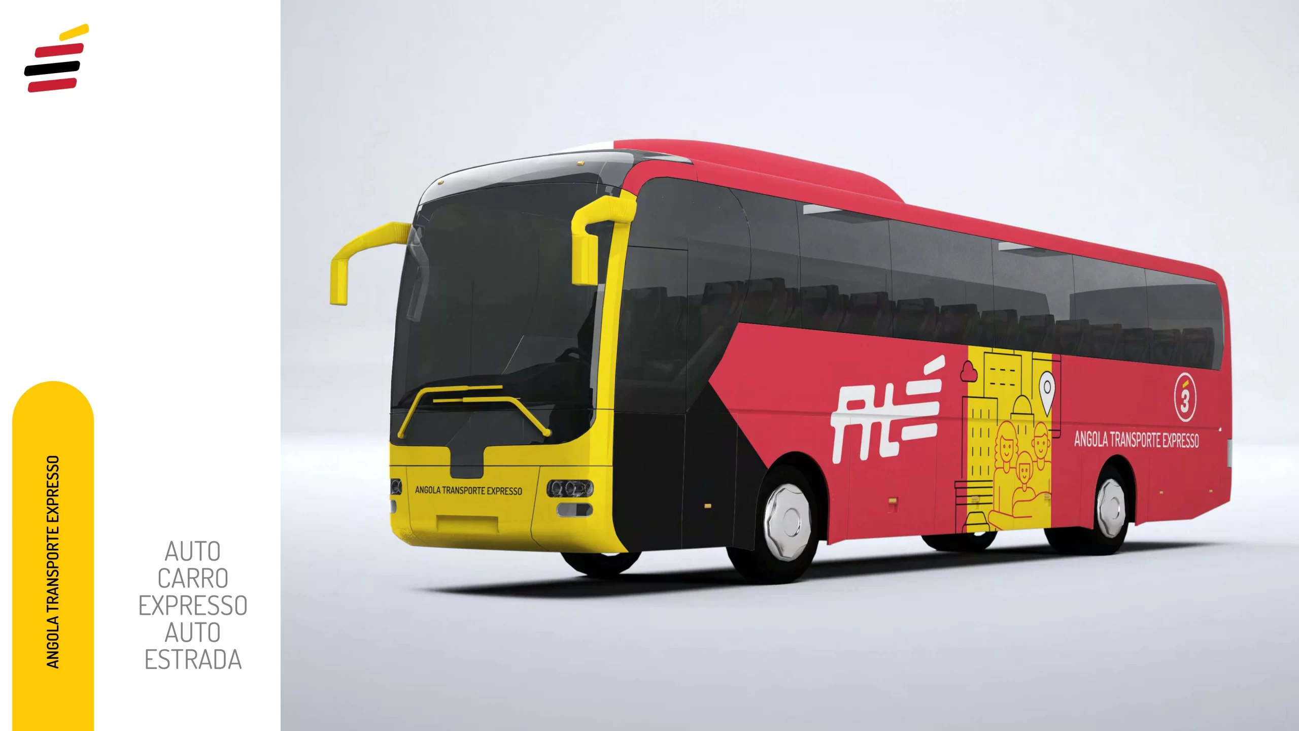
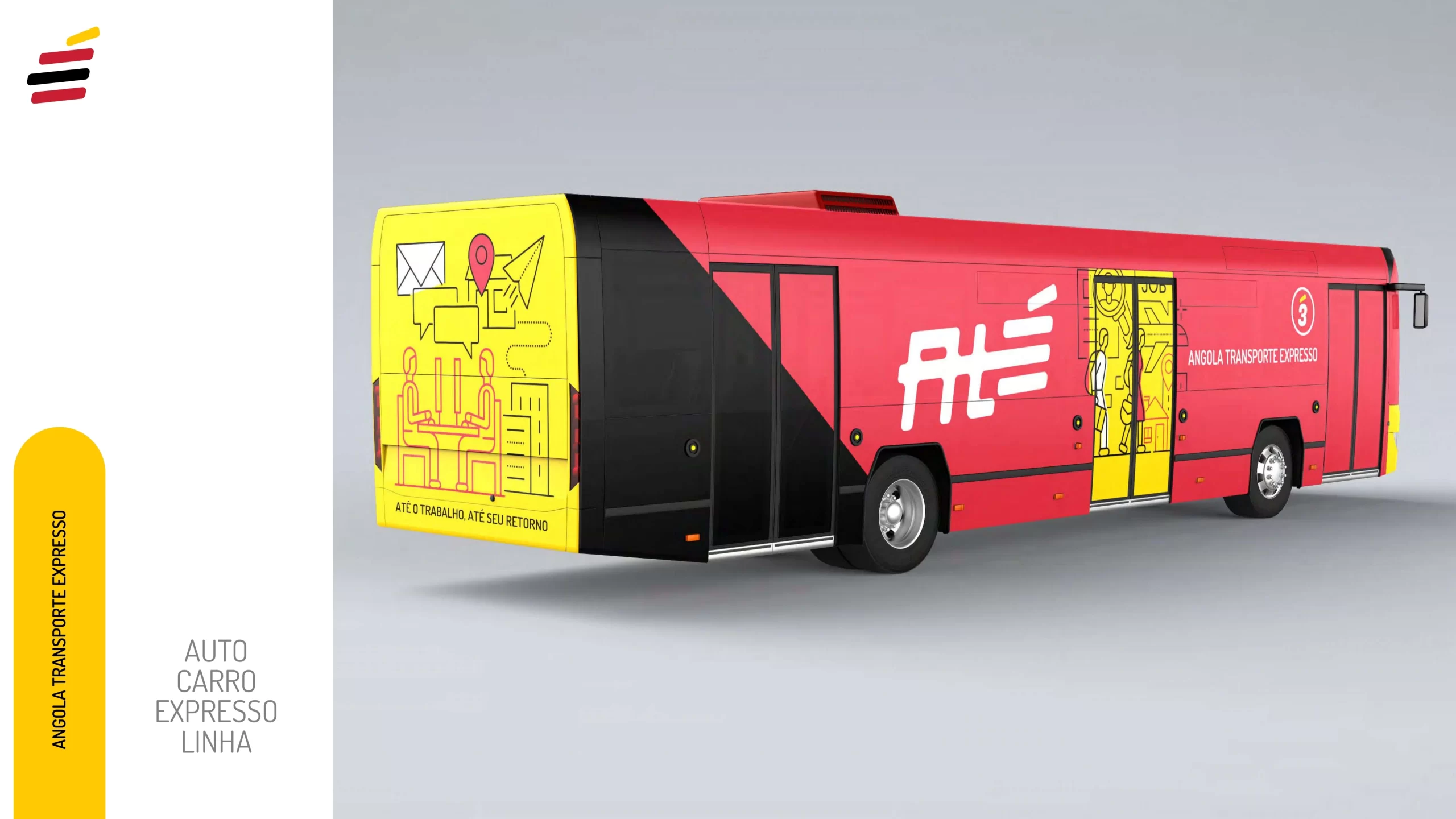
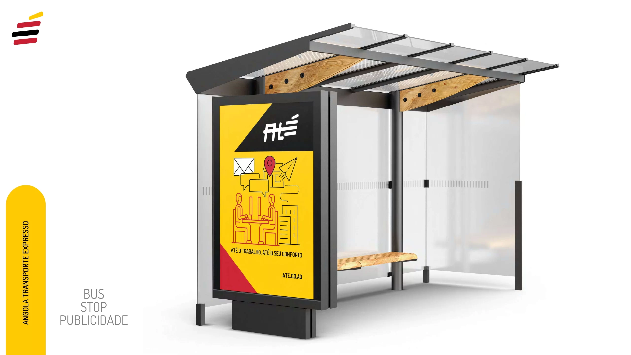
Every piece expressesMovementDeliveryArrival