Shipwise
CANADA | Branding & Visual Identity, On/Offline Design, Webdesign
Turning the Shipwise concept into a visible and coherent brand
Shipwise needed an identity that shows authority, international scale and maritime expertise, and still feels open and modern. That meant creating a logo, typography, icons and a visual system that work across digital, physical and institutional media, and keep their impact and clarity everywhere.
A brand designed with rigor and a vision for the future
The design starts from a stylized navigation symbol, solid technical typography and a colour palette that shows confidence and professionalism. The identity is built to scale, so it works on the website, in corporate presentations, in communication materials and across the company's digital world. Shipwise was born with clarity, presence and purpose.
One logo, four ways to use it
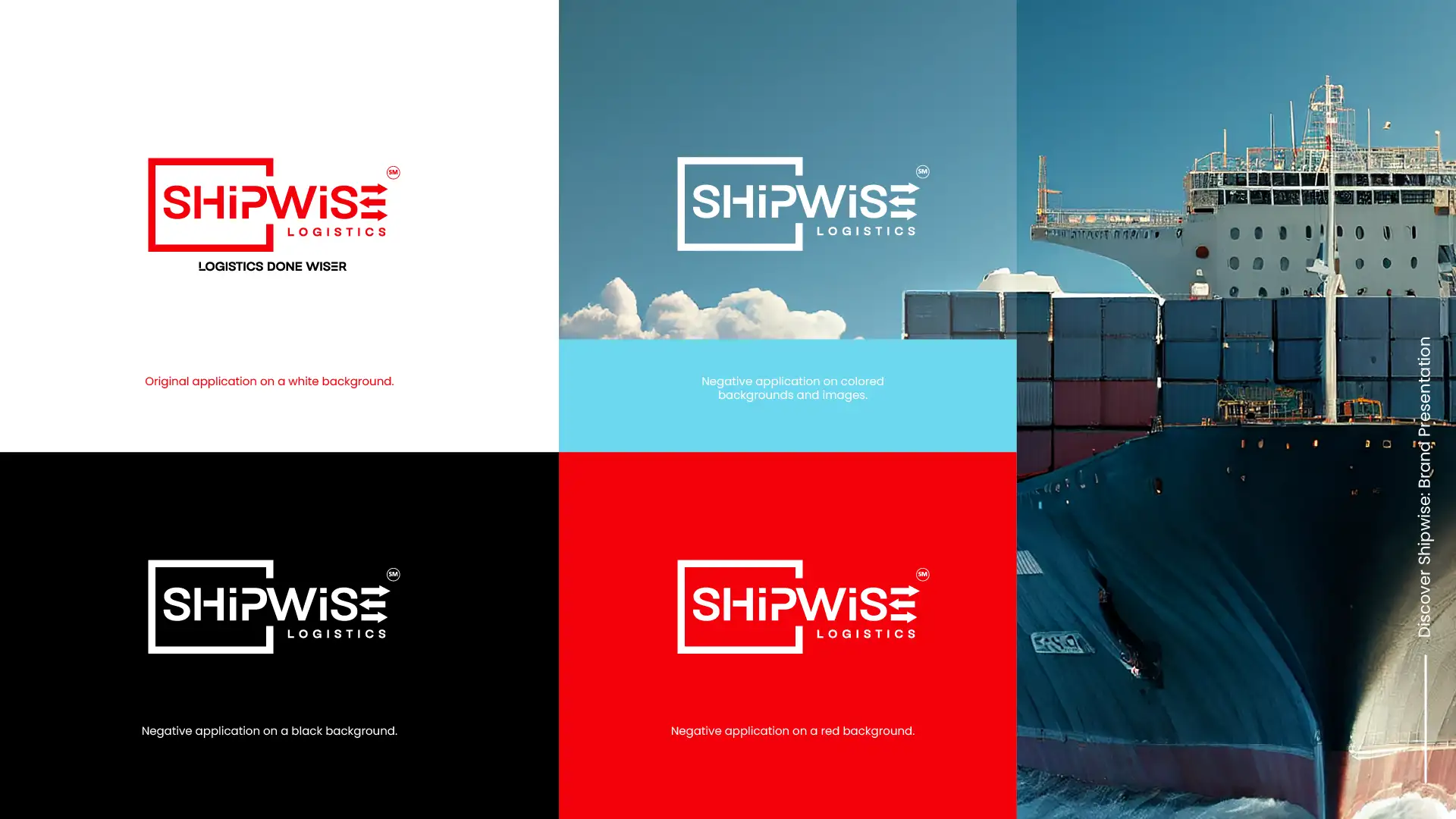
The logo is a bold red frame with the name and three arrows. On a white background it appears in red, with the slogan Logistics Done Wiser below it. On black, red, colour and photo backgrounds it turns white, so it stays clear on any surface.
The three arrows are a stylized navigation symbol. They also work alone as the Shipwise icon.


Red, black and one clear typeface
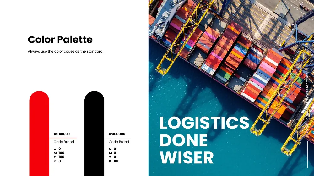
The palette has two colours: Shipwise red, #F40009, and black, #000000. The brand guide asks for these codes to be used as the standard.
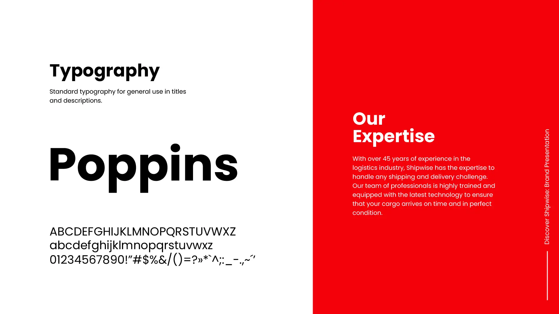
The typeface is Poppins, a clean geometric family used for titles and descriptions.


Stationery, a mug, a stamp and the street
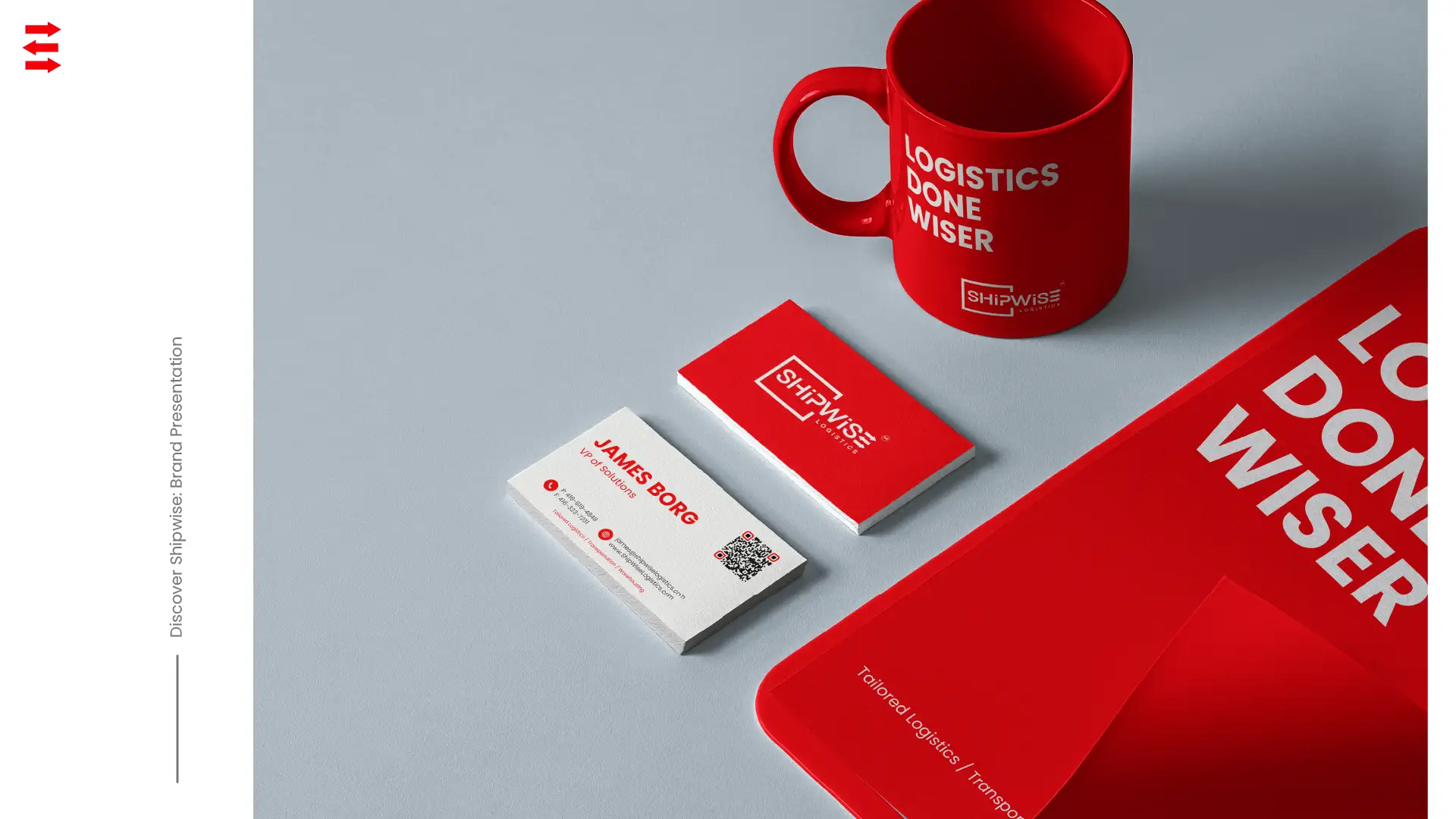
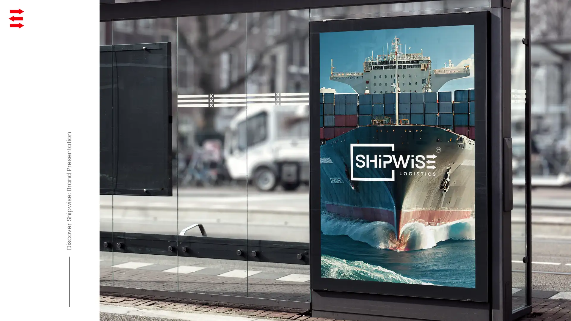
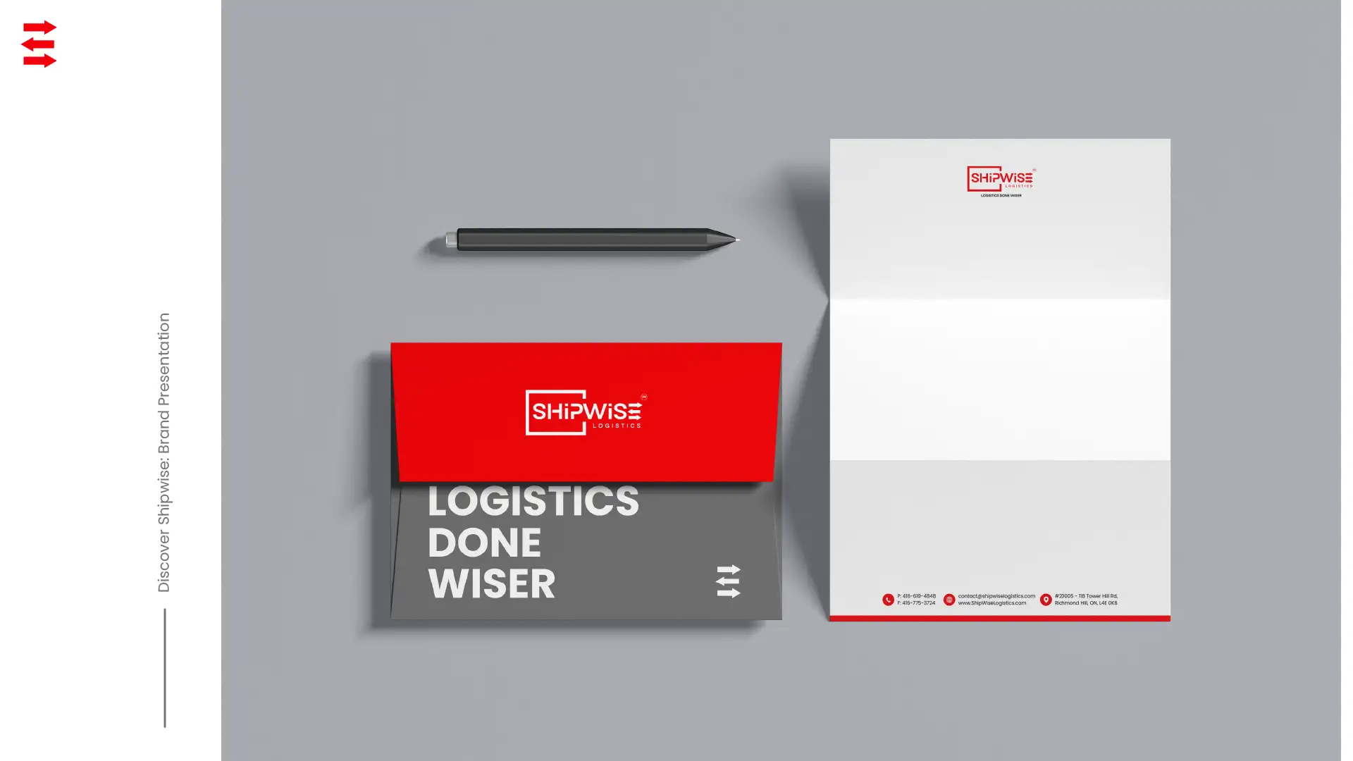
The identity was built to scale. Here it leaves the screen: business cards, a red mug and folder, an envelope and letterhead, a rubber stamp with the icon, and a poster at a city bus stop.


Result
The project gave Shipwise a brand with immediate presence and credibility. The visual identity brings recognition, consistency and a clear link to the company's strategic goals.
The brand is now ready to communicate, grow and stand out worldwide, with clarity and a distinctive character.
Logistics done wiser
Art direction, concepts and key visuals.
I worked as Art Director on the Shipwise brand. I created the concepts and the key visuals across branding and visual identity, on and offline design, and webdesign.