Rafa Ministro

MY PHARMA

ANGOLA | Branding & Visual Identity, Social Media

01 · The idea

Translating technical rigor into a memorable brand presence

MyPharma needed a visual language that shows a high standard of quality, scientific rigor and ethical commitment, in a way that feels easy to approach and works across many media. The goal was to turn professional expertise into one clear, recognizable design that fits the pharmaceutical market.

The visual approach mixes clean graphics, solid typography and a colour palette that feels both serious and fresh. The identity was built to work across websites, packaging, product catalogs, digital communication and institutional materials, so the brand keeps the same look and the same presence at every touchpoint.

5Modules
13Visuals
2Brand colours
3Typefaces
2022Brand guide
saúde à distância de um clickSomos compromissados com a sua saúde e da sua famíliaA MyPharma conecta pessoas, saúde e bem-estar apenas num clicksaúde à distância de um clickSomos compromissados com a sua saúde e da sua famíliaA MyPharma conecta pessoas, saúde e bem-estar apenas num click
02 · The system

Five modules, one brand

Each module shows one part of the work: the concept, the colours and type, the brand in use, the social media and the result. Choose a card to jump to it.

MyPharma · Concept03
03 · Concept

One symbol made from six ideas

MyPharma is an online service that sells medicines, supplements and beauty products through one app. The app brings many health and well-being solutions together, made for the customer.

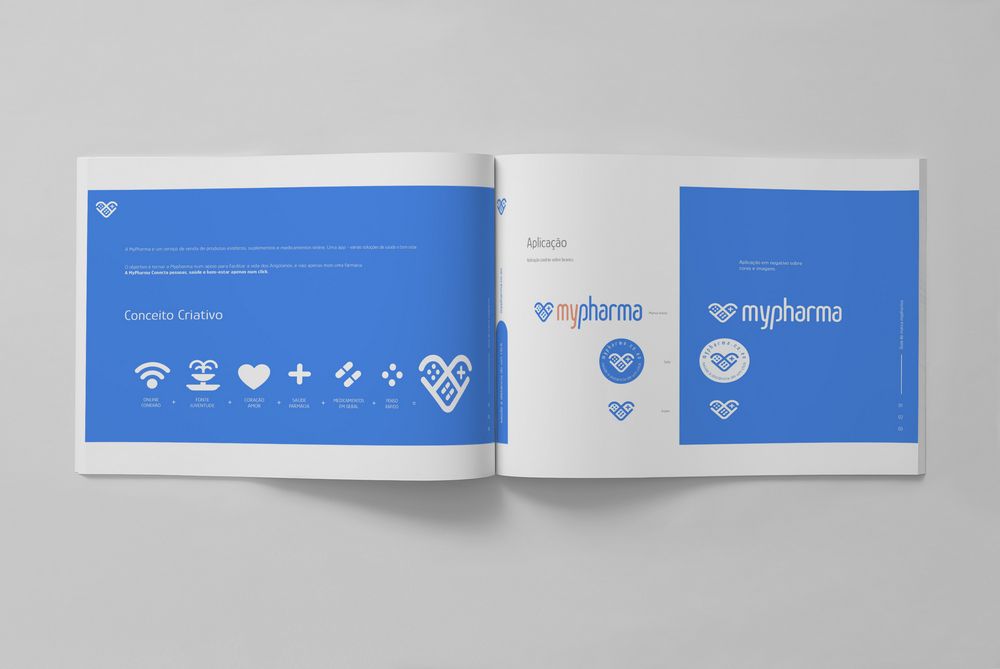
The brand symbol works like a sum. Six simple ideas are added together, and the result is one heart-shaped mark with a plus sign, pills and a plaster inside.
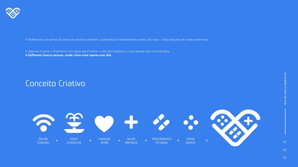
Brand guide page: the creative concept, six icons that add up to the MyPharma heart symbol
Creative concept
Online connection+Fountain of youth+Heart and love+Health and pharmacy+Medicines in general+Quick plaster
The goal

To make MyPharma a support that makes life easier for Angolans, and not just one more pharmacy.

The idea in one line

MyPharma connects people, health and well-being in just one click.
MyPharma · Colour and type04
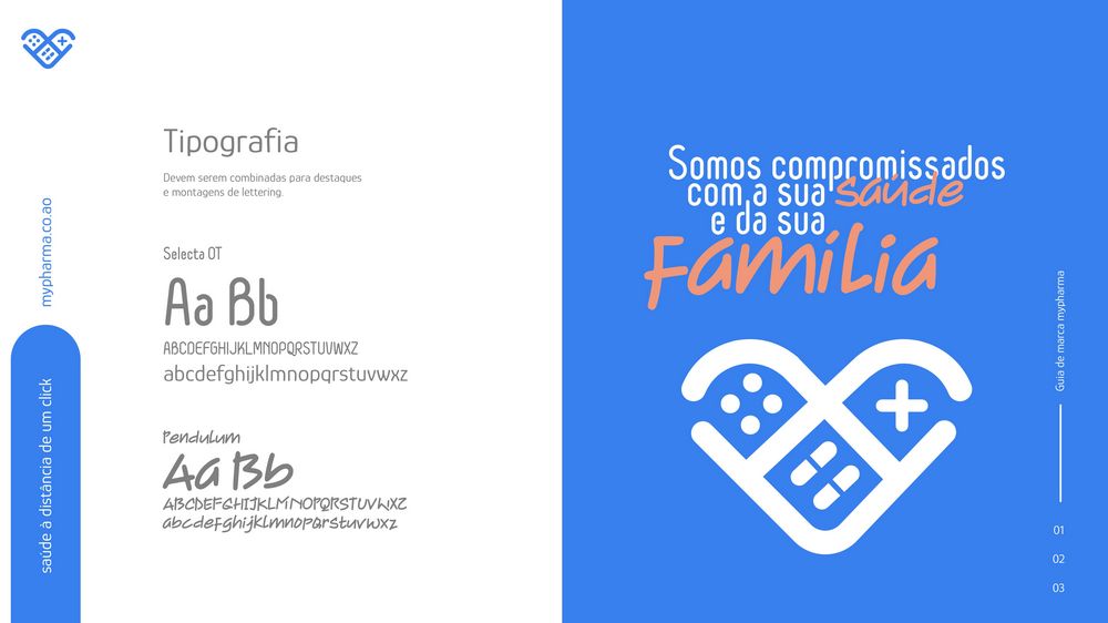
Brand guide page with the typefaces Selecta OT and Pendulum, and a poster that uses them
Typography
04 · Colour and type

Two colours, three typefaces

The palette pairs a clear blue with a warm coral. Together they give the brand both seriousness and freshness.

Glory, a Google font, sets titles and descriptions. Selecta OT and Pendulum are combined for highlights and lettering.

GlorySelecta OTPendulum
#3880EF

Blue · RGB 56, 128, 239 · CMYK 76, 50, 0, 0 · Pantone 2727 C

#F29879

Coral · RGB 242, 152, 121 · CMYK 0, 50, 51, 0 · Pantone P 45-3 C

#FFFFFF

White · the clean base behind the symbol

MyPharma · Brand in use05
05 · Brand in use

The identity across every medium

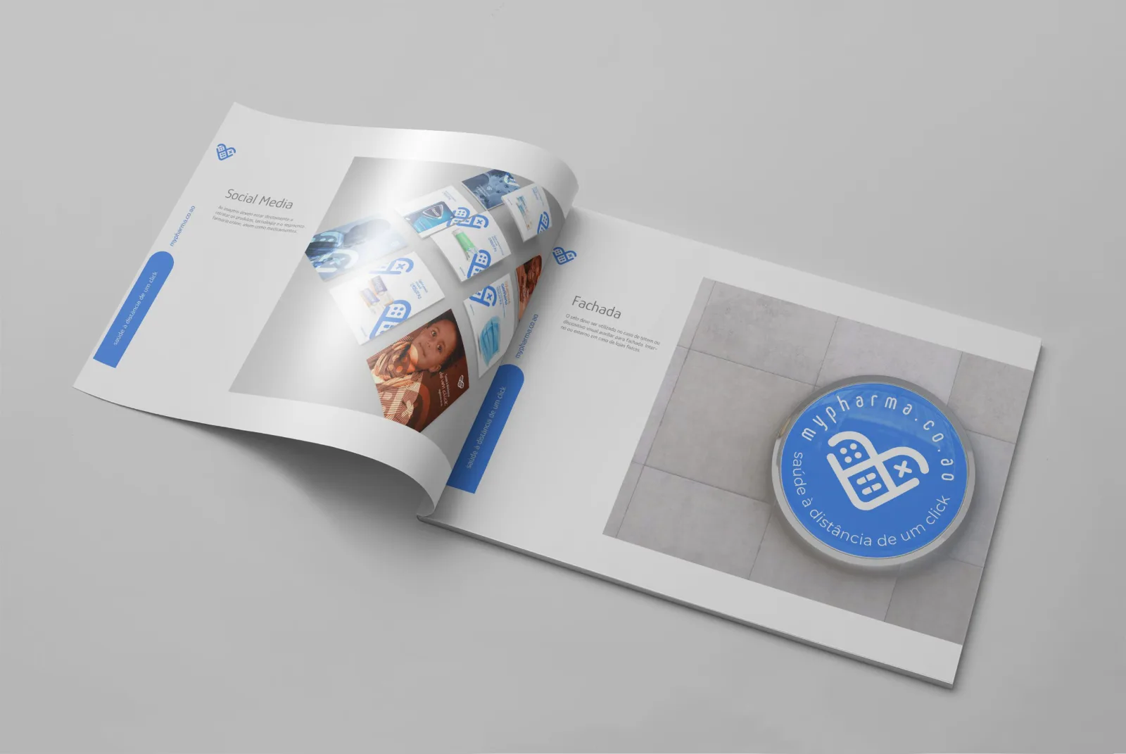
The identity was designed to work across websites, packaging, product catalogs, digital communication and institutional materials. The brand guide shows how: the logo on white and on blue, the type, the icons and the social media pieces, in print and on screen.
WebsitesPackagingProduct catalogsDigital communicationInstitutional materials
MyPharma brand guide booklet open, showing the social media and facade pages
Brand guide
MyPharma brand guide printed as a booklet, open on a grey surface
Brand guide
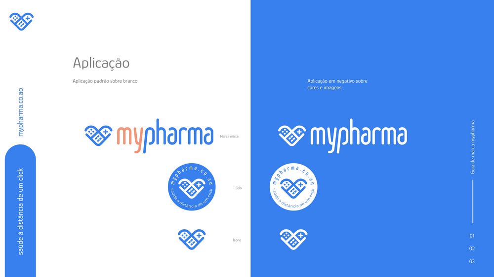
Brand guide page: the logo applied on white and on blue
Logo application
MyPharma logo: a blue heart symbol and the name, with my in coral and pharma in blue
The logo
MyPharma · Social media06
06 · Social media

Posts that bring the identity to life

The pieces bring the visual identity to life and translate the MyPharma universe into different contexts. Digital communication reinforces the brand position with clear, coherent content.


MyPharma social post about headaches, with a man touching his forehead
Headache
MyPharma social post about low immunity, with a man holding his nose
Low immunity
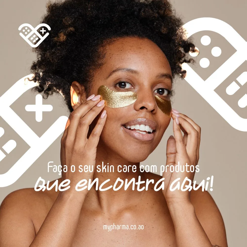
MyPharma social post about skin care, with a woman wearing golden eye patches
Skin care
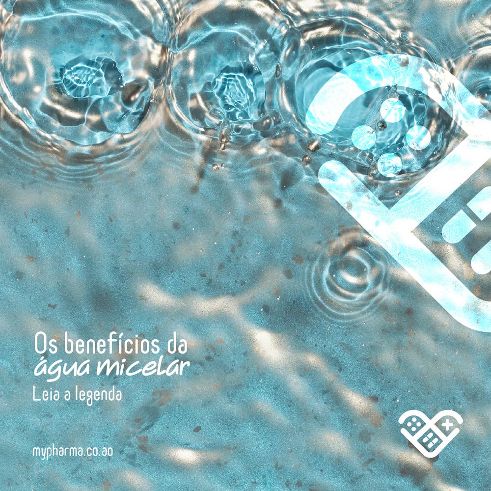
MyPharma social post about micellar water, over a water surface
Micellar water
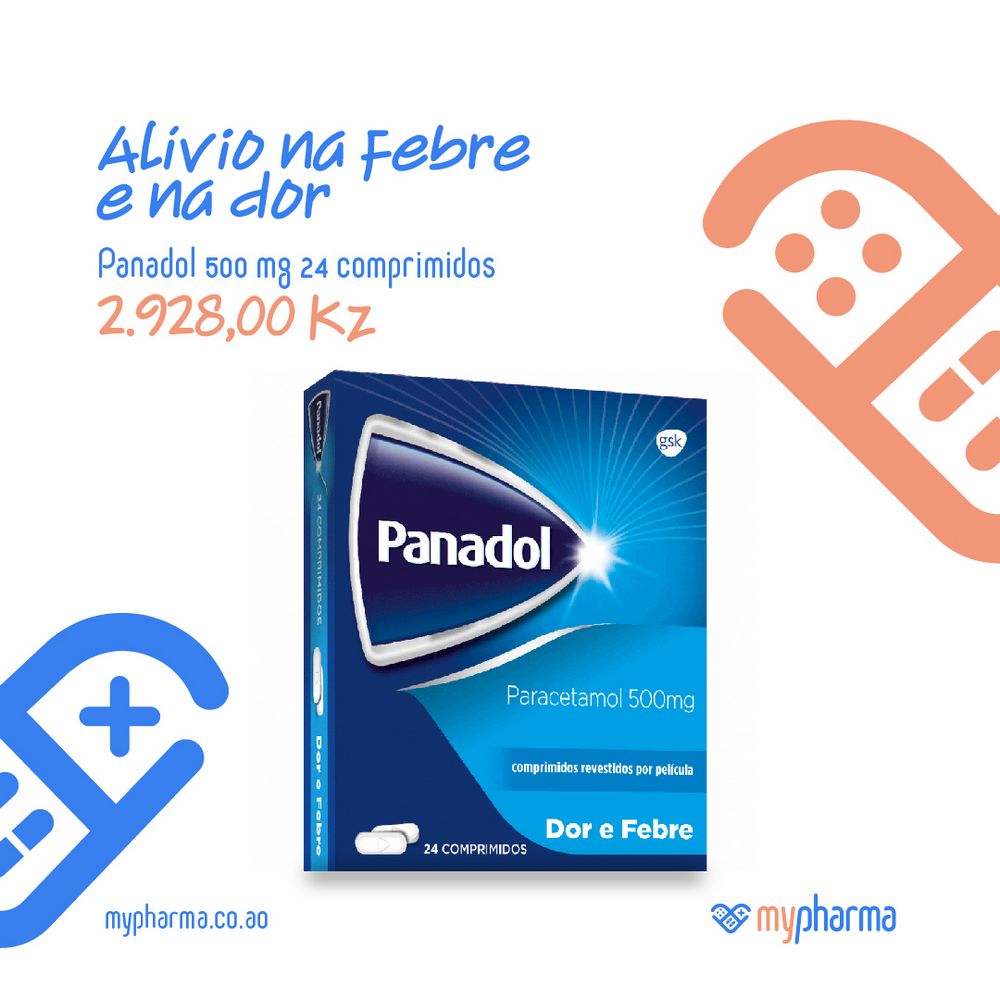
MyPharma social post for Panadol, with the coral symbol
Fever and pain
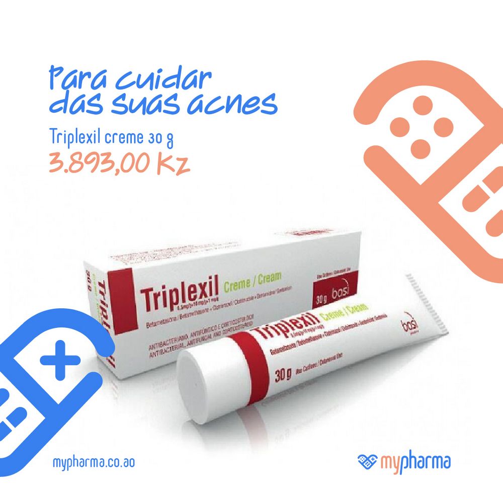
MyPharma social post for Triplexil acne cream, with the coral symbol
Acne care
MyPharma · Result07
07 · Result

A confident, professional brand

The project built a modern and structured visual presence for MyPharma. It strengthens credibility, coherence and impact. The identity and the materials place the brand with confidence and professionalism, and they open space for new markets and new communication opportunities.

CredibilityA modern, structured presence for a pharmaceutical brand.
CoherenceOne identity across websites, packaging, catalogs and digital media.
ImpactA confident, professional voice, ready for new markets.
The brand line, in Portuguese

saúde à distância de um click

Health, one click away.

Credits
Creative / Art DirectorRafa Ministro
Social StrategistAmanda Cunha
CopywriterVerônica Bachini
PhotographyRoyalty Free
CompanyBIGhub
My role

Art direction, brand identity and social media.

I worked as Creative and Art Director on MyPharma. I created the brand identity and the brand guide (2022), and I developed the social media pieces together with the social strategist and the copywriter.

Let’s talk.
Open to remote Creative Art Director roles.
Based in
Lisbon · Portugal