Rafa Ministro

T-Express

CANADA | Branding & Visual Identity, On/Offline Design, Webdesign

01 · The idea

A logistics brand, rebuilt for speed

T-Express is a logistics brand from Canada. The old identity used excessive lines to show speed and movement, and they hurt readability. The rebrand made the graphics simpler so the name reads clearly, and it kept the red and a sense of motion.

6Modules
39Visuals
13Applications
40Years celebrated
3Disciplines
02 · The system

One symbol. Red and black.

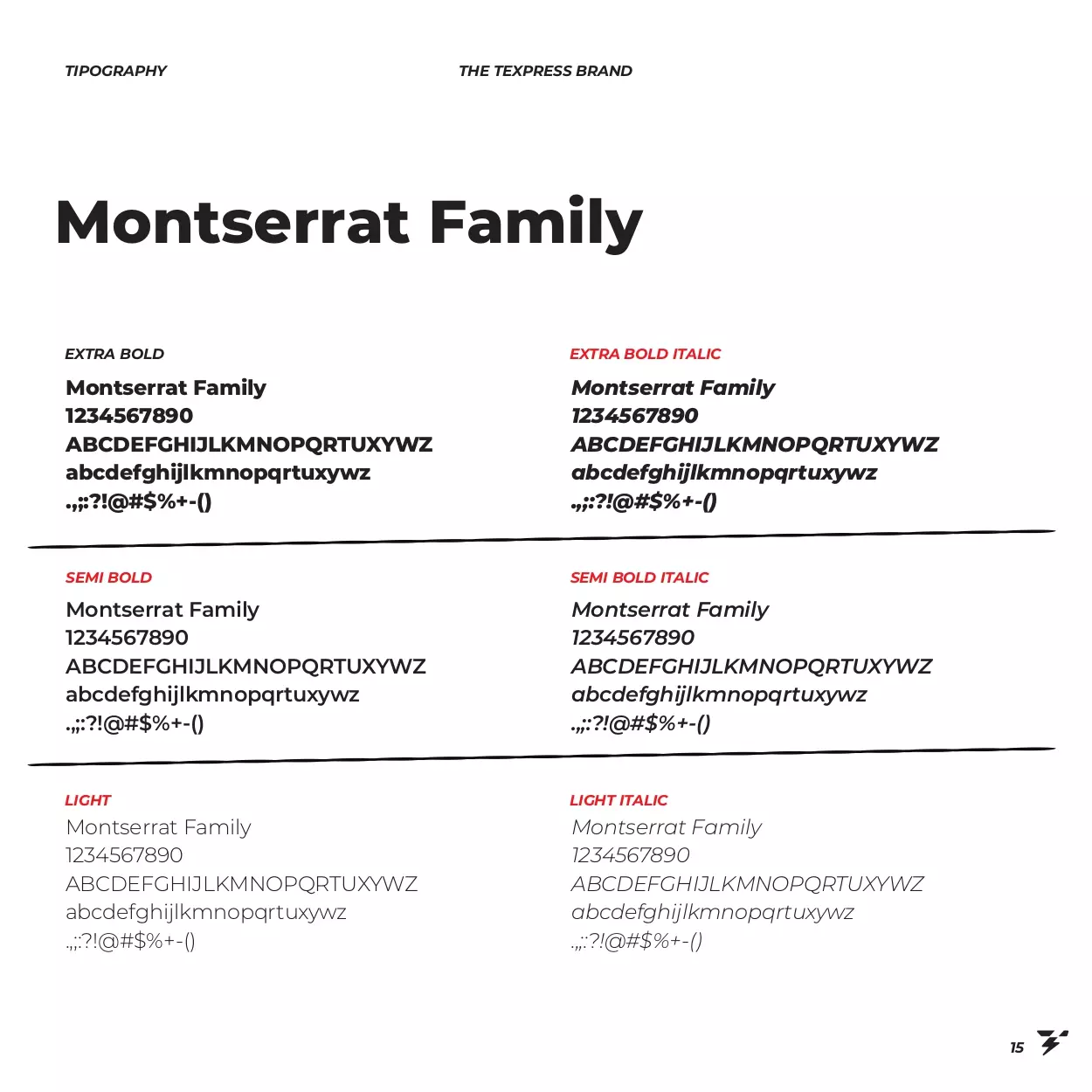
The new symbol fuses the letter T with a lightning bolt to show energy and speed. The colour sheet sets traditional red at 85% and black at 15%, and the type sheet shows the Montserrat family.

Colour
Red #EE3239Pantone Warm Red C · 85%
Black #37343515%
Typeface
AaMontserrat
Slogan
When you think of logistics
Concept
T+Lightning bolt=Symbol
T-Express
03Rebranding
03 · Branding & Visual Identity

Rebranding

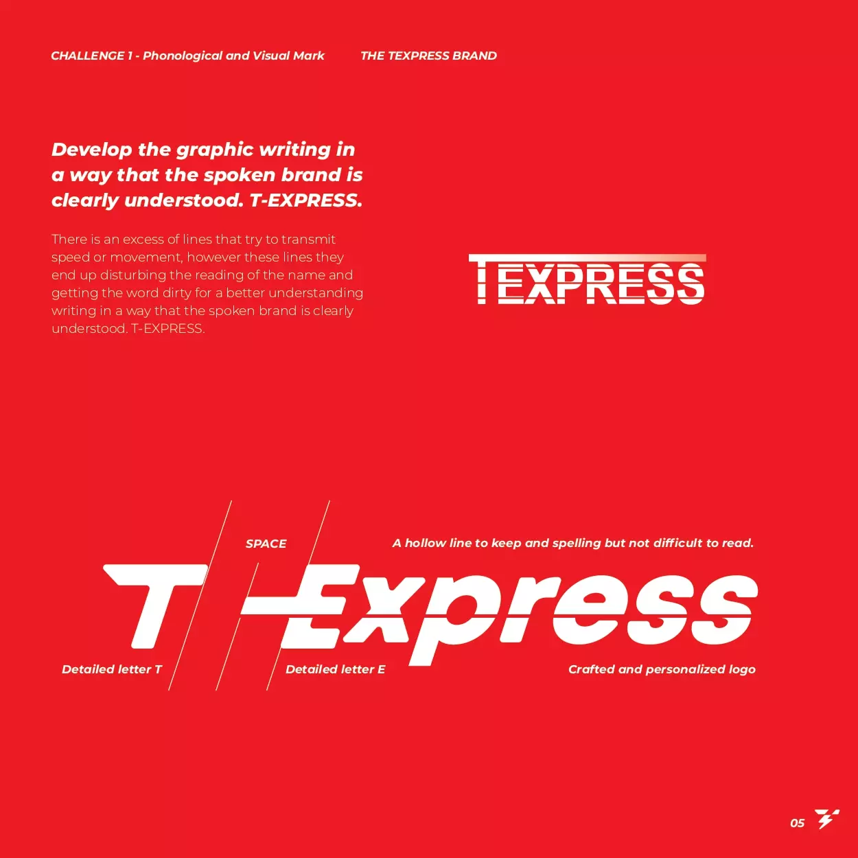
Excessive lines meant to show speed and movement were hurting readability and cluttering the composition. To make the brand name clearly recognised, the graphic elements had to be simpler.

The result is a solid, custom logo that fixes the phonetic readability and strengthens the brand identity. The new version keeps the red and a sense of motion, with one line that recalls the memory of the previous identity. Extra elements were removed, so the brand is clearer and has more impact.
T-ExpressLogoRedMotion
T-Express rebrand sheet in red with the logo
Rebrand sheet
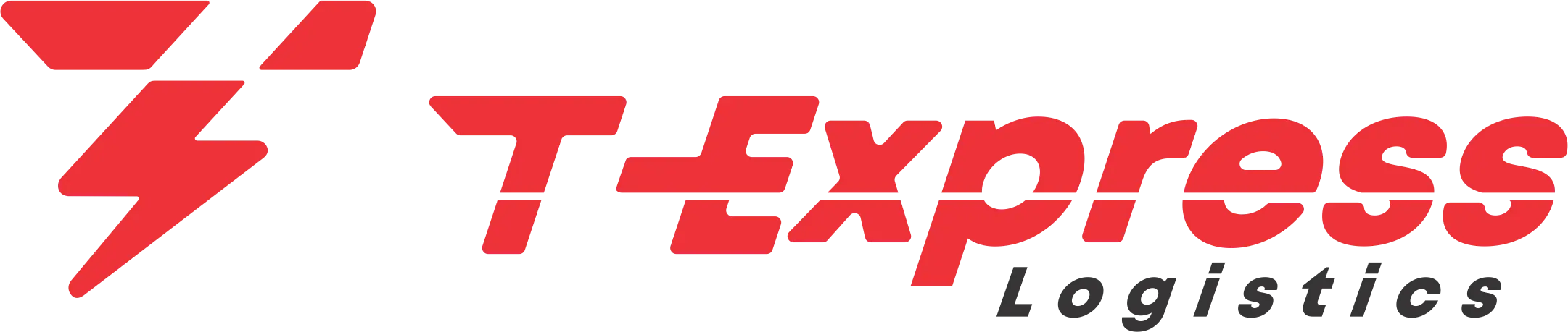
T-Express Logistics logo in red
Final logo
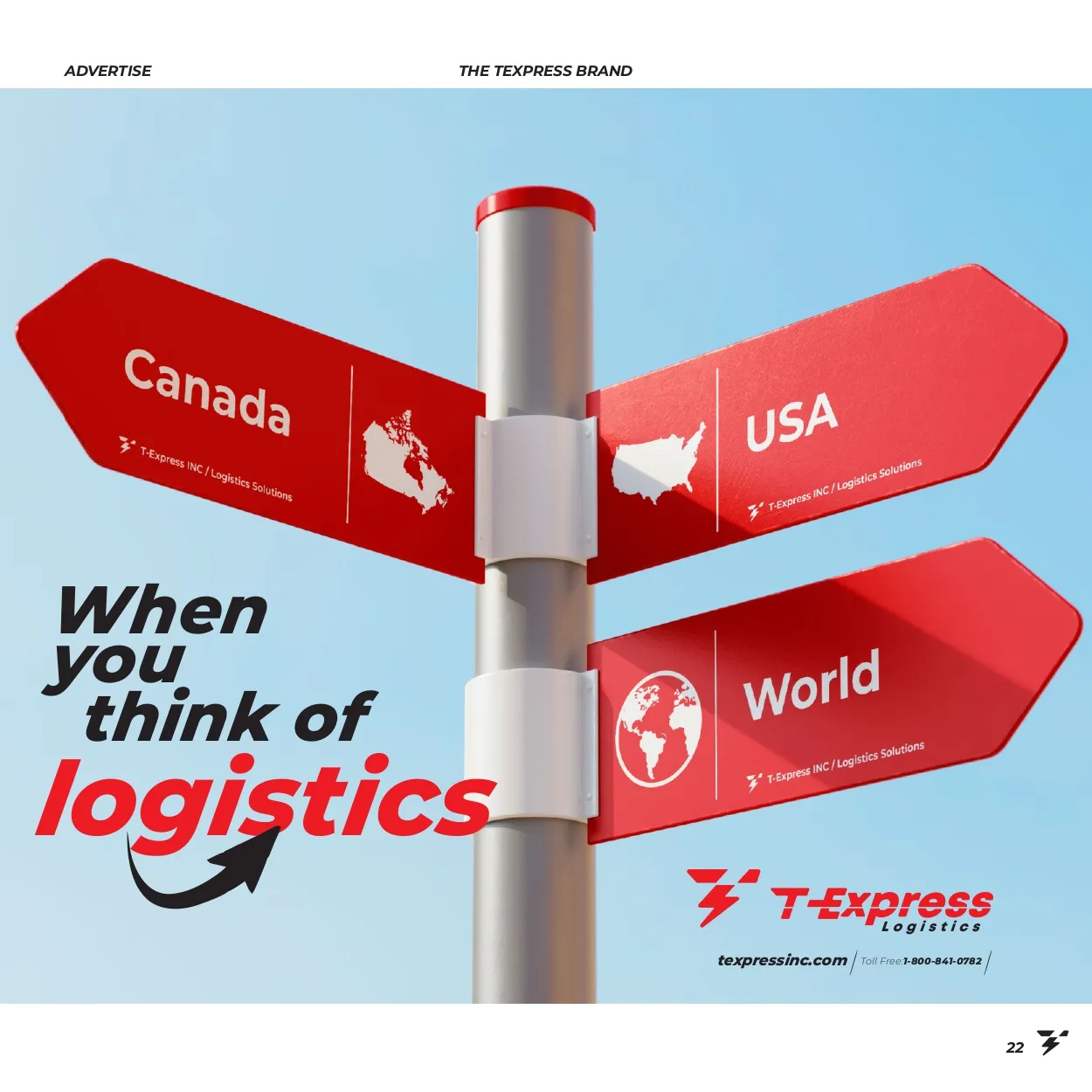
Signpost pointing to Canada, USA and World
Canada · USA · World
The symbol

A T and a lightning bolt

The developed symbol fuses the letter T with a lightning bolt, detailed to emphasise dynamism and energy. This composition subtly and effectively communicates the brand name and its activity.
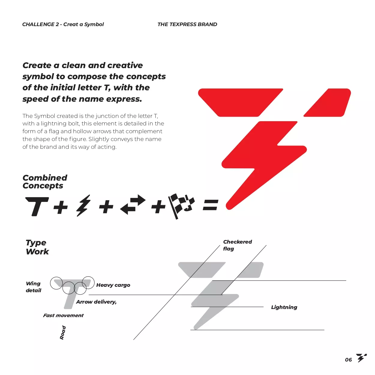
T-Express symbol construction: a T and a lightning bolt
Symbol construction
Slogan: When you think of logistics
The slogan
T-Express
04Identity system
04 · Identity system

Logo, colour, type and the brand in use

The identity works as a system: three logo versions, a colour sheet, a type sheet, three photo mockups and thirteen applications, from signs and stationery to vans, a plane, shirts and posters.

Logo versionsColourTypographyApplications
Logo versions

One mark, three versions

The logo comes in red, black and white, so it fits any background.
T-Express Logistics logo in red
Red
T-Express Logistics logo in black
Black
T-Express Logistics logo in white
White
Colour and type

Red, black and Montserrat

The colour sheet gives traditional red as HEX EE3239 (Pantone Warm Red C) and black as HEX 373435. The type sheet shows the Montserrat family.
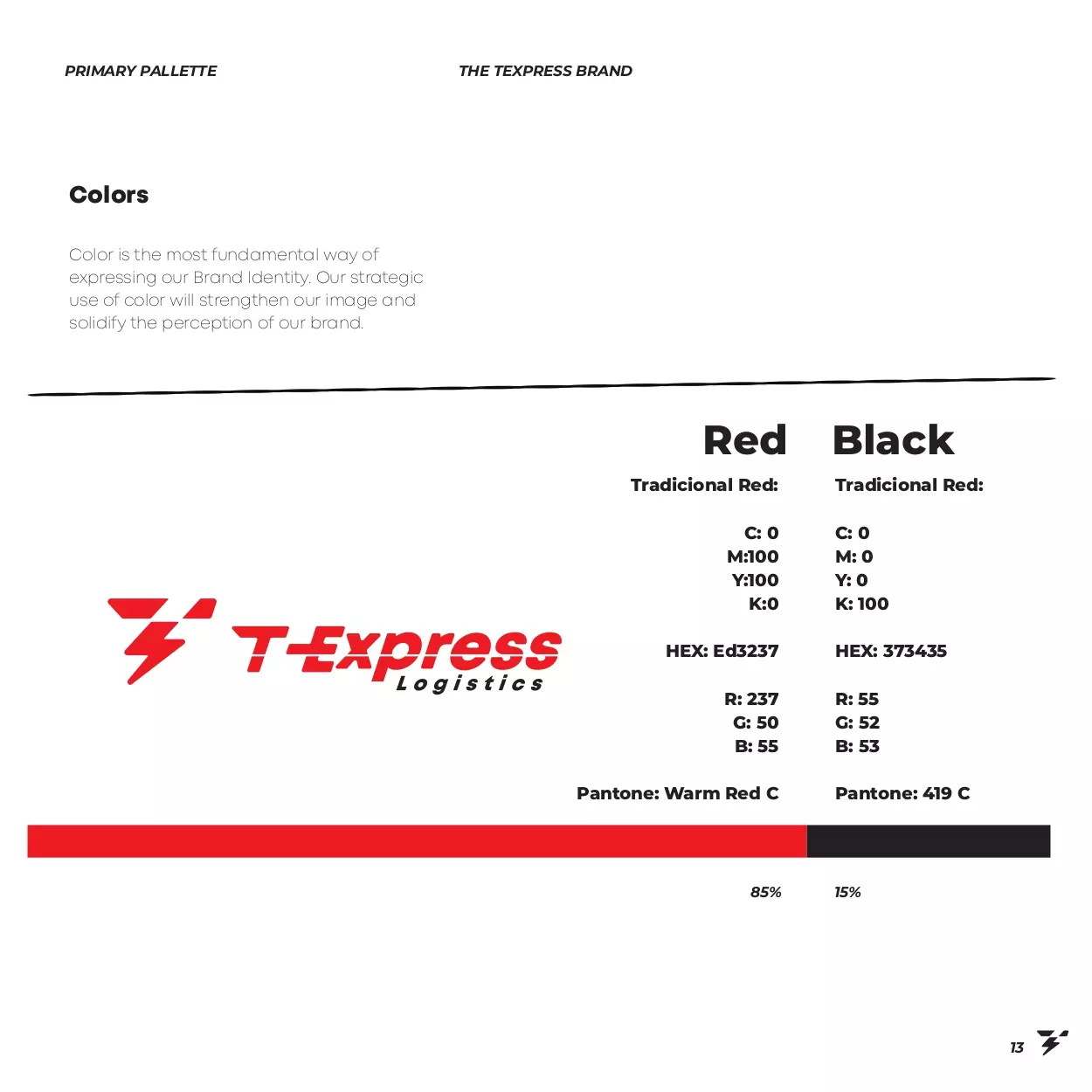
T-Express colour sheet: red and black with HEX, RGB, CMYK and Pantone values
Colour sheet
T-Express type sheet: the Montserrat family
Type sheet
The brand in space

Real places, real surfaces

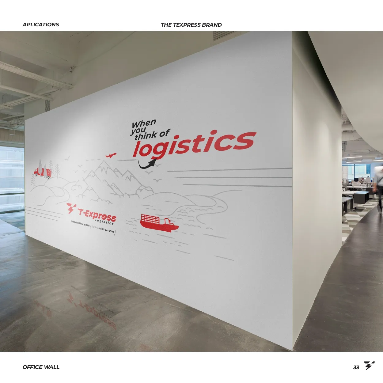
Three photo mockups show the brand on a building sign, on stationery and inside an office.
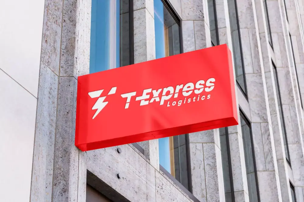
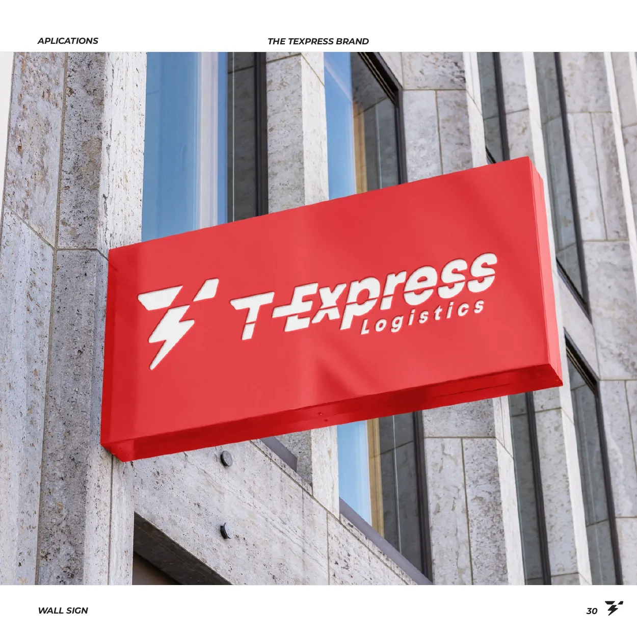
T-Express sign on a building facade
Building sign
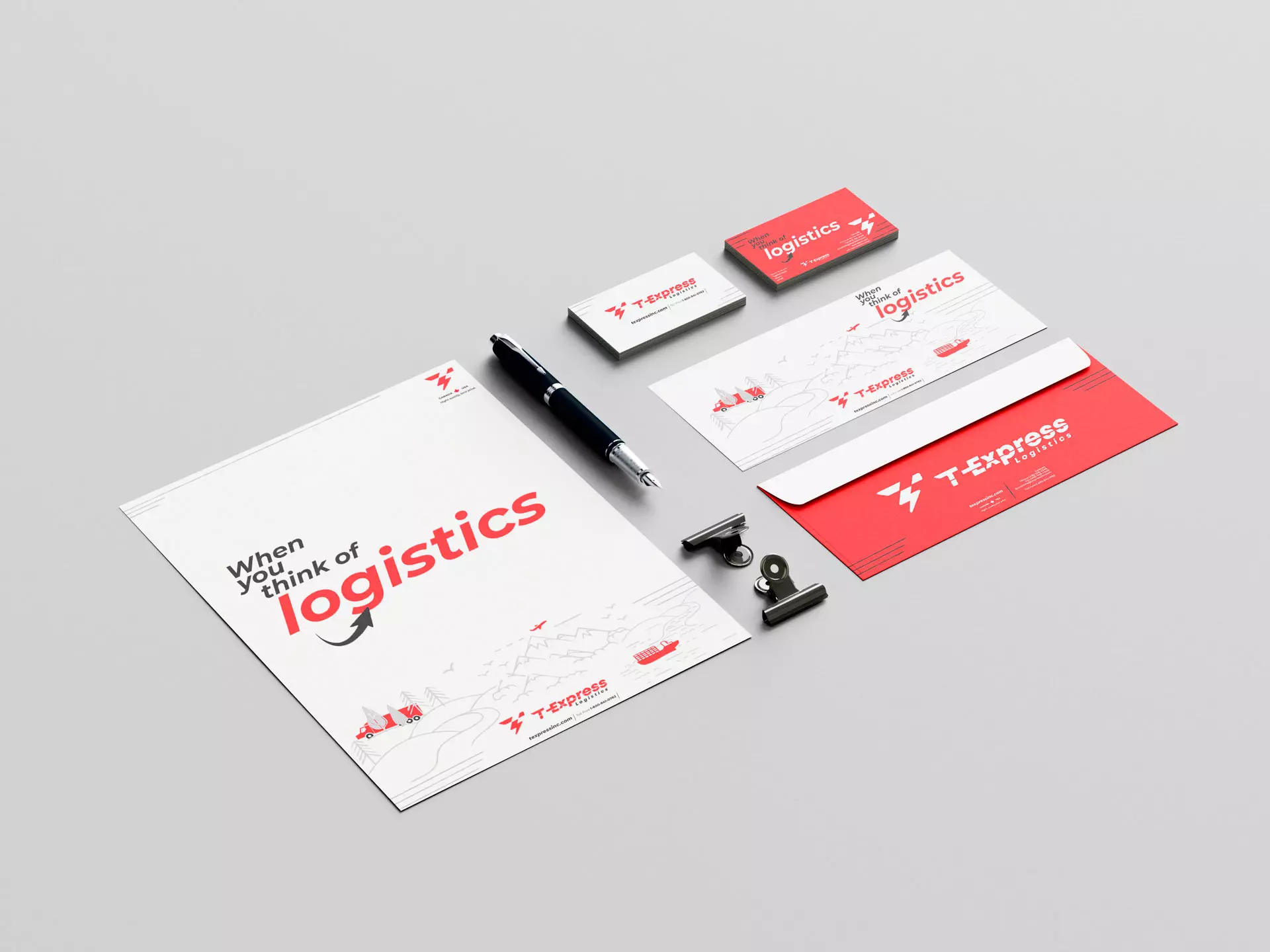
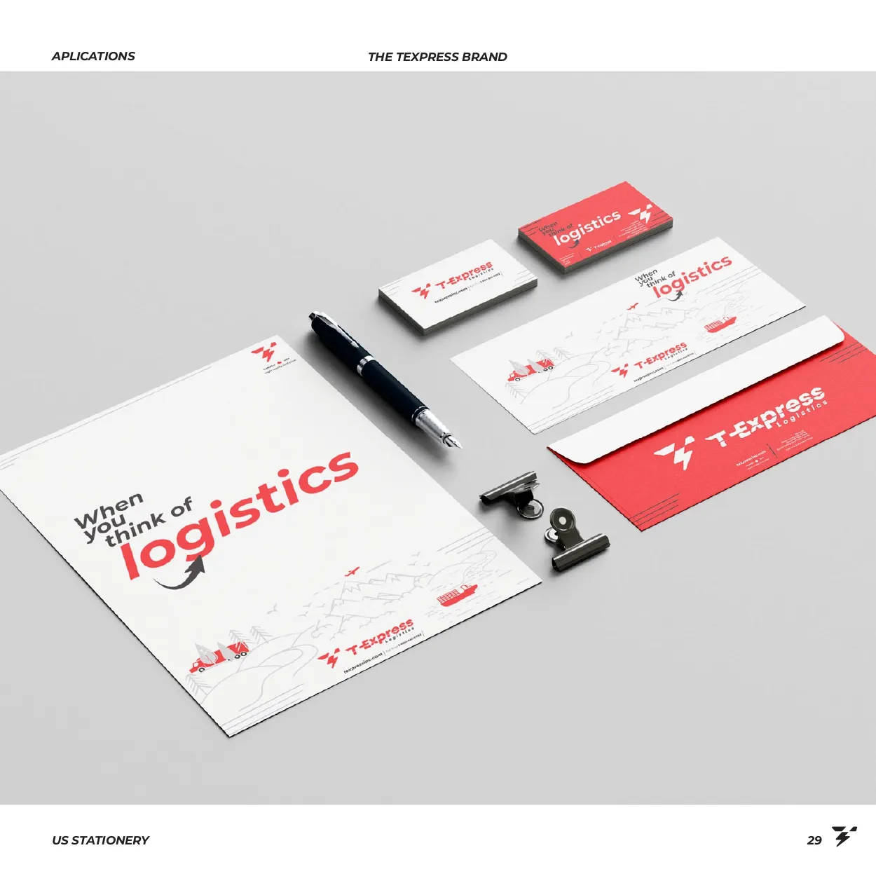
T-Express stationery: cards, envelope and folder
Stationery
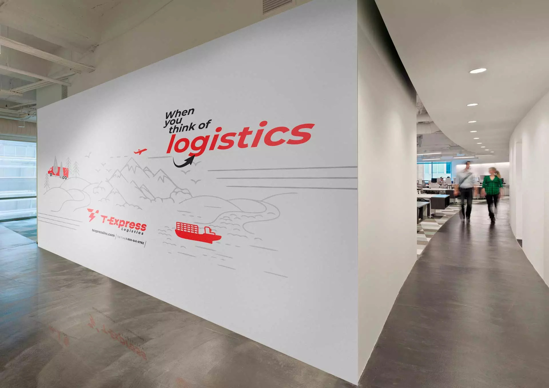
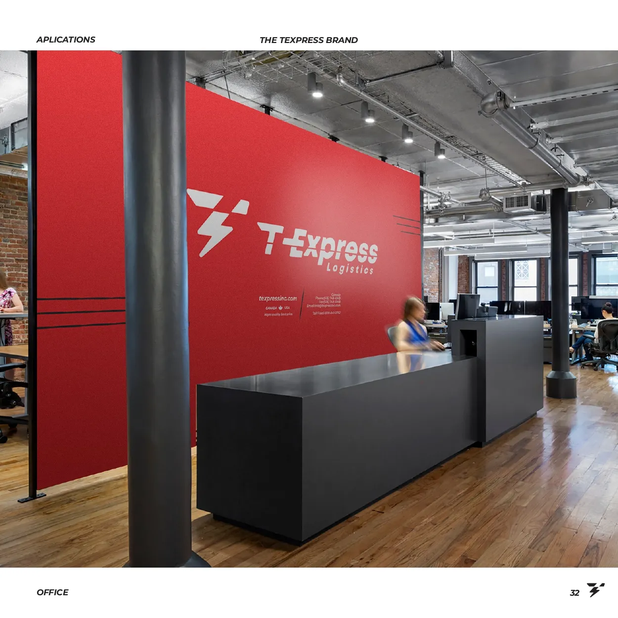
T-Express office wall with the slogan and line-art graphics
Office wall
The brand in use

Thirteen applications

Tap any image to see it larger.
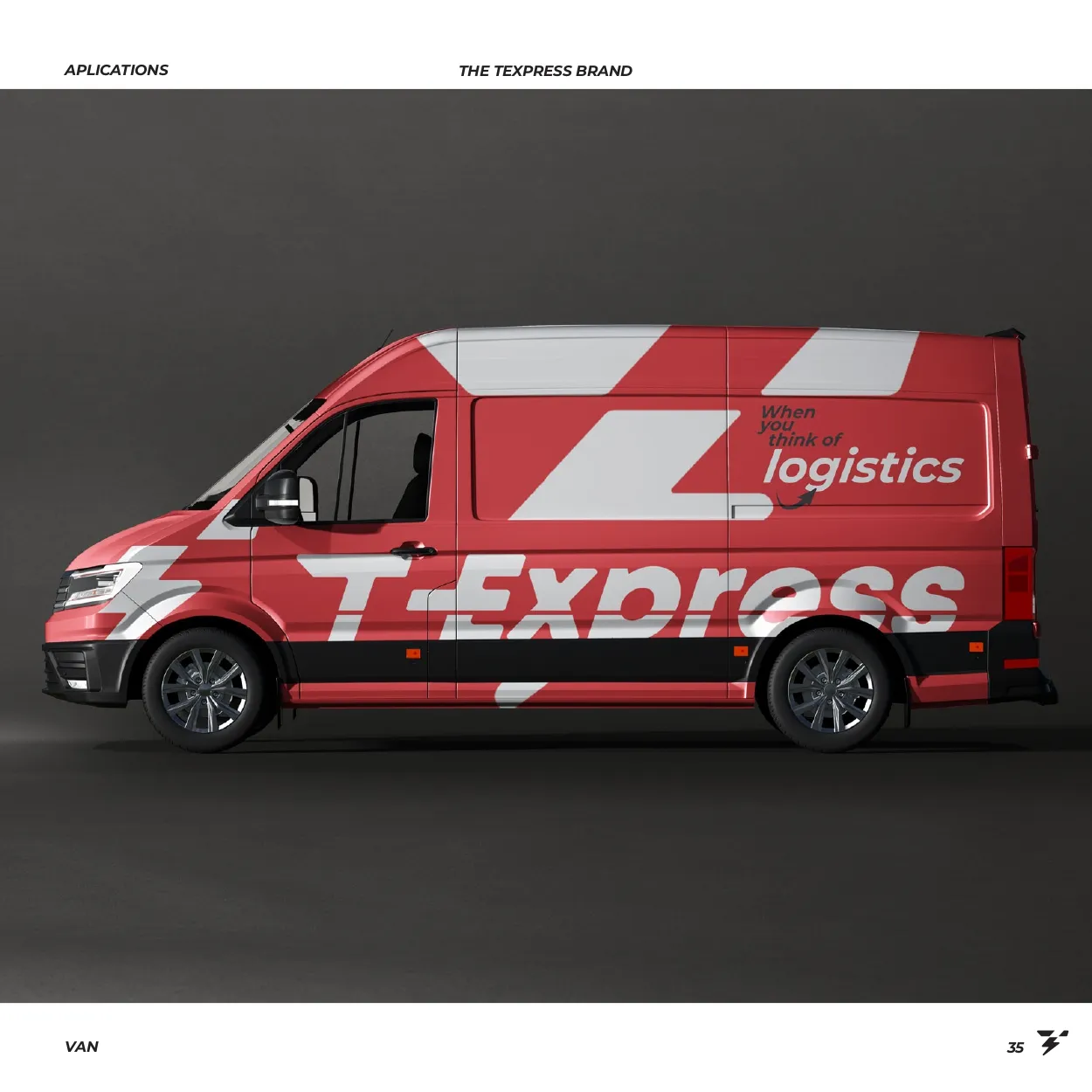
T-Express delivery van
Van
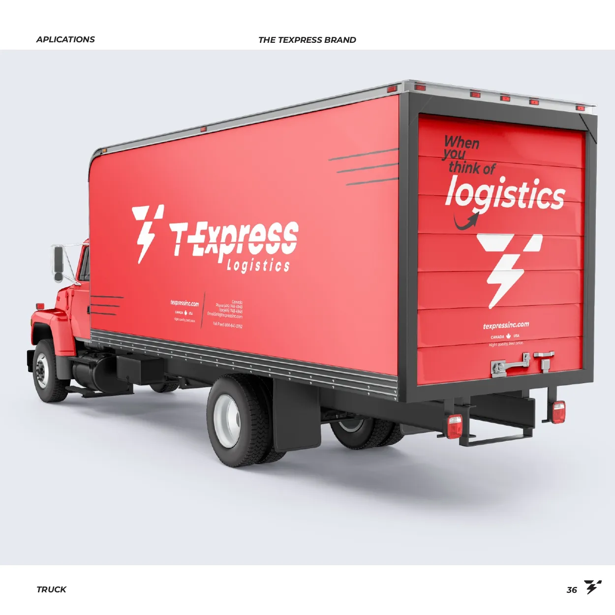
T-Express box truck
Truck
T-Express sign on a building
Building sign
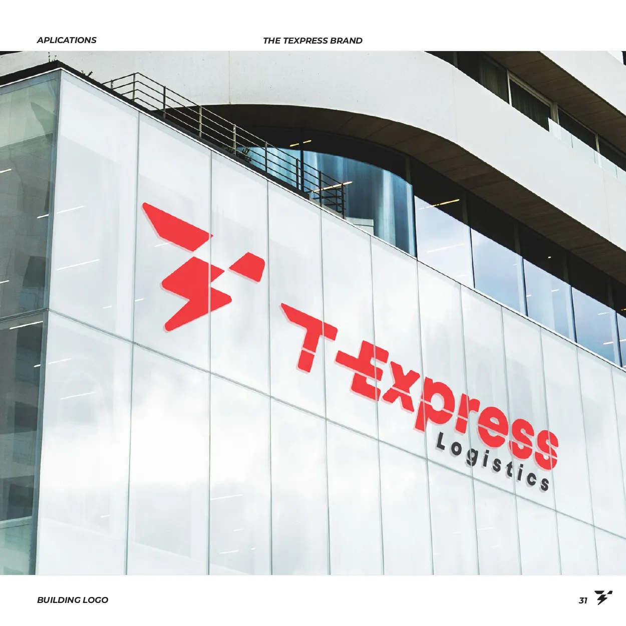
T-Express logo on a glass facade
Glass facade
T-Express reception wall
Reception wall
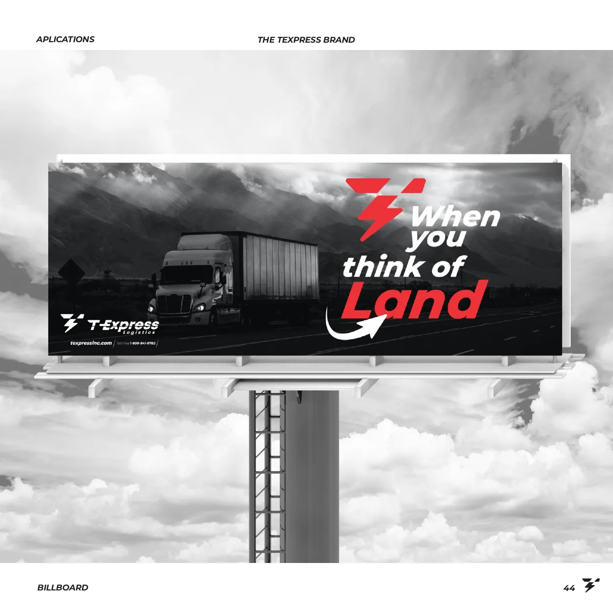
T-Express billboard: When you think of Land
Billboard
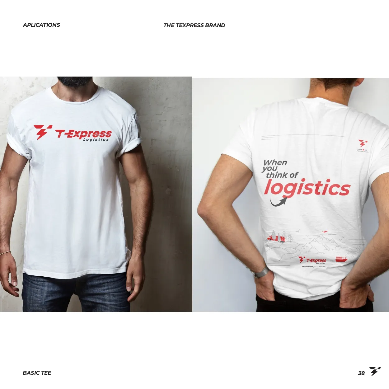
T-Express T-shirts, front and back
T-shirts
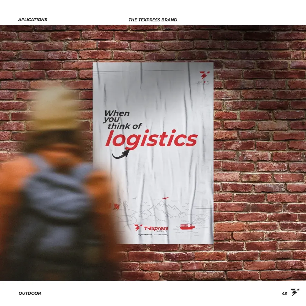
T-Express poster on a brick wall
Poster
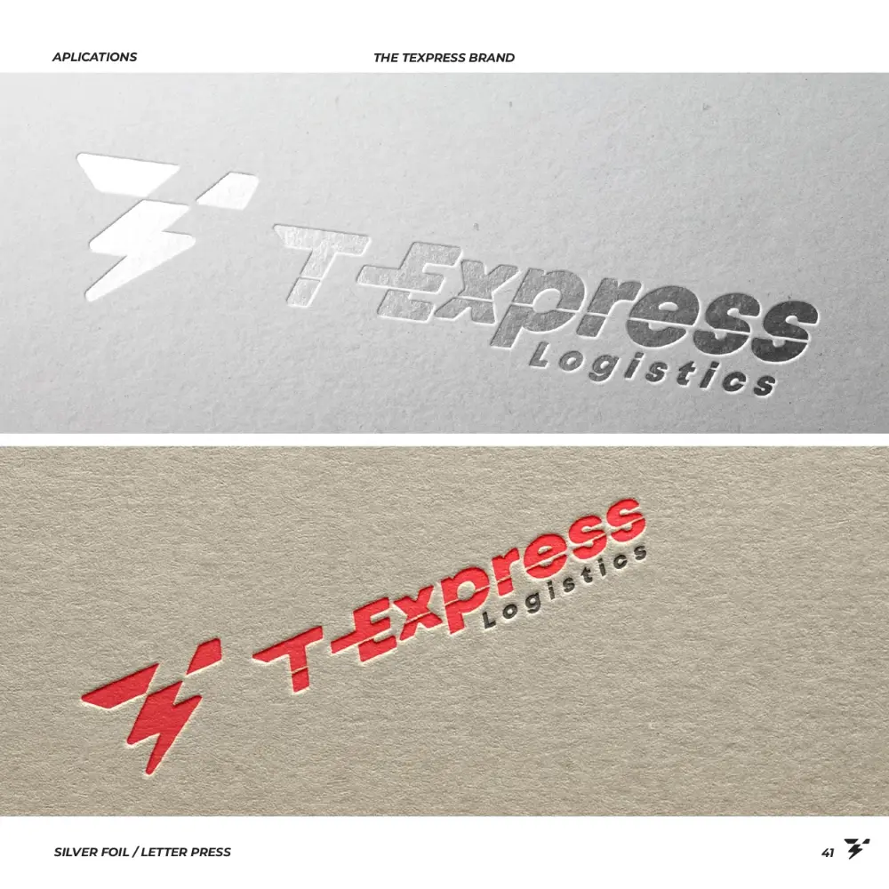
T-Express logo in print finishes
Logo print
T-Express stationery on a desk
Stationery
T-Express office wall with graphics
Office wall
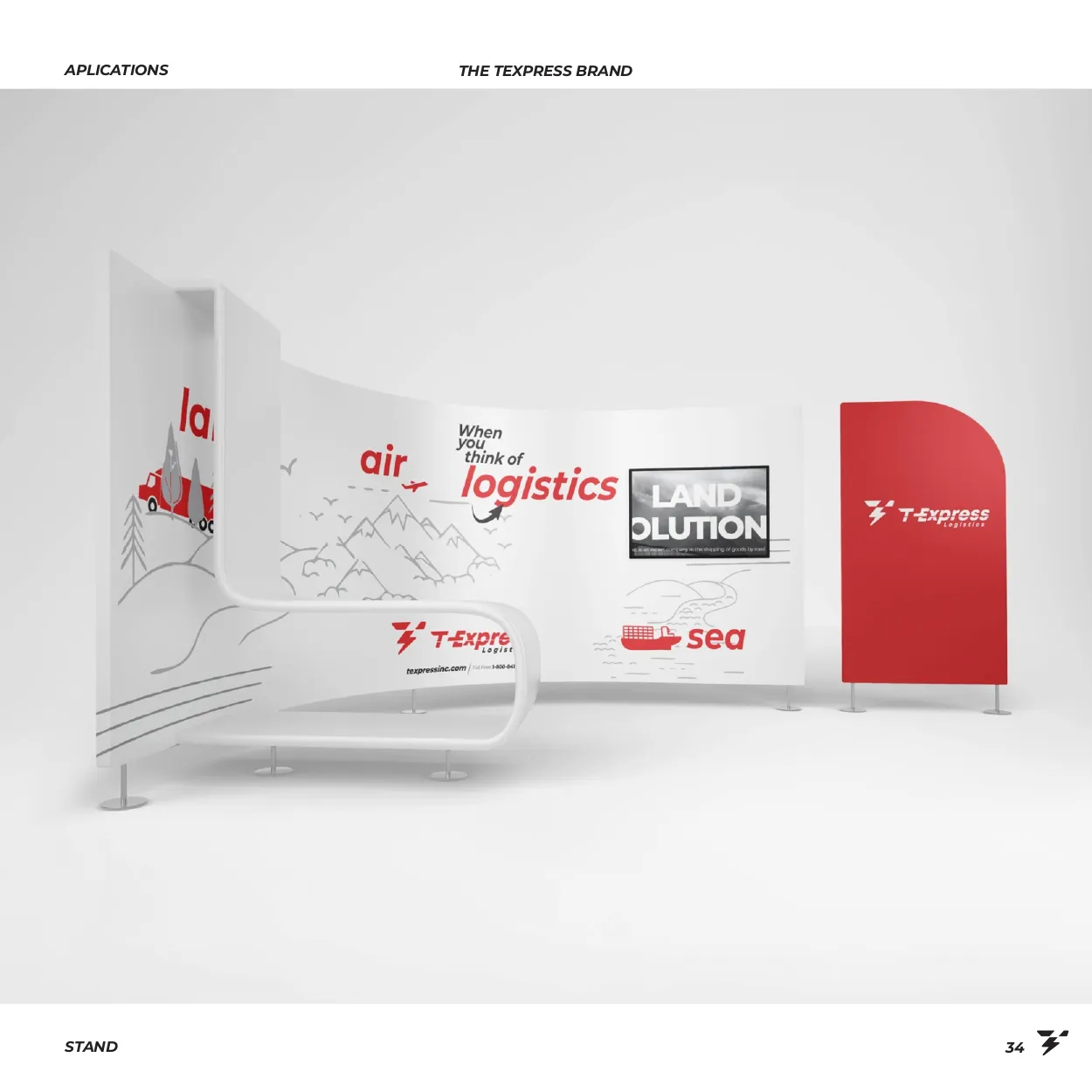
T-Express display stand
Display stand
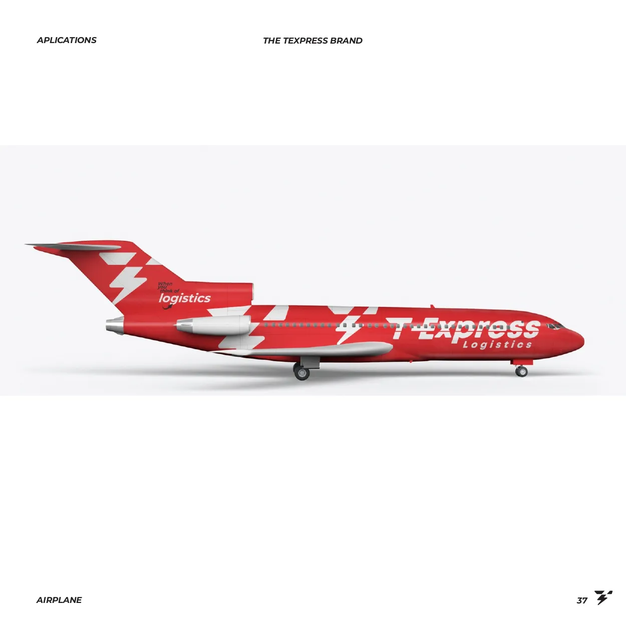
T-Express plane
Plane
T-Express
05Advertise
05 · T-Express

Advertise on air, sea and land

Extra details were added to show speed and versatility. This makes the brand easier to apply and allows a symbolic use that did not exist before.

Symbol and logotype together make the brand more dynamic and conceptual. It clearly says its name and adapts easily to different applications. The new identity was also built with strict technical rules, so it keeps a standard, a balance and a good use of colour.
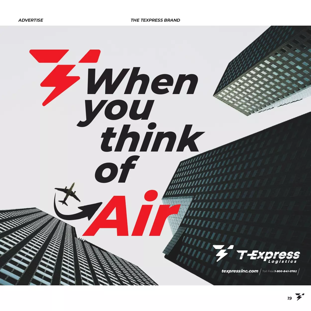
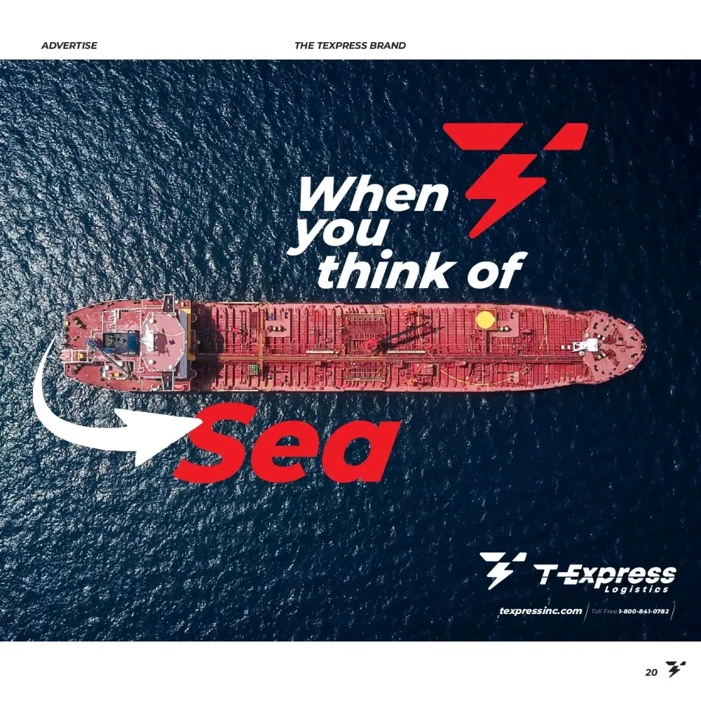
AirSeaLand
Poster: When you think of Air
Air
Poster: When you think of Sea
Sea
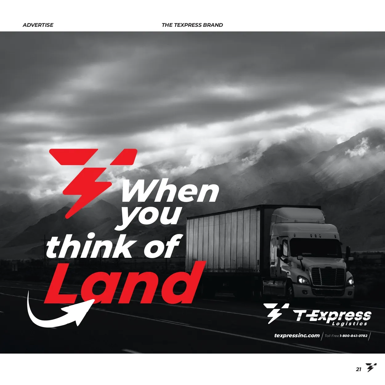
Poster: When you think of Land
Land
Signpost poster: When you think of logistics
Logistics
T-Express
06Celebrate 40 years
06 · T-Express

Celebrate 40 years

The graphic concepts reinforce the brand communication and set it apart from the corporate identity.

AnniversaryGraphicsLine art
Line-art concepts

Air, sea and road

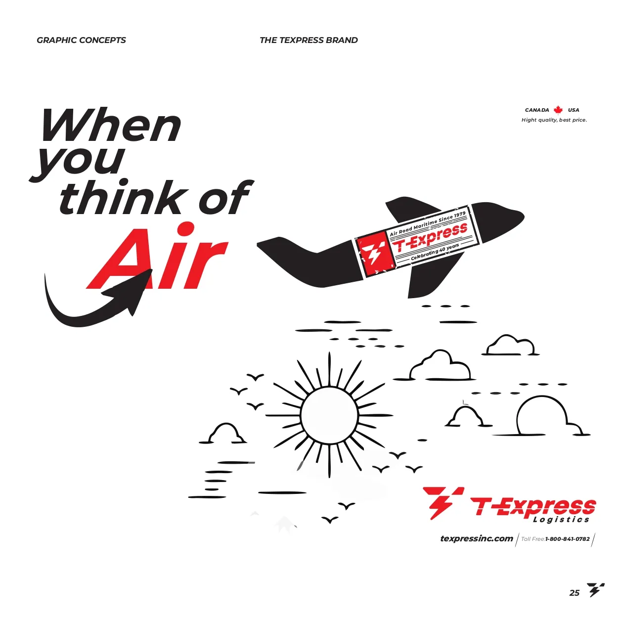
Line-art illustration: When you think of Air
Air
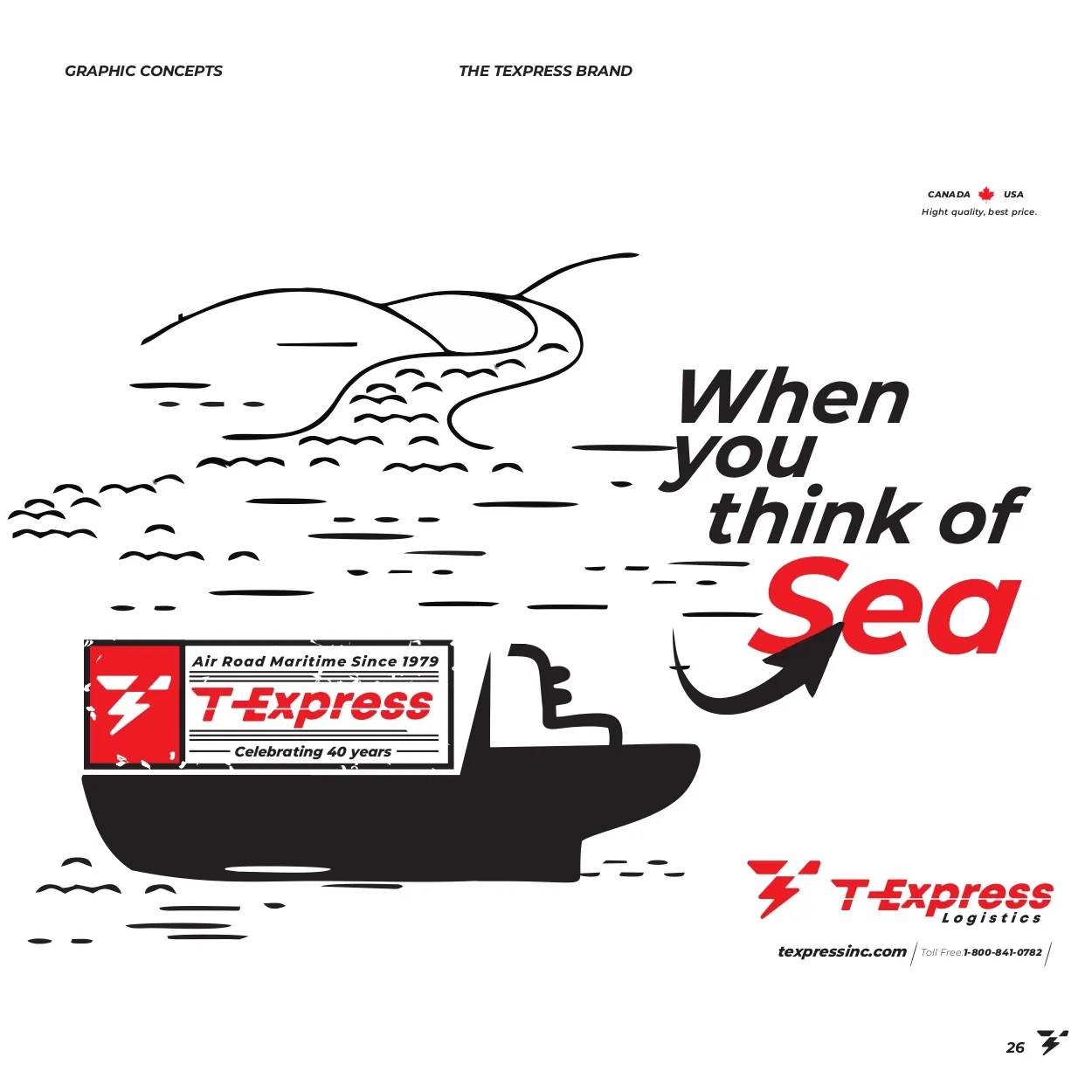
Line-art illustration: When you think of Sea
Sea
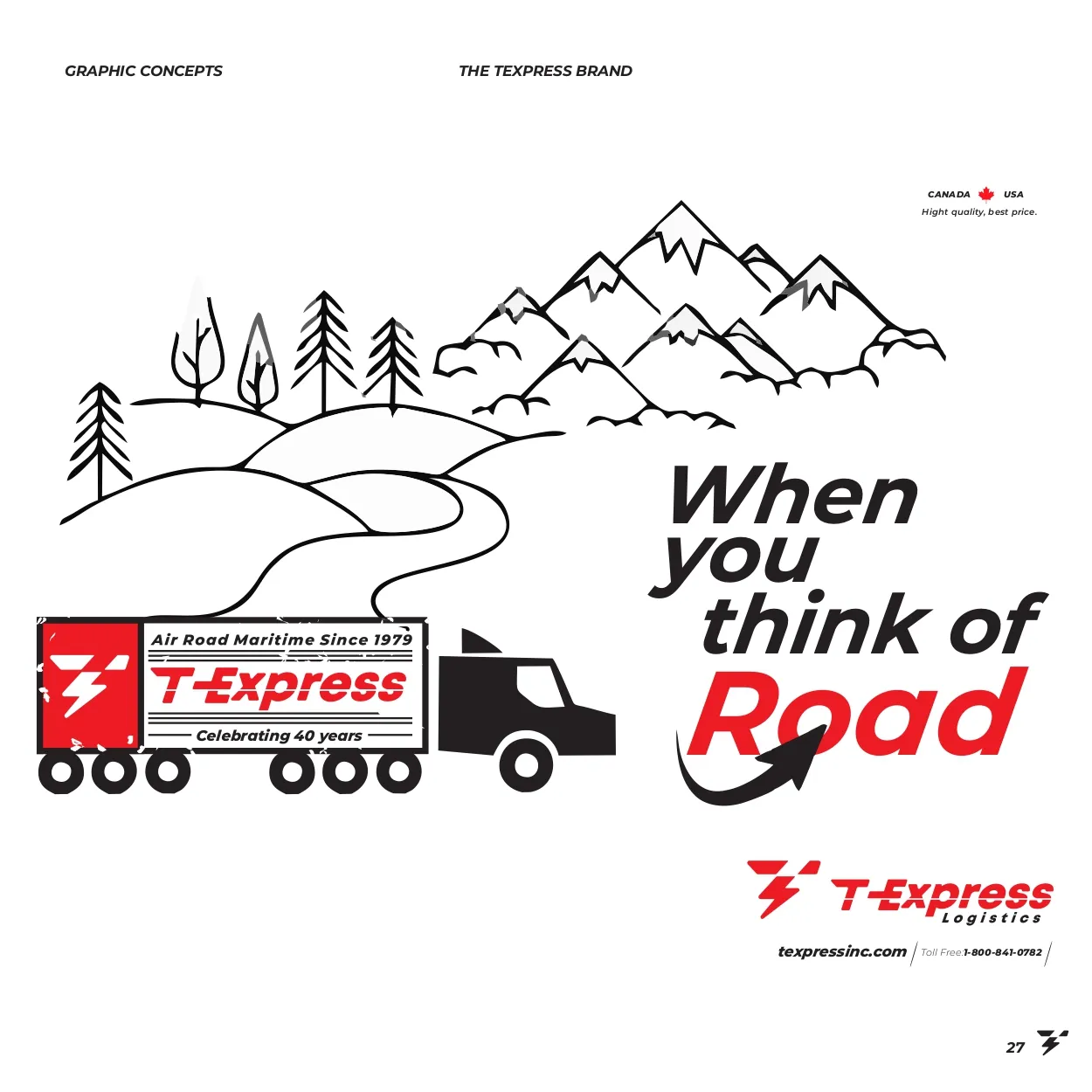
Line-art illustration: When you think of Road
Road
Graphics that engage

A distinctive visual language

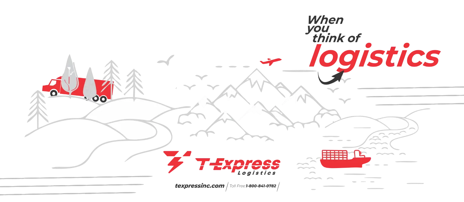
With these elements, graphics were built to speak directly to the audience, using a distinctive and immersive visual language.
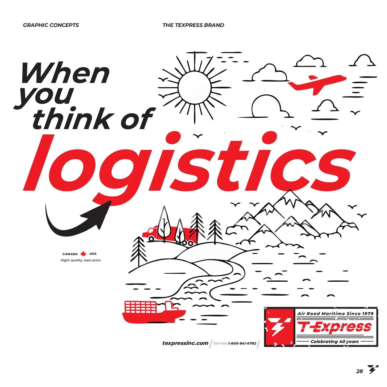
Line-art illustration: When you think of logistics
Logistics
Line-art illustration of trucks, a ship and a plane with the slogan
Line-art illustration
T-Express
07Website
07 · Webdesign

Website

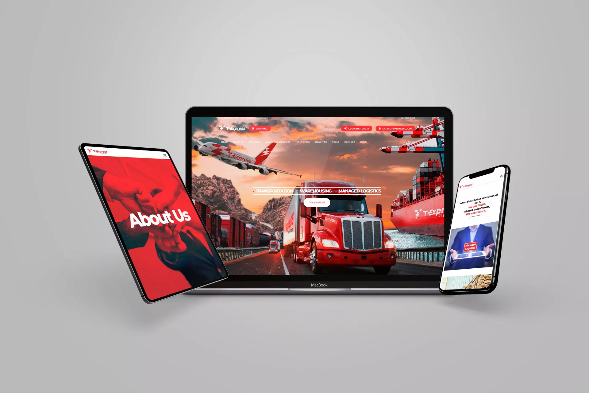
The new website reflects the evolution of the brand. It turns the renewed identity into a modern, intuitive and engaging digital experience.

The design follows the rebrand. It gives smooth navigation, clear communication and strong visual impact, so the brand stands out and shows its values.
WebdesignNavigationVisual impact
T-Express website shown on a laptop, a tablet and a phone
Website
The experienceModernIntuitiveEngaging
T-Express
08Results
08 · Results

Results

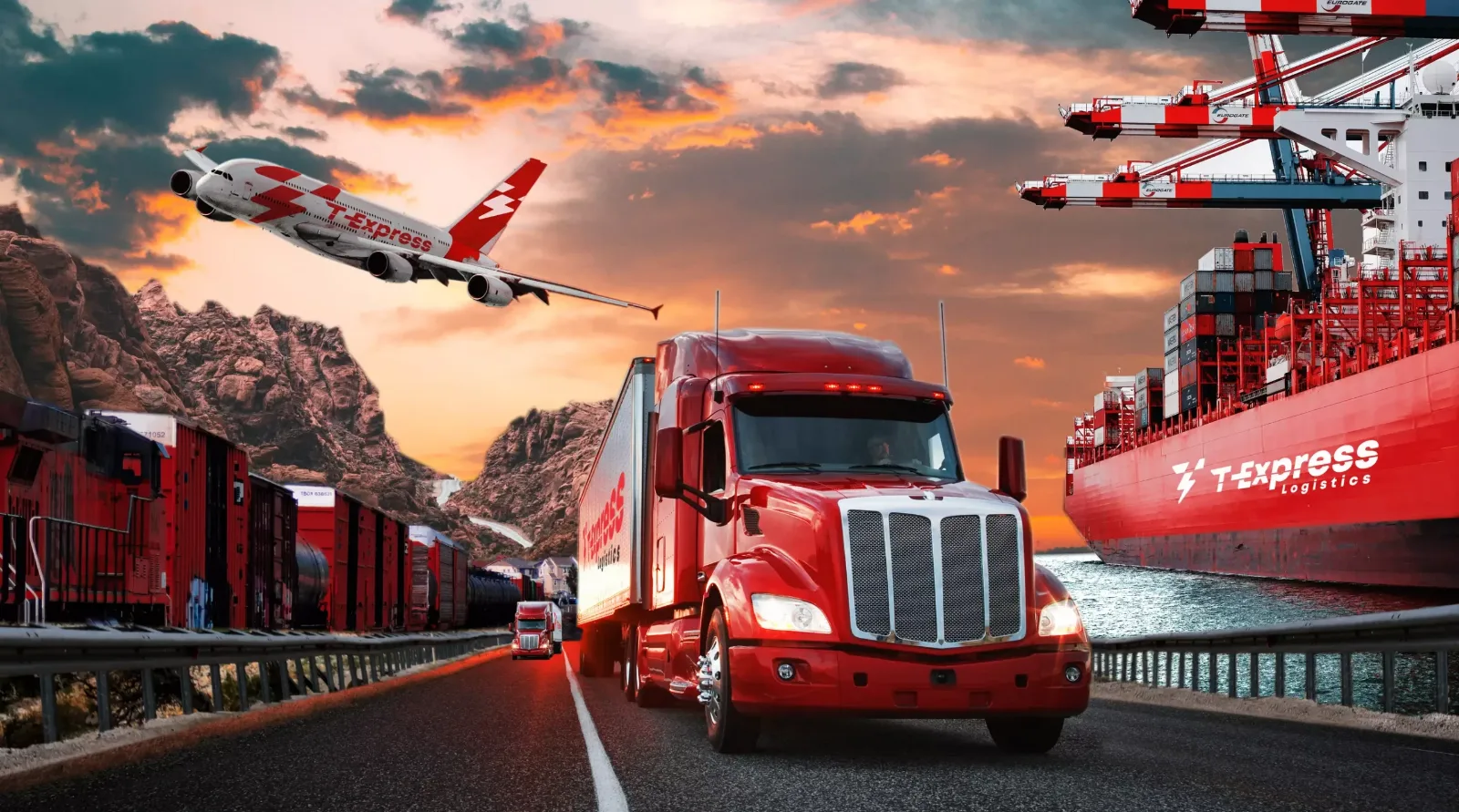
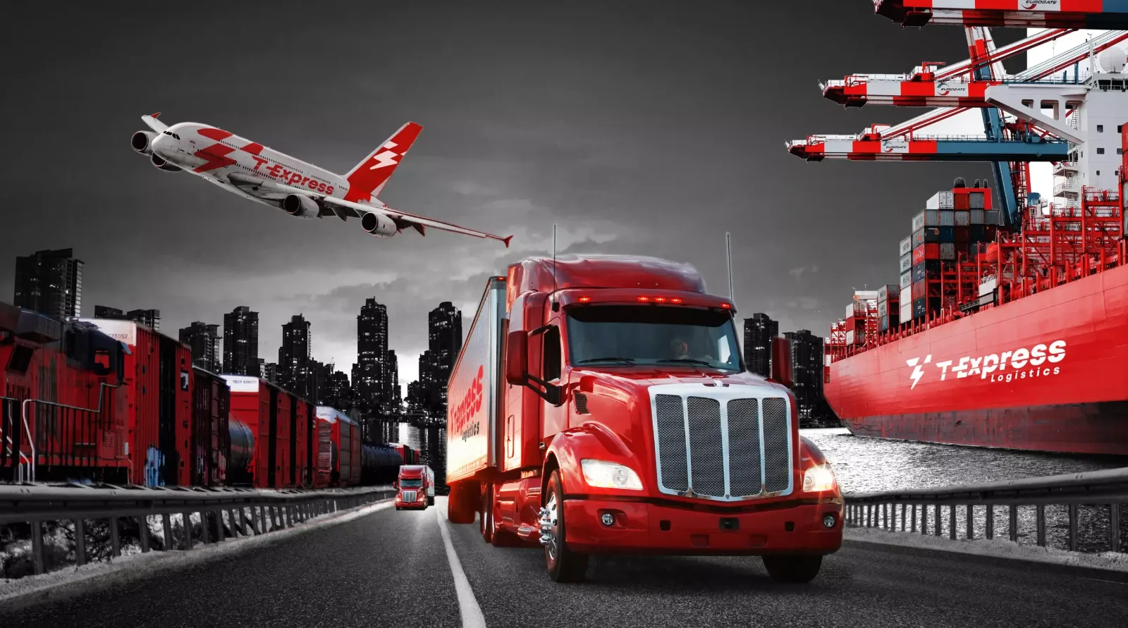
Campaigns, advertising, concept and marketing strategies strengthened the presence of the brand, consolidating its identity and expanding its reach. Communication became more direct and impactful, which brought higher audience engagement and stronger brand positioning.

The mix of visual elements, strategic narratives and digital activations made the connection with the target audience more effective. It led to more recognition, more conversions and more market impact.
CampaignsAdvertisingStrategy
T-Express truck, plane and ship in a dramatic landscape
Truck, plane and ship
T-Express truck, plane and ship at a port
At the port
EngagementHigher audience engagement.
PositioningStronger brand positioning.
RecognitionIncreased recognition and conversions.
Market impactA wider reach for the brand.
The brand line

When you think of logistics

The line appears on the signs, posters, vehicles and sheets across the whole system.

My role

Art direction, concepts and key visuals.

I worked as Art Director on the T-Express rebrand. I created the concepts and the key visuals across branding and visual identity, on and offline design, and webdesign.

Let’s talk.
Open to remote Creative Art Director roles.
Based in
Lisbon · Portugal